Is there a way to prevent the navigation (see short video) from jumping down when resizing the window?
It looks as if there is no longer enough space and a break is made at the next place with sufficient space.
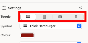
When there is no longer enough space, you can switch to the “hamburger” menu. For each of the breakpoints, you can set whether the menu appears as a hamburger.
Thanks BLOCS-Freak, is it also possible somehow to make the distance between the menu items smaller, so there will be space enough that way (in case hamburger is not wanted this early/I mean while the window is still pretty wide)?
I can see where you are coming from as I have had this at times when I seem to have so much space in the navigation it drops down a line in Blocs I do find the Nav container quite wide - but I am guessing this is a Bootstrap design.
I would suggest for visual appeal I personally would centre the menu text so it fills that line using Flex (not ignore this if you like it set to the left)
I would then remove so much space in between the text (padding / Margin) and let the Flex spread it out or just reduce it and keep reducing it till it sits on the next break point.
The issue you have is you want it to sit on the MD breakpoint, but this needs space to breath still so it will again jump down a line when it gets to SM point.
But if you only want the full menu showing on LG - try reducing the gap and try Flex.
Have a play ! this is why I love Blocs - its like Lego for developers! we play till we get what we want!
Enjoy.
2 Likes
“But if you only want the full menu showing on LG - try reducing the gap and try Flex.”
Yes, thanks, Adie, sounds interesting even if I can’t really get what you describe here, tried to read it a few times but the details missing, for me (I’m not a power true user of Blocs), can’t get the things in really. I want the “text” menu to work for the first 2 breakpoints, or maybe 3, and then the hamburger jumps in, and the hamburger jumps in well even now when the window is thin enough (and works ok on mobile!) – I simply want the distance between the “text” menu titles to be smaller, it doesn’t heed that “huge” space like it has now.
1 Like
Hi @Himmelstrutz, just following on from @AdieJAM suggestion.
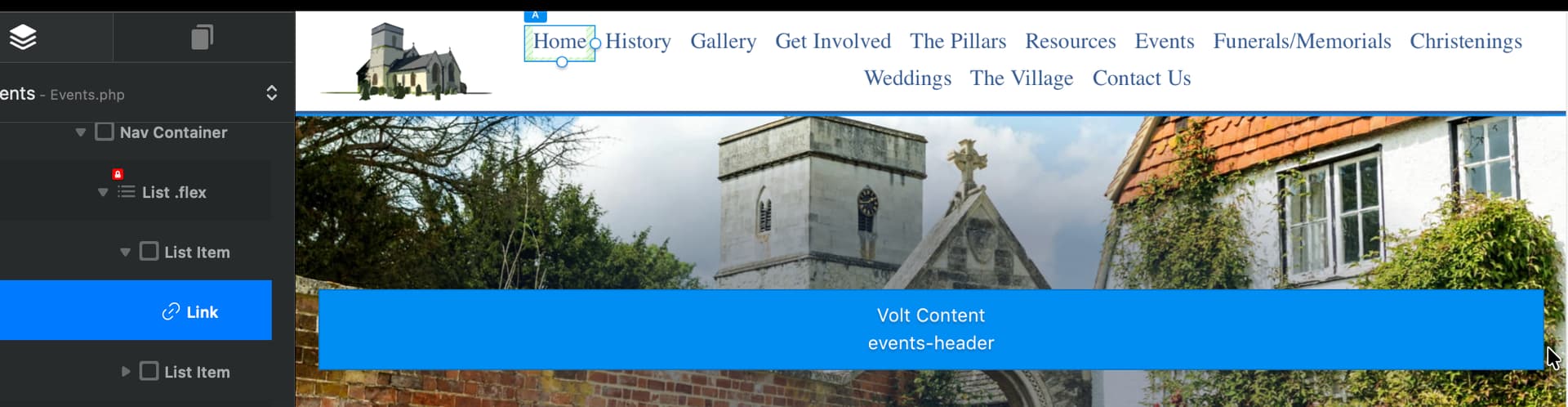
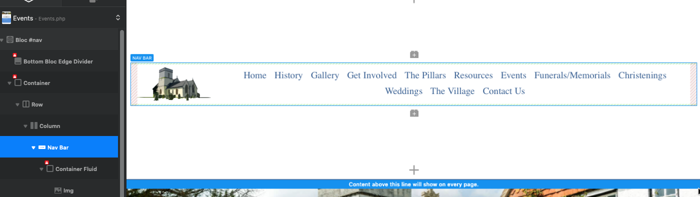
Your Nav Container contains a list (which houses each menu/List item) and each menu/List item contains the link itself.
Add your Flex settings to the ‘List’ box and adjust each ‘Link’ size by dragging the handles on the box.
The screenshots below have the items selected (maybe not the best example because of the volume of menu items pushes it to 2 rows, but you should be able to see what I mean).

2 Likes
Thanks but sorry, I have no idea what you do there and you also mention “flex”. I cannot really drag anything in the handles, they seem to be like stuck. Isn’t this something about a css where this should be adjusted?
Hello again, I’ve enlarged the padding on my previous examples for you to see better.g
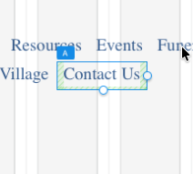
First off, your banner that says “This Is Himmelstrutz Custom Shop” needs to be below the item called Nav Bar - this will stop your menu being split when reduced (‘About’ falling below the banner). It looks as though the Custom Shop banner is within the list item somehow, maybe accidentally dragged?
Personally, I’d set your Source for the menu to none and do it manually - this just seems easier to me, but should work both ways.
Make sure the item called Nav Container is set to as wide as you can get it, which will give the menu items more room to manoeuvre.
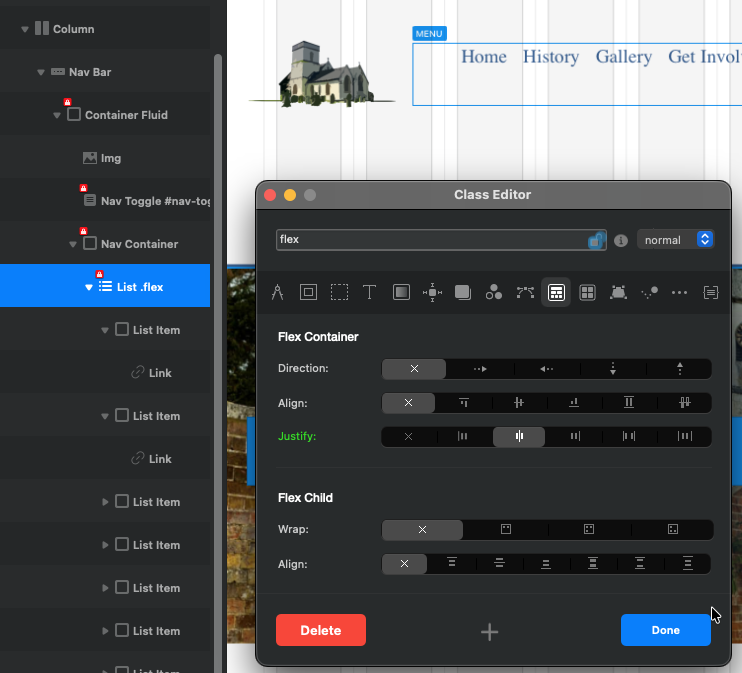
Here is my class setting for Flex, nice and simple - and note which item it is assigned to:
Finally, the “Link”, not “List Item” has the resizeable handles, but I do find this very hit and miss. Today I can reduce with the handles, but not enlarge - so whether it works for you is another matter!
Sorry, I don’t think I can be any more help than this, but best of luck.
Thanks for your time and help, but I don’t get this to work.
So next step must be to try to make a “manual” navigation menu, on each page. But how, yeah that’s another question.
Got it to work with a few lines of code from ChatGPT. Just shout if you want to see that magic code 
1 Like