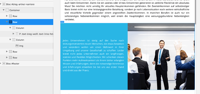
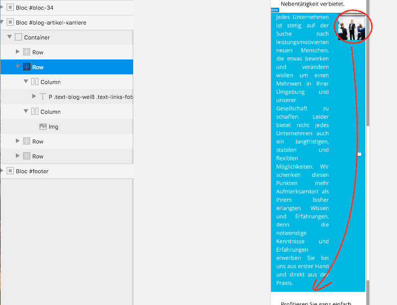
I have created a highlight banner on a page and everything is fine in the desktop/tablet view. The view on smartphones is a bit distorted.
How can I tell the Blocs App that only in the mobile view, the image should slide down (i.e. the rows should no longer be displayed next to each other, but below each other).
There are a couple of things you could do. The best way is to adjust the column not the row. Set each column (in the sidebar) to 12 wide on the mobile breakpoint. This will make them equal and your image will be the same size as the text column.
Casey
2 Likes
Yes, as above, you need to set the columns to 12 at the mobile breakpoint.
Thank you very much for your answer. It seems like I’ve always tried to adjust the column and not the row. Now it worked. Thank you very much!
No, it’s the other way round.
You tried to adjust the row. You must adjust the column.
Anyway, it works so you did the right thing.
1 Like

