I have been using Blocs for web design & I am running into a challenge when trying to optimize my websites for mobile devices. Specifically, the responsive design does not seem to adjust as expected when switching between different mobile screen sizes. Despite setting breakpoints and adjusting mobile-specific settings; certain elements do not resize correctly / align properly.
I am aware of the responsive settings within Blocs but I am still experiencing issues with elements like navigation bars, images & text boxes that don’t maintain their intended design. Sometimes, these elements overflow or become misaligned in the mobile view; which disrupts the user experience. Checked Responsive web design is working on desktop but not on mobile device - Stack OverflowMinitab guide for reference .
Has anyone else faced this problem or can share insights on how to fix mobile responsiveness issues in Blocs? Any tips on best practices for handling responsive web design within this platform would be greatly appreciated.
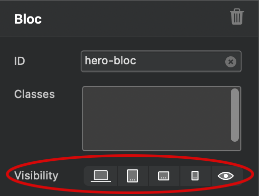
I’ve had the same experience when the larger breaking point layout does not translate well to the mobile breaking point. To make it easier for me I will create a duplicate of a specific bloc and only show that bloc for mobile only by utilizing the Visibility section on the side menu and making sure the original bloc is hidden. This way I have more control of the design I want instead of relying on the larger breaking point design.
For text alignment I would start with mobile view and work your way up and if elements are overlapping there is padding that can be added and that is all by way of using classes if you don’t wish to create an extra bloc.
 Checked Responsive web design is working on desktop but not on mobile device - Stack Overflow Minitab guide for reference .
 Any tips on best practices for handling responsive web design within this platform would be greatly appreciated.