I think I am not alone when it comes to dropdown adjustments. The hamburger menu on my site sits on the left but when clicked it shows on the right. Anyway to adjust this?
Hamburger menu content on mobile does not have any left padding so it looks weird being at the left edge of the menu. Anyway we can adjust this per size?
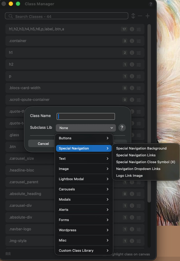
I’m not at my Mac atm, but have a look at the built-in Special Navigation options in the class menu when you add. Not sure which one applies to what, so you may have to play around a bit.
you can customise some classes of the existing elements in the Class Manager. This means you can override some of the blocs’ own specifications. For example, the background colour and appearance of the hamburger menu. I haven’t tried yet whether this allows you to change the sidebar menu.
But you could try the following in the Code Editor
.open.nav-special.sidebar-nav { left: 0; transition: all .2s linear; }
No luck with this. Really cannot believe styling of the drop down should be that difficult. Desktop works fine as is but mobile/hamburger is definitely not ok.