Easy Issue or not? how to define css for diferent screens

As far as I can see text size and text aligning can be configured differently for each screen size (available in blocs top bar). But why not simple css things like padding and margin for different screens.
(they now apply to al sizes).
Why is the @media in css not available for tweaking your positions of elements or am I missing something? :grin:

Thanks for the tips!
Jerome

As far as they go, they can adjust padding and margin in a custom class! for every break point! I don’t know if you mean something different?

Captura de Pantalla 2020-03-26 a la(s) 1.54.03 p. m.

Yes indeed something like that, but the questions is where to set the breakpoint?
here’s explained a bit
https://help.blocsapp.com/knowledge-base/breakpoint-views/
still it seems a custum class applies on all screen sizes

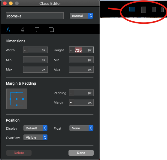
Just open class editor, and without closing change at each breakpoint, you can change each setting and it will only apply to the point where you make the change … It’s perfect.

Try it and you will see that it is easy to adjust everything for each breakpoint.

Only a custom class with different settings for each point, without closing change from desktop to mobile point, the changes remain in each one.

1 Like

Ok, wow. that’s easy! :grinning:
was hard to find :grin:

I couldn’t spot it in the online manual.
Thanks for your help! :+1:

Yes, it is necessary to update the documentation, but when you discover it, it saves you endless time, and you can make many adjustments as you need for each breakpoint …

Excellent! Best regards