Hi everyone,
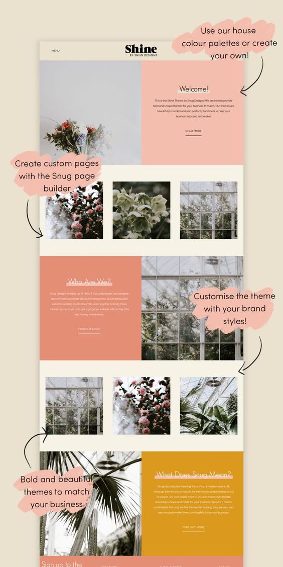
What is the best way to create a two column edge-to-edge layout, like this? I cannot seem to get it to work properly. There is always a white gap around the edge of my site.
Jess
Hi everyone,
What is the best way to create a two column edge-to-edge layout, like this? I cannot seem to get it to work properly. There is always a white gap around the edge of my site.
Jess
I assume that you are not trying to create a site that includes the call-outs as seen in your example. If you did want call outs, they would have to be included in the total page width. Given that they overrun the edge of the page elements, it wouldn’t be possible to have the main content columns running edge to edge. However, if my assumption is correct, and you don’t want these call-outs, You simply add blocs to your page and select the full-width option on the boc.
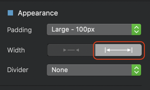
If you need to remove the white margin from either side, select the Row and uncheck the Incude Gutters option
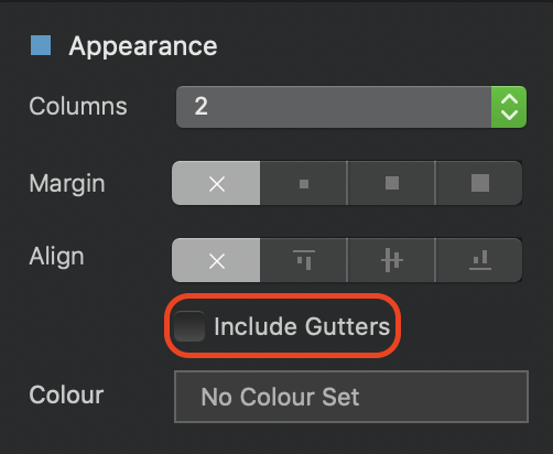
Have in mind that this will remove gutters from all elements in the row, so if you have an image in one column and text in the adjacent column, the text and image will have no space between them. This means you will have to set padding on each individual element.
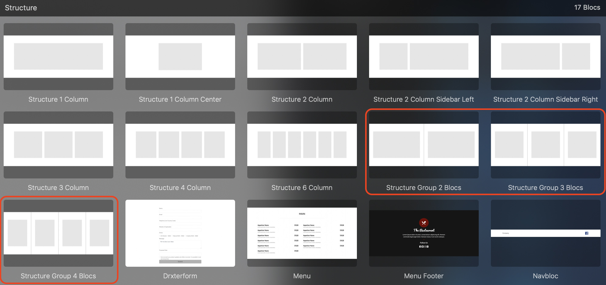
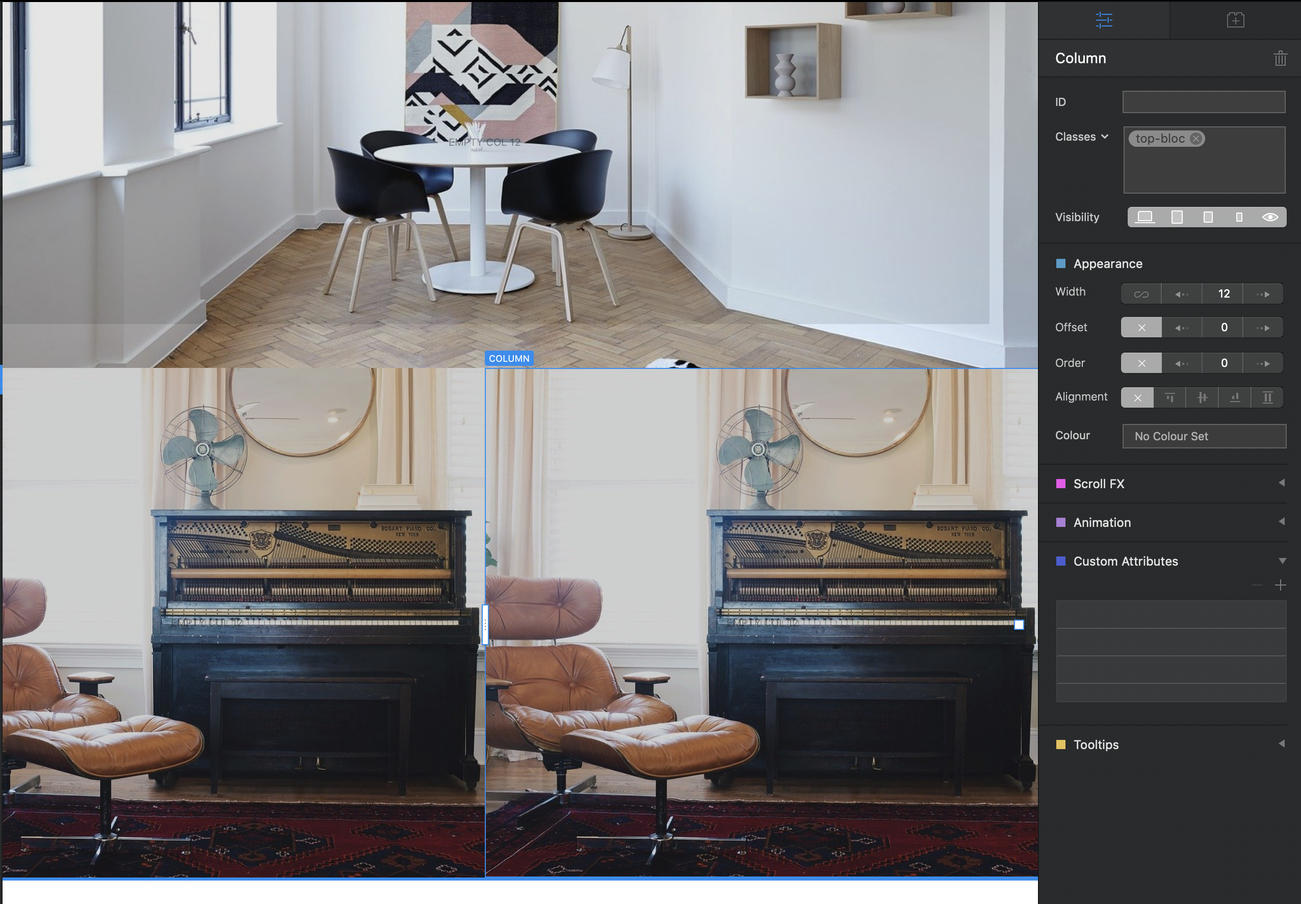
The most useful structure blocs to use for this type of design are the Structure Group Blocs as shown below. These types of blocs will allow you to set individual bloc backgrounds for each column which is very usefull for creating the effects shown in your example.
Thank you! I will look over this tomorrow. My layout is as such, (minus the hero image and footer- I already have that part done) for the home page.
Hi @hendon52,
I am using the Feature 2 column for dong mine, but just noticed on testing that on table mode, that it spills over.
Would I be best doing this in a Structure Group 2 Bloc? and for the purple colour as shown my in image, if I save that as a file and in the same size as the image on the left?
Crazy question - whats the difference in the Structure Group 2 Blocs, and Structure 2 Column? (not sure how the 2 work different?)
Thanks
The structure group 2 column bloc is actually 2 blocs sitting side by side. The structure 2 column block is two columns sitting in the same row. To understand the difference, place both on your page . Now add a background image or colour to the structure 2 column bloc. You will notice that the background spans the entire width of the page. Now do the same with the structure group 2 column bloc. You will notice that adding a background image or colour only affects one half of the page width. This enables you to set a different background image or colour to the other column.
This also means that you don’t necessarily have to add an image bric on, say the right of the screen - you can just use the image as a background. Likewise, on the left block, you can add a background colour of purple. By using this method of adding background images, you will probably solve the issue of the bottom margin on your tablet view, because the image will expand or contract to fit the available space. If you use an image bric in a normal two column arrangement, the image aspect ratio will be restricted to the width of the column the image sits in. Therefore, if you view on a smaller device, the width of the image gets smaller, thus making it shorter. This is why you will see the bottom margin.
thank you.
I will try this now - so structure group 2 bloc and add my image as background on the left and the colour as a background on the right.
Thanks
Hi @hendon52,
I did what you mentioned above, and went into a new clean design to play around and for some reason it seems fine i the blocs visual, but when i go to maximum size on safari responsive visual, on the max setting it breaks up again.
The banner works find on the blocs edge to edge carousel, but when I add it as an image to shows white lines left and right…
and the left and right 2 images break up too.
How come it does this? I have tried Structure and Structure group and no luck at all.
Any help from anyone would be appreciated.
(I added them as images, as background seemed to throw it out event worse)
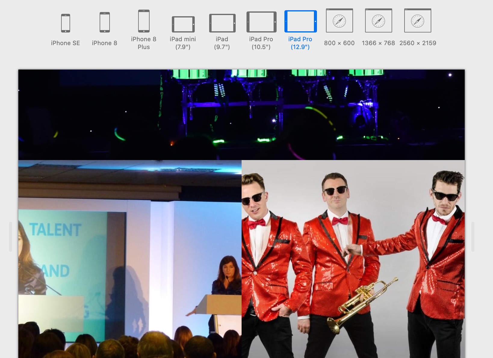
I have attached images on how it looks in Blocs and then in safari.
It looks like the bottom two images have been placed in image brics. You must be sure to use the images as backgrounds to the blocs.
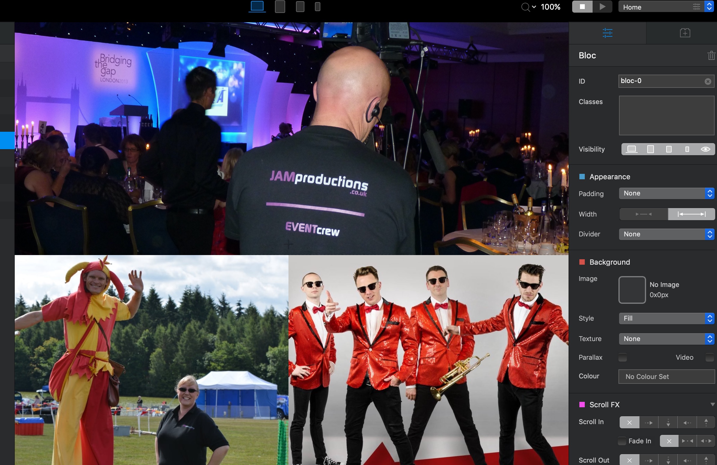
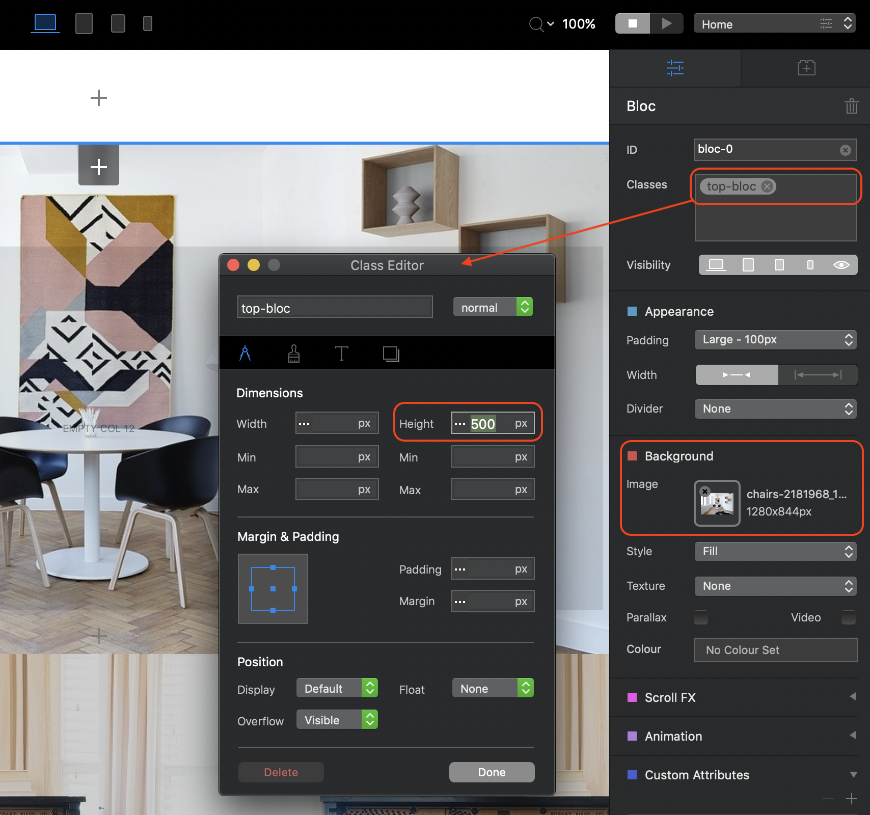
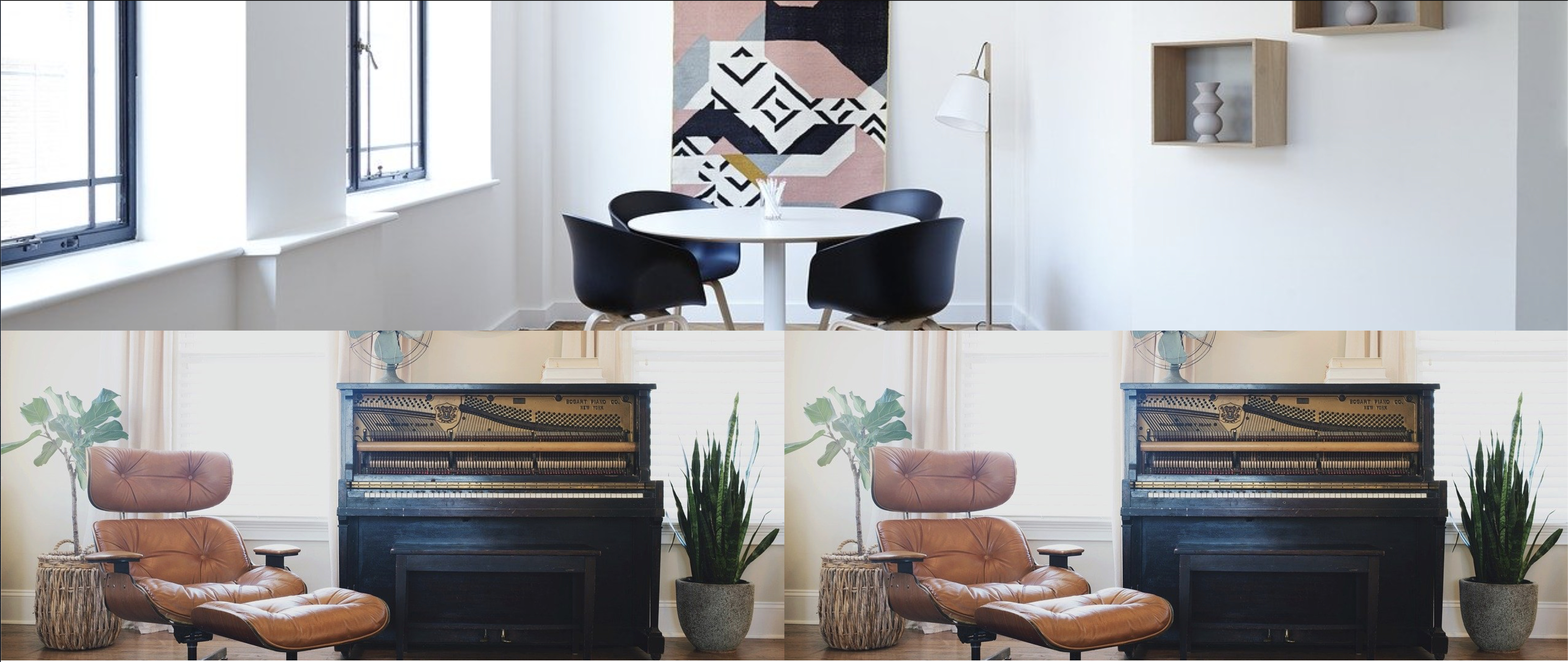
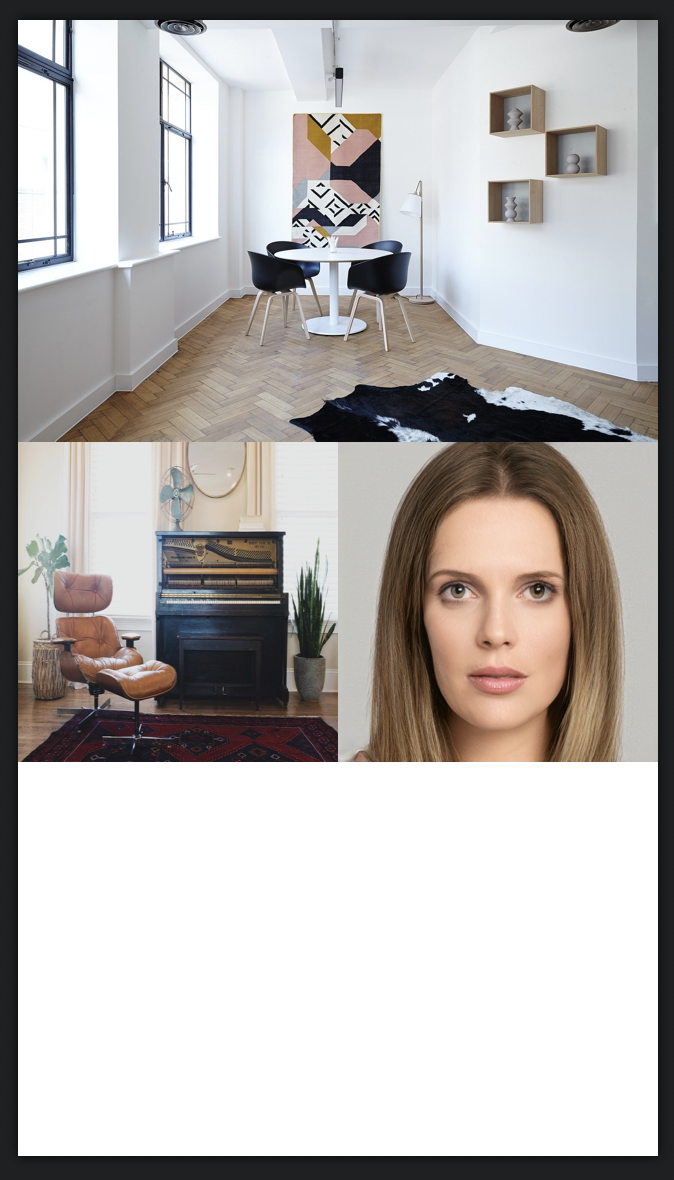
I’ve made a bloc similar to yours using the settings shown below:
The top bloc is a standard full width bloc that contains the background image. I also created a custom class to ensure that the bloc remain a certain height - if it has no content then the bloc will not show anything, so by setting a fixed height, the image will show with or without content added to the bloc. Here are the settings highlighted:
Additionally, set the width of the bloc to be screen width. Then select the row in this top bloc and deselect the “include Gutters” option
Next, add the two column structure group bloc. Add the background image to each of the adjacent blocs. Again, taking each bloc in turn, set the width to full screen, select the row and remove gutters. Also ensure that the bloc padding is set to none. Now apply the same custom class to each of the blocs - this simply gives the blocs an exact height. If you want a different height for these blocs, just create another custom class and apply that instead.
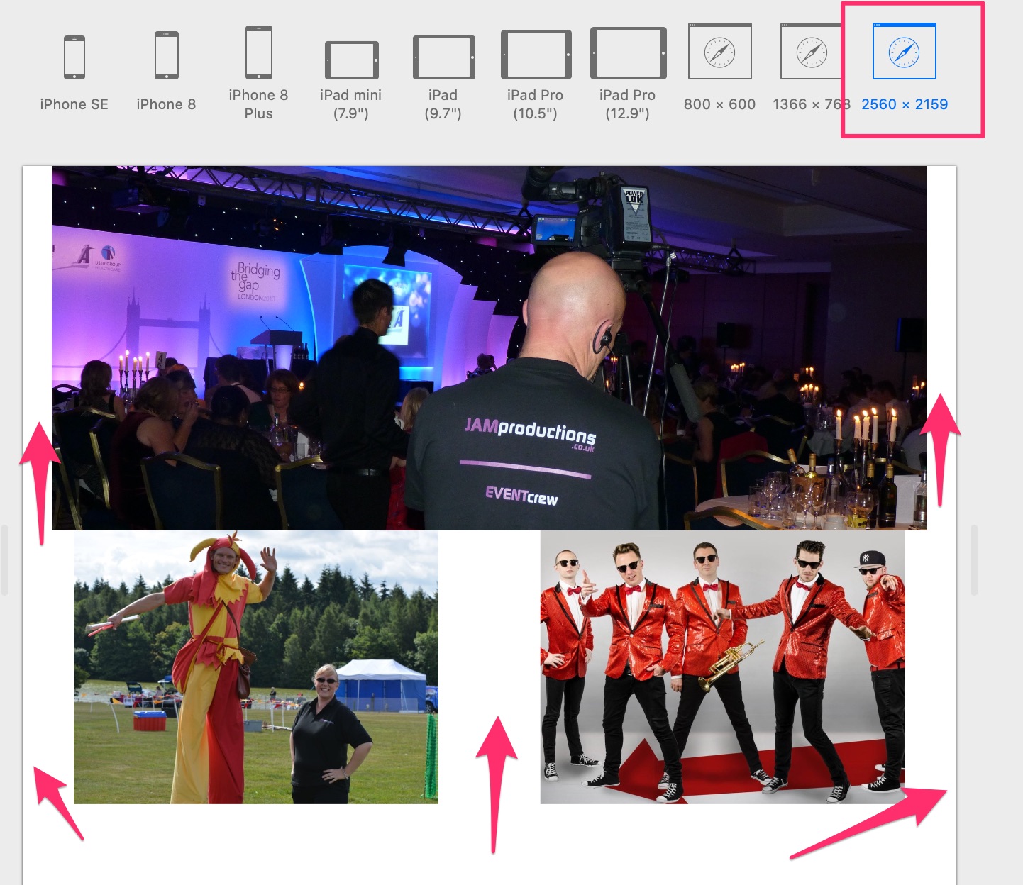
This is how it looks in blocs.
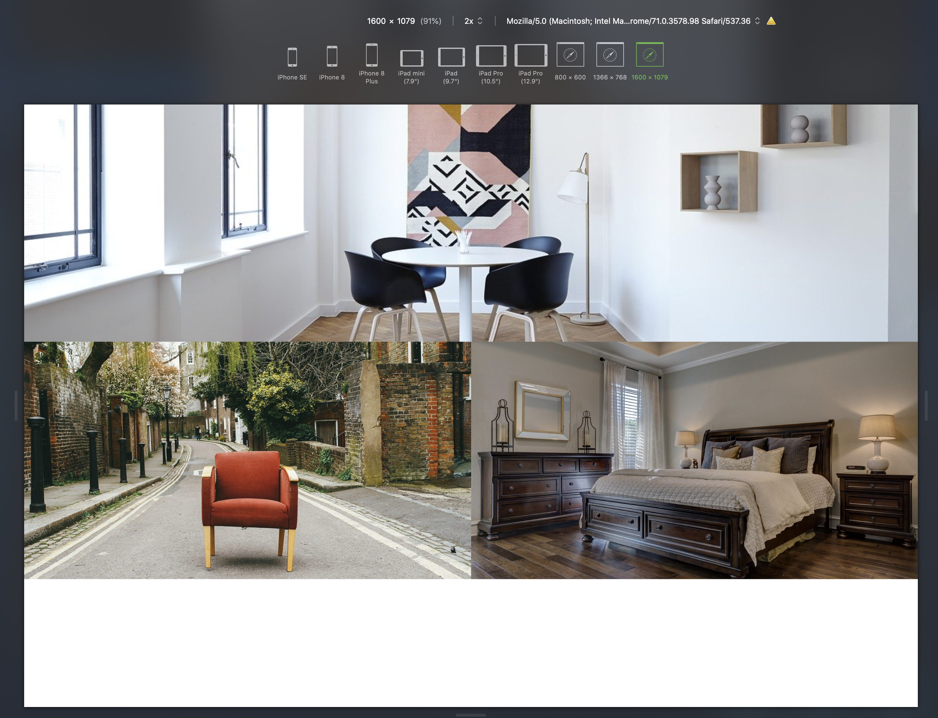
If you now view in a browser, it will look like this:
By the way, I used the same image twice in the bottom two blocs.
Things to note:
Using background images and fixing the height of the blocs will cause the images to crop at the top and the bottom as the page gets wider. This is because the image WIDTH will always occupy the space. But because we’ve set a fixed hight, the bloc cannot expand to accommodate variable heights. This means you should choose your images well and ensure they have a fair degree of top and bottom space to allow for this cropping.
The second point concerns minimising this effect. Essentially, design the page using the widest screen size likely to be encountered and set your bloc heights accordingly. You can then go to each smaller breakpoint in turn and set the bloc height to better display the images at those breakpoints - just edit the custom classes set for the blocs. Remember, the “unpredictable” cropping will only really become of concern on your widest (desktop) breakpoint because only desktops and laptops allow for browser width adjustment. Even so, if someone reduces the browser width there will be a point at which the next breakpoint variant will kick-in. On all other devices, the layout is more predictable because there is no browser adjustment.
Thank you for the detailed information, I will spend some time on this shortly.
Thank you so much.
Let us know how you get on.
Will do. Do you only use the visual settings for PC, Tablet and Mobile on Blocs, or do you use the development tools in Safari too ? All looks ok on Blocs and all settings on the development tool, apart from when I go to the max setting of 3840 x 2160…but i notice when i put what others have done on Blocs, this sits good on that too, where some of mine has fallen. I have adjusted most now and very happy, its just this bit which I need to sort.
I will come back later on how I got on - thanks.
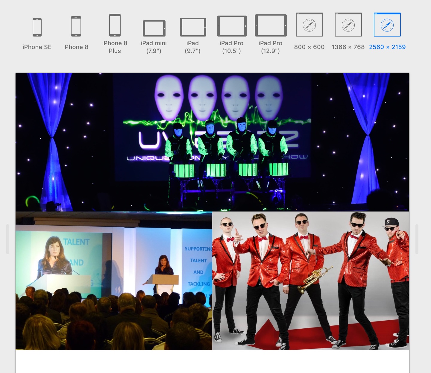
I do use the developer mode. The screen looks like this:
As an addendum to my other post above. It isn’t strictly necessary to remove gutters from rows because you may want to add content to some of these blocs at some point, in which case you would probably want to maintain the gutters. The same is true for padding - it wont change the image placement if you leave the padding in place. I only remove them for the purpose of this exercise, ultimately the choice is yours. Keeping them or removing them shouldn’t have any detrimental effect on the image placement within the page.
Hi again,
Right, I did this and it did work for the full screen test, but it does not have its full responsiveness.
I guess as its only a background and not an actual image as to say, this will not work fully as i wanted.
I just tried it on 2 other forms of software and it works simple, just tell the 2 columns to be full width and put the image in and text box and it works with every screen size…but not blocs?..but i want this to work in Blocs so much !!!
I don’t get why this only works as a background image? why not any bloc or bric if its set to full width and no padding…
A bit like the carousel header edge to edge, this sits in and works fully responsive without cropping the image…I wonder, if to do this Carousel is the only way Blocs can get it to work…
because you don’t use the “brics design card” it really fits your entire width and you can use it on the blocks without problem !!! I think it would be faster and easier.
I’ve used the full-screen layout to full edge, and you can adjust how your image will look at each breakpoint with the custom class! And if you want other width at breakpoint just add the “Media query” with your custom class and adjust the width of the image, this way you adjust it quickly.
You only want to place the image and that blocsapp or brics adjust it alone, I recommend using “brics design card” and in two click you do it quickly.
@AdieJAM There is nothing to stop you from using completely dynamic image brics if you want to. These will expand and enlarge dynamically as the browser width adjusts. All you have to do is create blocs with no padding, no gutters in rows and set all the blocs to full width. For your images, just create a custom class that sets the image at 100% width and 100% high. You can see an example that I’ve uploaded HERE
The downside of using this option is that it’s not easy to add other content over the top of the brics if that was something you wanted to do. Also, your images can display very large as the screen expands because they will expand proportionally in both directions. The other downside is that if your side-by-side images are a different aspect ratio, one of the images will distort (as it does in my example). There is little you can do to mitigate this effect. If one image is 1200px x 1200px and the other is 1200px x 1800 px, clearly one of them has to give if they are occupying equal space on the screen (say six columns each). Generally speaking, the higher of the two images will dictate the height of the row the images are sitting in, so the wider of the two images will be squeezed to fit the same dimensions. So, the key to this issue is to ensure the aspect ratio’s of your images are identical if they are to be placed side by side. I don’t know of ANY app that can seamlessly place two images of unequal aspect ratio and display them side by side to occupy equal spaces without either cropping or distortion of one of the images. If you know of one, be sure to let us know.
So, my first solution of using background images uses cropping as the solution to the dilemma whilst this example uses distortion to solve the problem. I prefer the cropping option because it gives me greater control over the page layout as a whole. The distortion option can often have more unpredictable results - the choice is yours.
You can maintain the layout on any breakpoint. Here is what my example page looks like at the mobile breakpoint.
Hi there! So I tested out the home page and was able to create my needed layout. I:
The only problem is that when I start narrowing the screen, the margins go crazy! This is I think before it even arrives to tablet view.
Update!
I fixed it by removing the spacing in the classes and isntead adjusting the column size
I did notice that if I have two columns and try to align it with a 1 column it doesnt line up easily - which is a problem. I went ahead and just centered my one column text. Not sure how else to avoid that problem.
Hi ya,
I tried that way too - it looks great in Blocs, but when tested on safari on its biggest screen size, it throws it out again (did on mine away - see my post a few up)
Good luck !
Hi @nelo
You mean card designer? I did see that - it looks good, but im sure this should be a simple thing out of the box.
My aim to have have an image on the left and a text box on the right and it have it edge to edge and be responsive.
I have jumped on 3 different builders now, which I don’t use anymore - and it just works…2 x columns, take all padding off, set to full width and add text box, background and the other an image and BOOM! all good.
It really should be as simple as that !
does as it says on the tin !
I will keep playing, and have a look again at that card designer if my head is on the verge of exploding !
thanks again! your example is perfect!!!
On mine i do want to do a text box on the left or right, but will have a play.
I take it you have used the exact same method as your earlier posts, but this time added the image bric into it?..i am sure I did try that too…and that didn’t work…
ill have a play around for 1 more hr ! if not…going to have to scrap that idea and just do what blocs kind of layout for your, or move this site to another platform.
@Norm can the simplicity of what I am trying to achieve be brought into the new Blocs? All i want to do is have 2 columns, and image on left and on right text with a background, and edge to edge and fully responsive. @hendon52 has done an example here - which is perfect…just need to create one as a text box…but before I do that ! work out the order to do it all in !
EDIT!,
I think with a bit of butchering! I have worked out what you have done !!!..ill try the text box now. THANKS!!!


