My first project with Blocs 3 version 0.6
Macbook Air Mid 2013
Great Help of @Bill (Tabs & accordeon)
And @MDS providing code for the hamburger.
It´s online and SEO implemented via Blocs is Ok.
Only ok - because SITEMAP was never exported.
I find this white gap BLOC issue horrible
Hamburger via a script / Thats not the blocs I love
Anyhow
Customer is happy so far
@Bill GDPR tool was worth donating in version 2, but buttom corners don´t make it at Blocs 3 (no Problem-we are patient)
https://www.beckers-scheune.info/
Obviously design questions can be subjective, but I think you have several areas that need more space to breath.
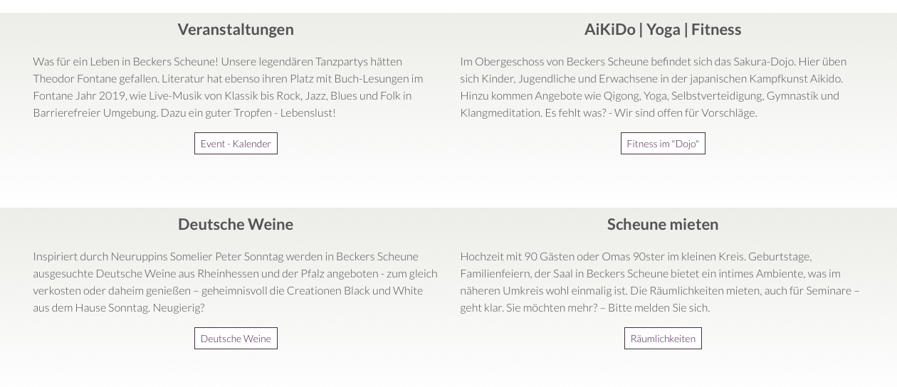
For example, I would have more white space under the subject boxes for Yoga and Aikido etc to separate it from the area below.
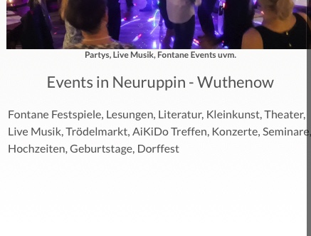
Here below you have text that appears to be cropped at the side of the page:
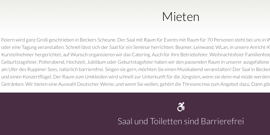
Here below you have reasonable spacing above the header Mieten, but it feels crushed below the paragraph.
These are all very simple things to change and can be done in a couple minutes. They would make a big difference to the overall feel of the site.
Obviously the sitemap should export if you have selected it and it does in my case. If you are having a problem there are lots of places you can create one online and upload it via FTP. If you are still struggling I am happy to create one for you.
Also looking here the logo of the handshake needs more space at top and bottom. If you then look at the phone number and address, it needs more contrast with the text and space around it.
@Flashman Your coments are more than welcome - always.
You are absolutley right on all critisism.
The sites you mention are in proces (waitng for stable 3.1)
Sitemap / hey …
Thanks to this great forum I knew where to click
…Never exported
Blocs Version 2 became sable after 2.1 that was when I diceded living with it.
Lookiking forward to 3.1 / stable 
All spaces tested in real on devices / no SOLIS
This is what averge people see - so best compromise.
Open on how to make it better with BLOCS
These were just screenshots I took on my desktop computer. I think you just need more padding around your text. If you look here below, it really needs more space above the headers.
My background is in photography and among other things I spent 11 years in Milan working with art directors involved in beauty and cosmetics. That is where I learned the importance of space in design to achieve balance and communicate a message clearly.
Your font used in the paragraph text is very slim and I generally like that, but it needs more contrast against the background for better legibility. You can simply make that text a bit darker and possibly go for a slightly heavier weight.
1 Like
Again, your comments a have warm welcome and I do agree with all you said.
Thanks for your honest words.
There is this white gap issue wich is already reported as bug.
Fiddled around like @Eldar did. Different but same results.
All good - so far.
But?
What happens to the classes once this BIG bug is fixed?
redo? That´s no option
Either Blocs or Pinegrow
Ma lostesso,
Penso, tu parli anche un po Italianio Bravo – A me mi piacce
I am an orthopaedic shoemaker, in love with photography since getting my first Camera from Dad – Autodidactic Graphic Designer and Organizer of BALVE Jazz Festival.
He decided in 86 living in Turkey and this is he real reason why I am doing websites.
Keeping his heritage:
www.bluecruise.org / some sites behind are done with Blocs
Nice to get know a bit more of you
Classes can be adjusted or deleted if necessary once things are fixed.
Non ho mai studiato la lingua, ma l’ho imparato vivendo lì e quindi tiro avanti.
These days I bit a bit of web design, a bit of photography and a few other things.
Anche io mai studiato - La vita e un grande proffessore!
Thanks @Flashman
Your top main image needs to be compressed. The site loaded fairly slow the first time and you png image is over 500k. Try compressing it to a jpg and you’ll be able to have over half the files size and it won’t comprimize the viewing quality.
casey