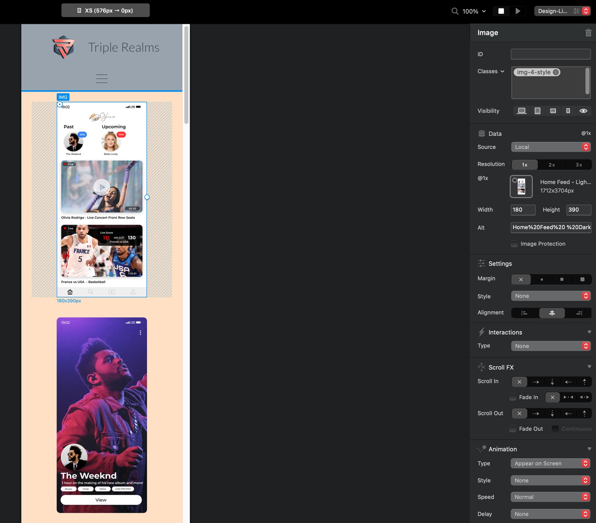
Hey, if anyone asked for more information I’d be happy to provide it. Just to confirm that it wasn’t something in that bloc, here’s a test bloc.bloc (1.1 MB) I whipped up which has the same thing. How can one fit this whole image’s height, dynamically by device screen size?
Here’s a site (pw:333333333) I coded myself that shows exactly the behavior I am looking for - no matter what device I view it on, the height of the entire image fits. iPad, mobile or desktop - and I genuinely coded it in 5 minutes. you can even open it in your favorite browser and resize the window and see it move accordingly
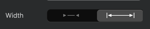
So the behavior I am looking for is what we see when we use html code like “height=100%”, which is how I did the above site
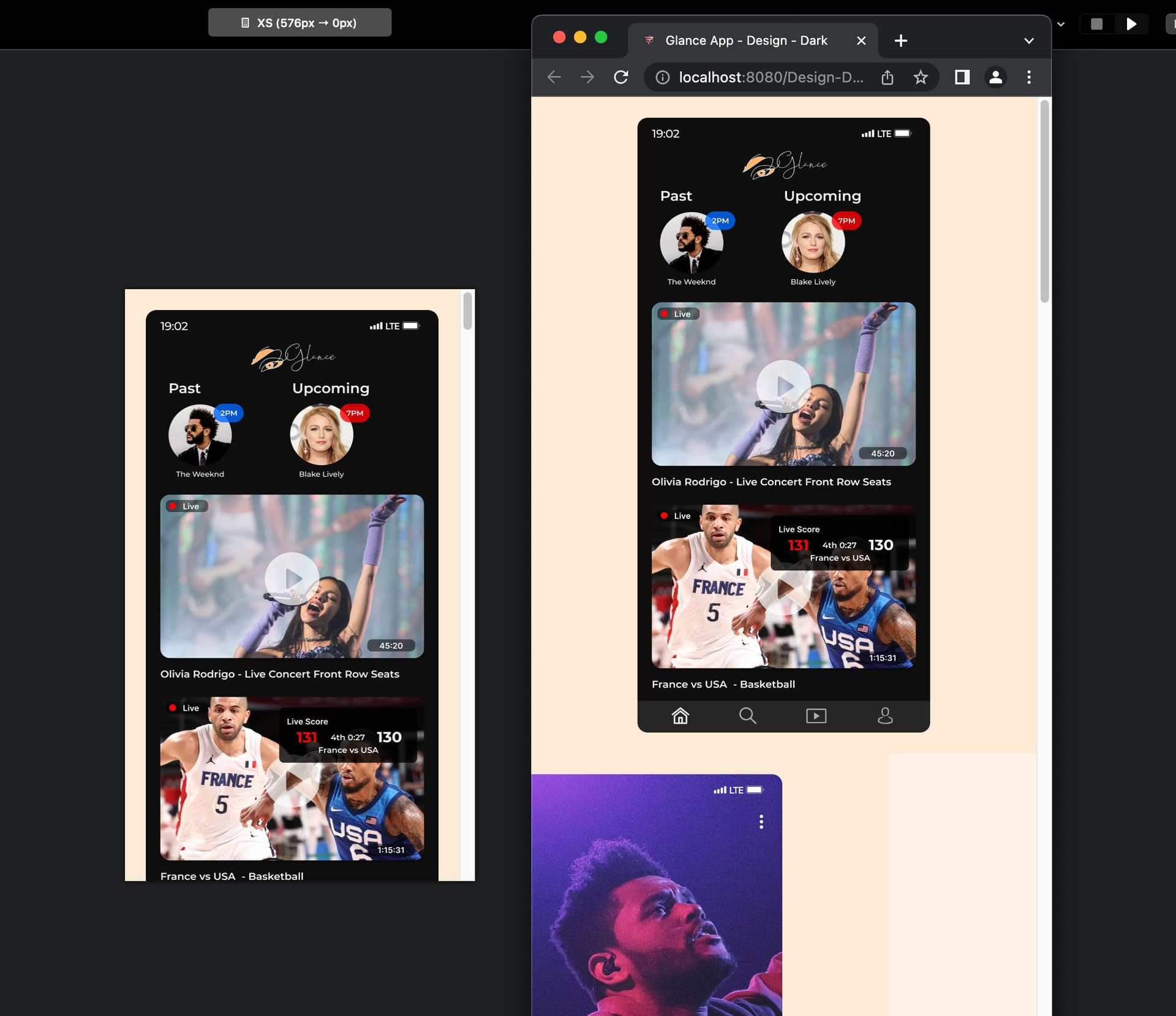
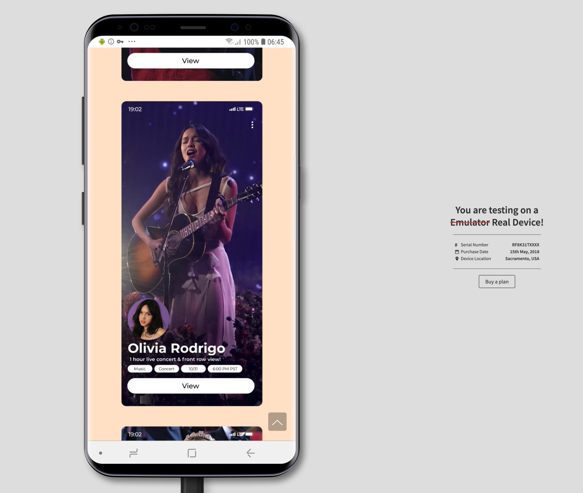
I am not sure how the conclusion was reached that it is a very tall image as, all the screenshots from blocs and the site in prior replies show the images are just iOS screenshots. The pixels might be large only because the quality is high, but the ratio is the exact same as the iPhone.
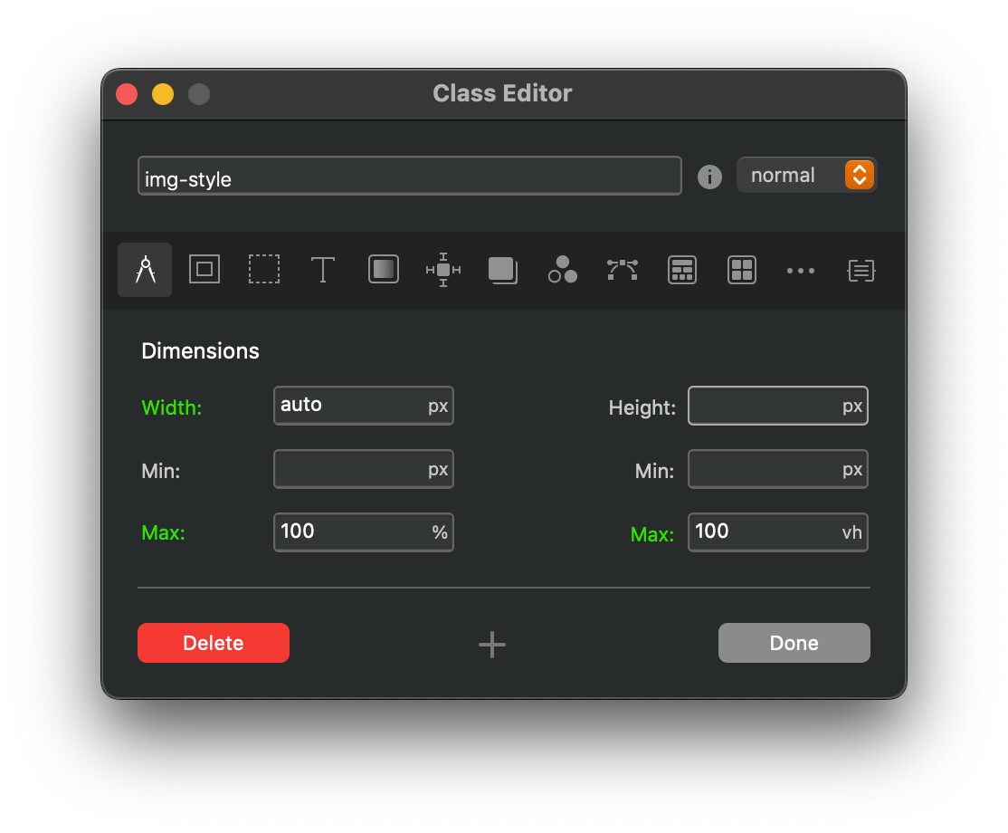
Currently, I was able to set a height that fit well on iPhone 14 Pro, but doesn’t fit well or fill by height on either the iPhone 14 Pro Max or iPhones smaller than the 14 Pro - that’s also pointing to the issue. The images are a finite pixel amount at each breakpoint, not changing for each device.
Whereas the other site I mentioned as a reference to the behavior I want, no matter what device you open it on, that one fills by width.
Yes, the alt text isn’t great, thank you. I can fix that. My main concern as of now was getting this right so I can breathe.
I just can’t fathom that all it takes in raw html is two words, “width=100%” or “height=auto”, and it just cannot be done here.
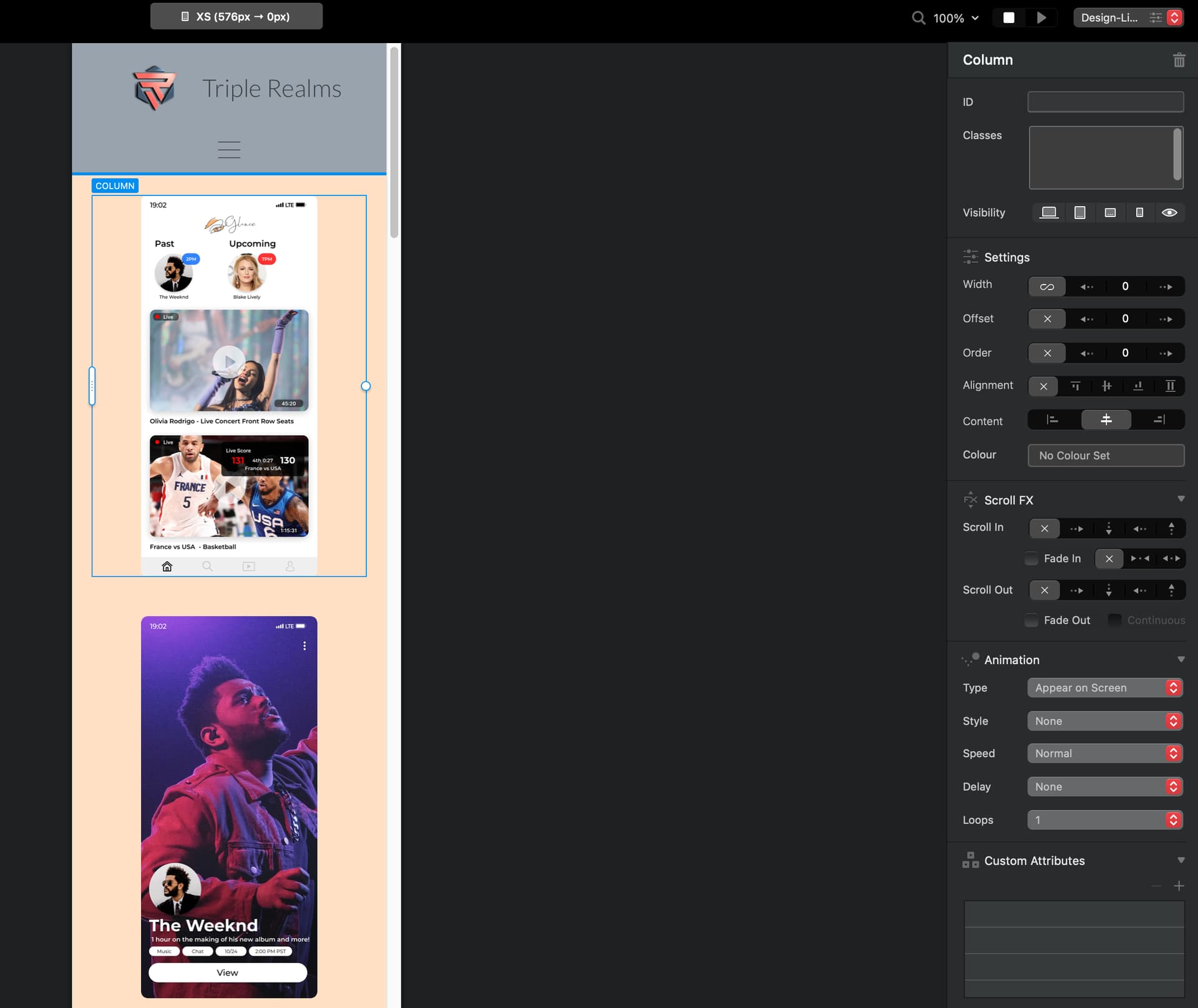
Again, if anyone knows how to add html code onto that image / class while overriding the width height amounts, that could be a way to fix this
thanks all for the time…if I can’t get it solved in the next few days, I’ll just have to transition to writing it by hand or some other software.
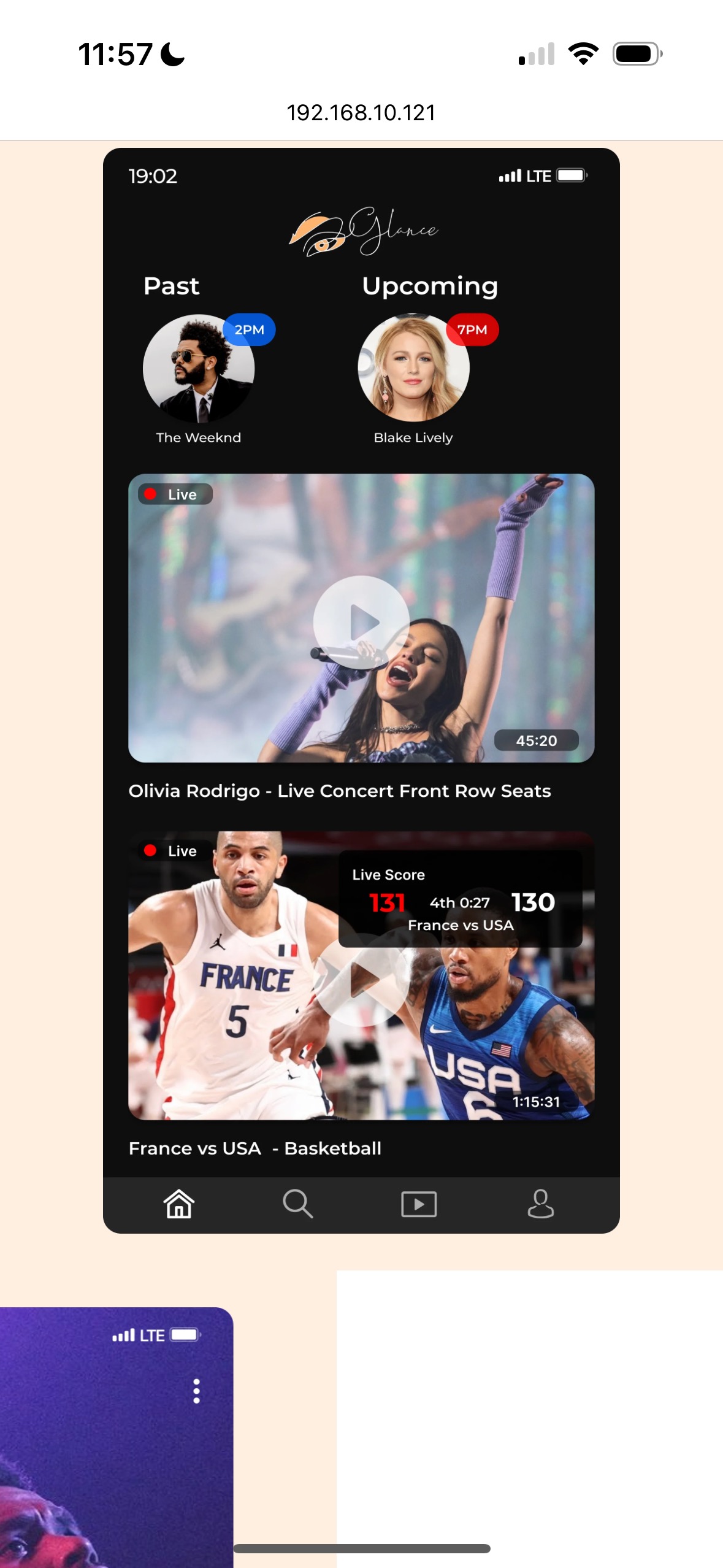
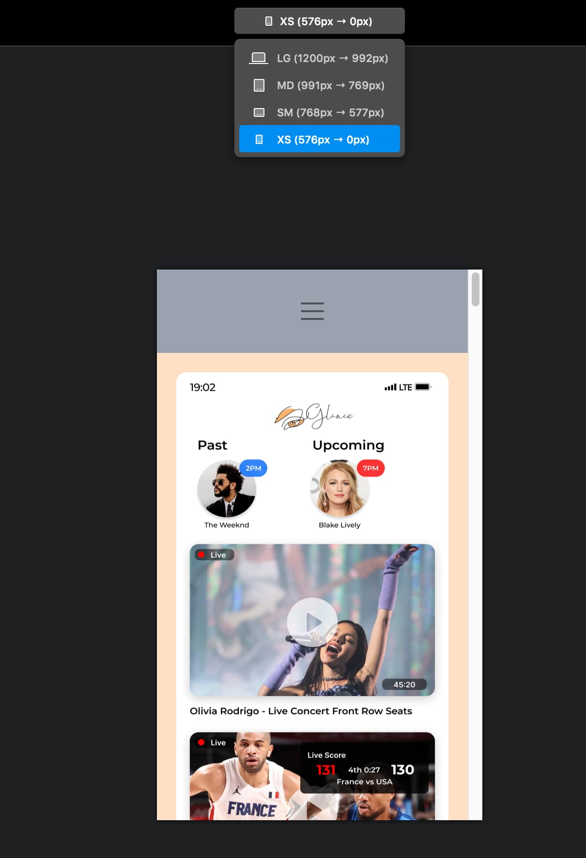
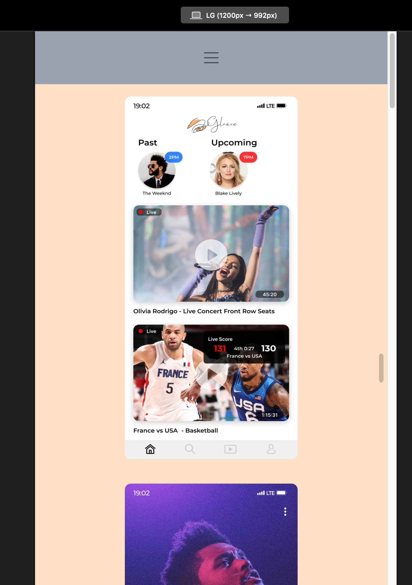
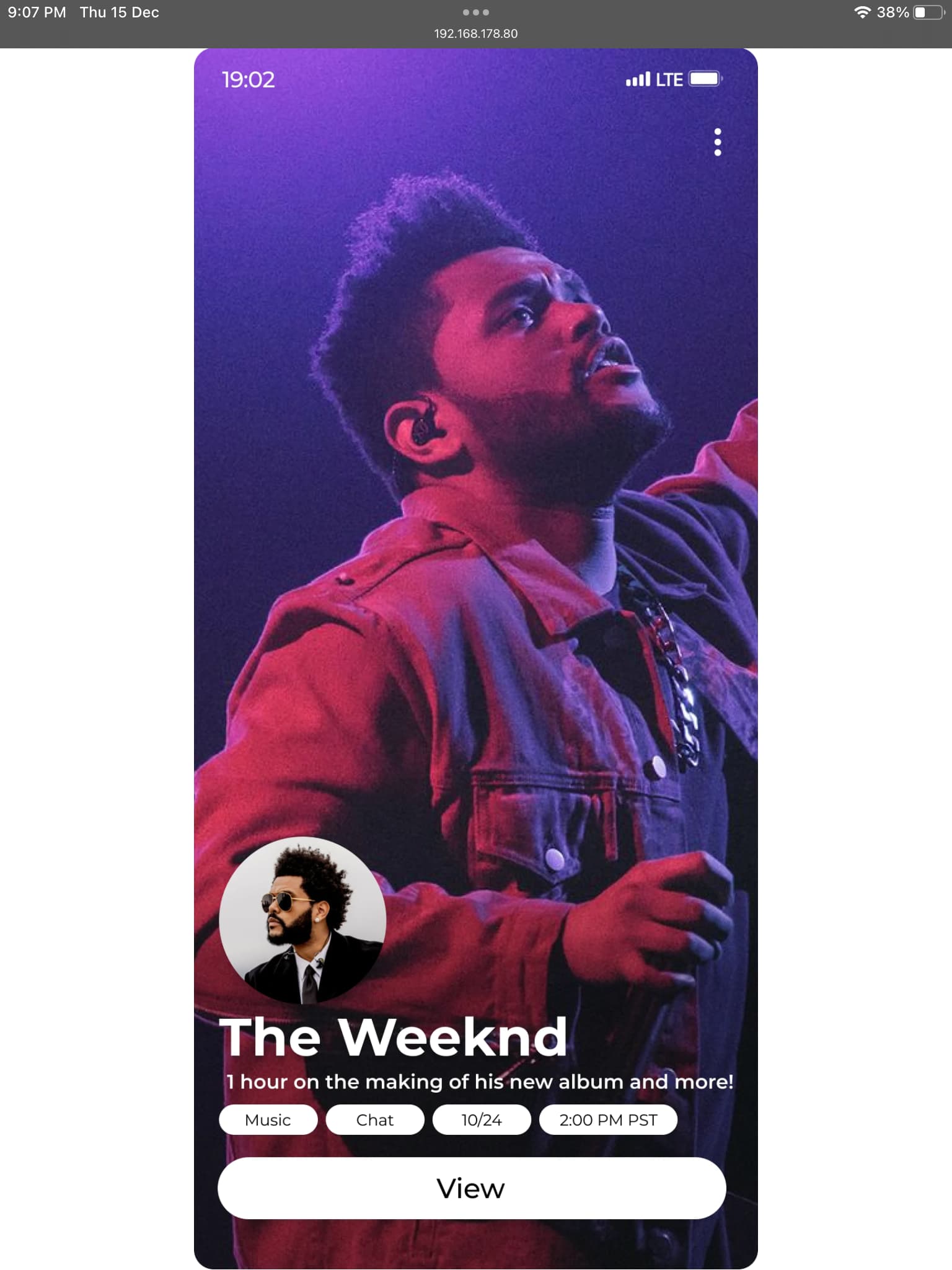
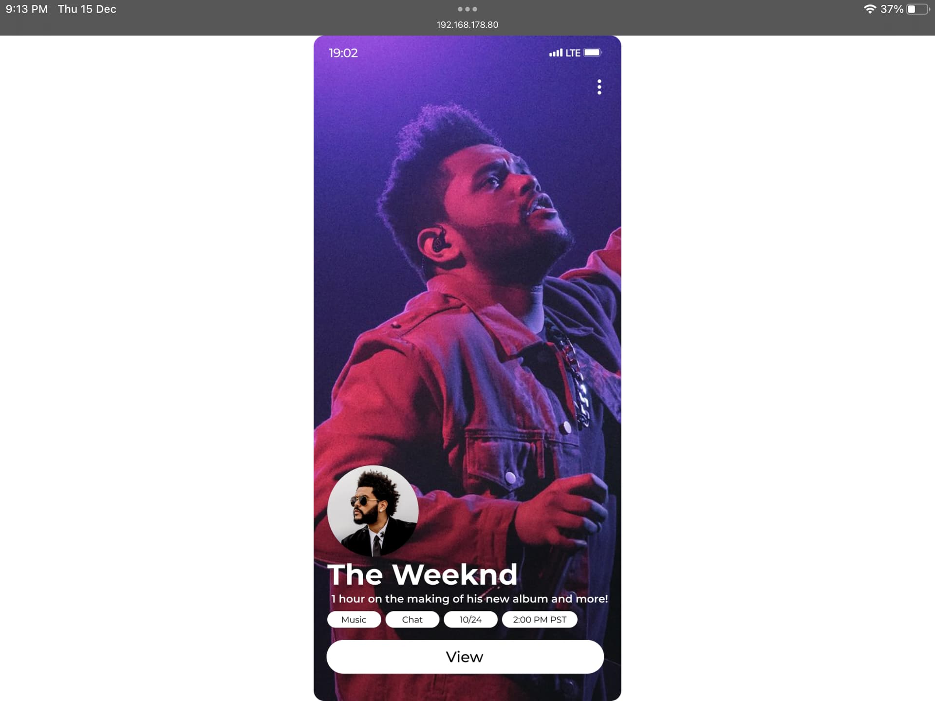
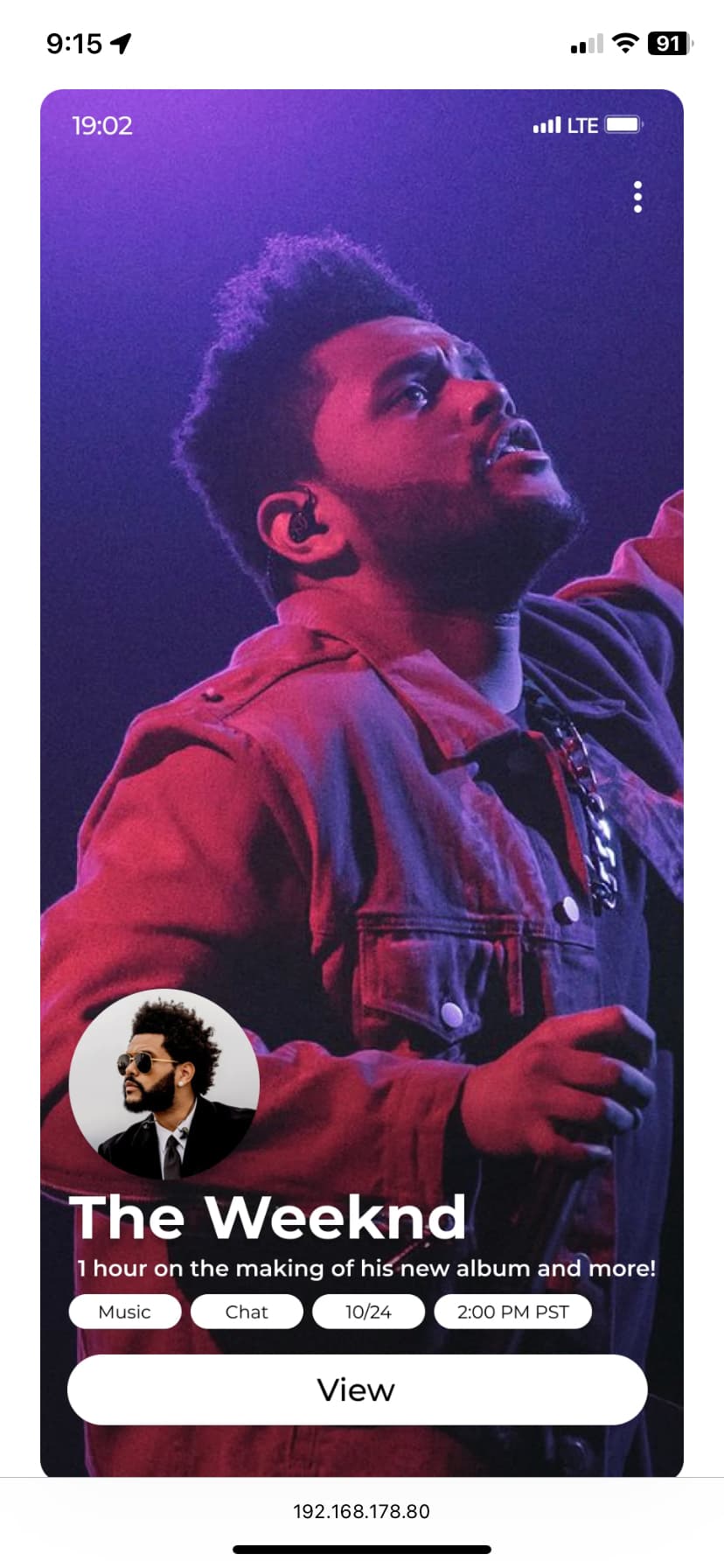
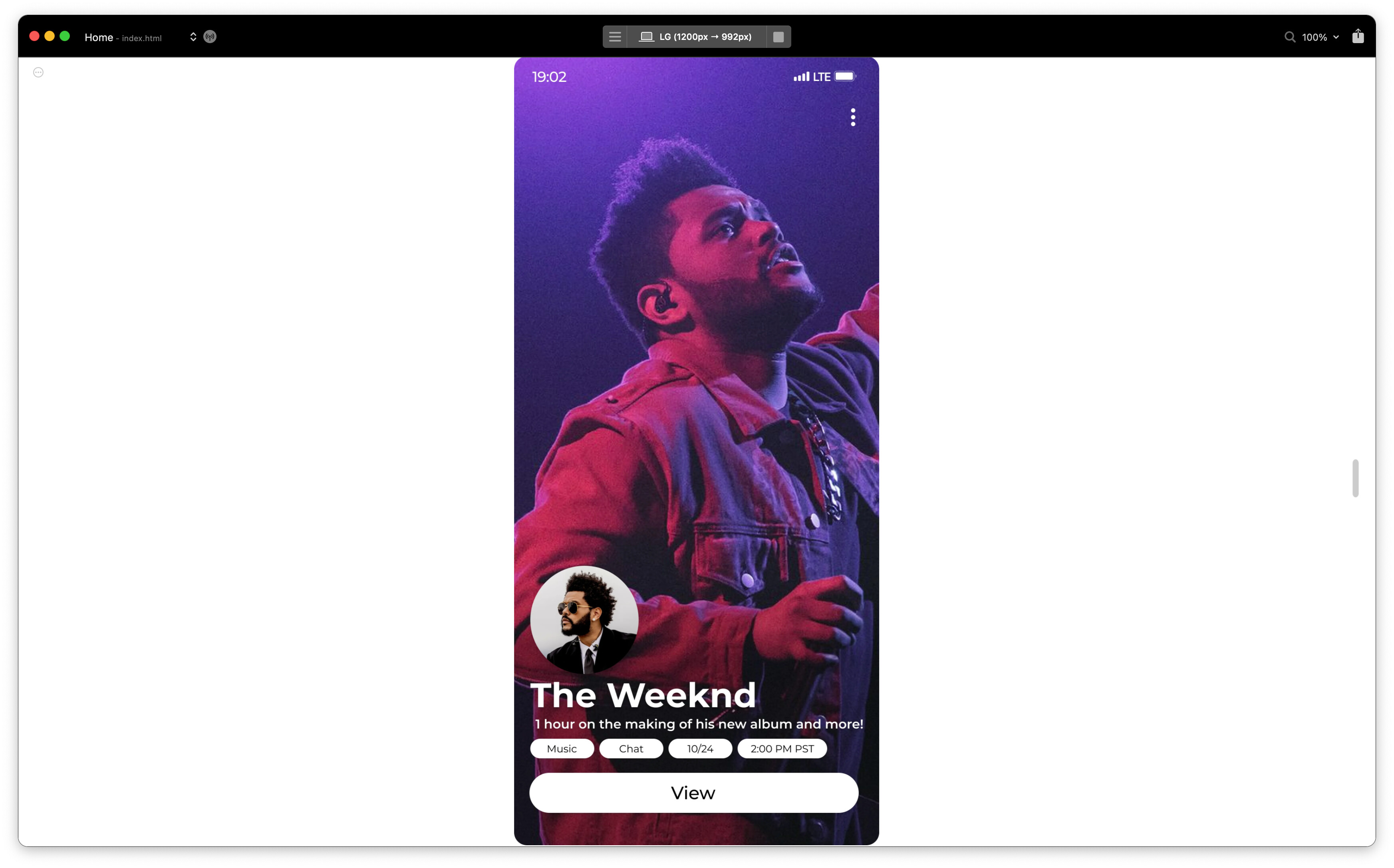
Here are some additional screenshots that show the problem and desired outcome:
Where the first is not fitting the whole image, and the second is. I am aware the second is by width and the first need be by height, but it’s the same thing just swapped.
Thank you all for your time.
If this doesn’t reach a solution, at least the devs know what they can add next, because it seems there’s quite a few people that want this.
I did find some other threads on this, all that did the same of removing all elements from lg and inserting them only on XS - which still wouldn’t make it responsively fill the device screen width / height as desired.
Thanks all! Best


 Took two seconds but two weeks to get the answer…I’m still rather grateful to have it done in the end.
