To be honest I do not know if this is a simple bug or a misunderstading on my part.
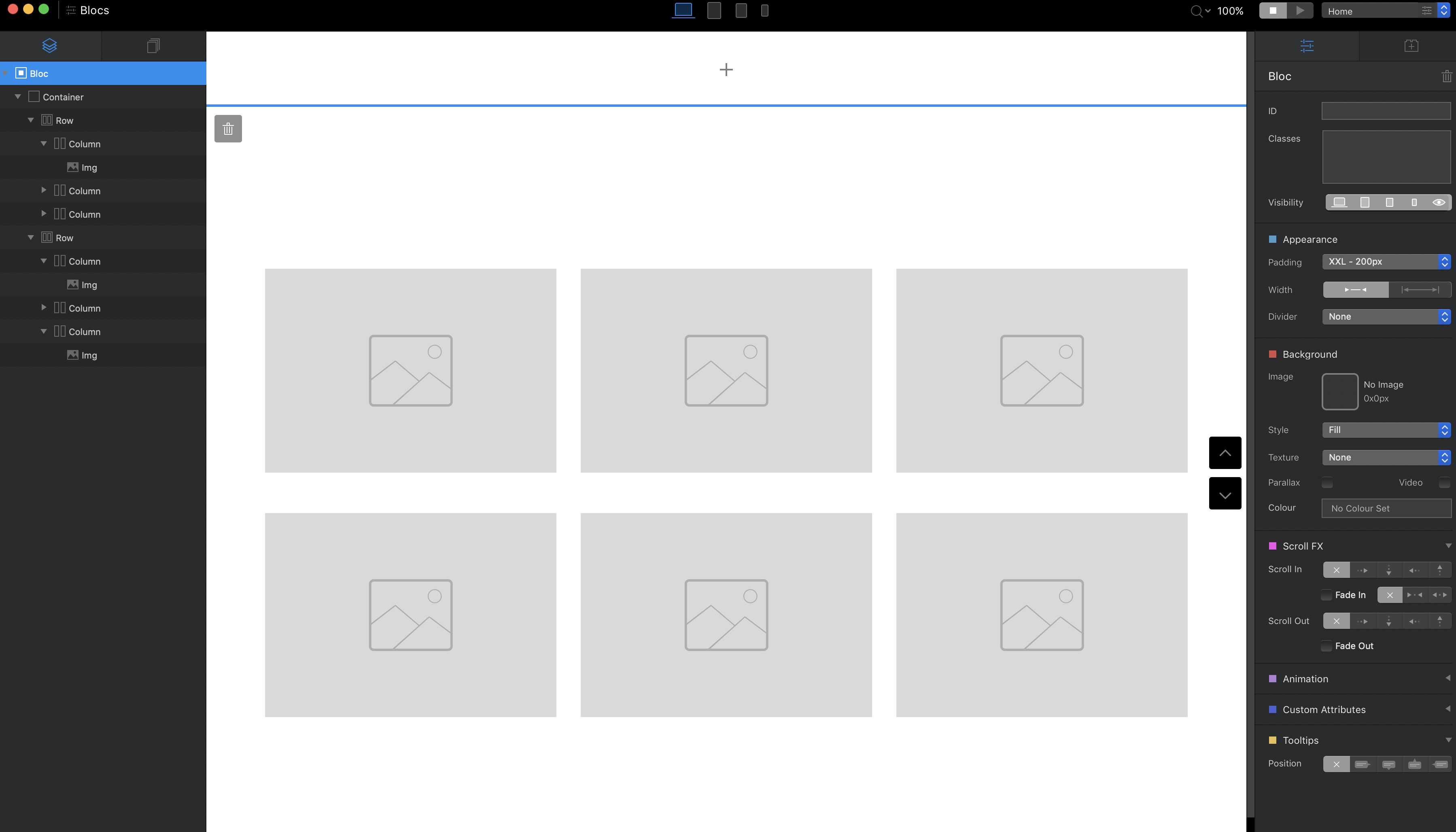
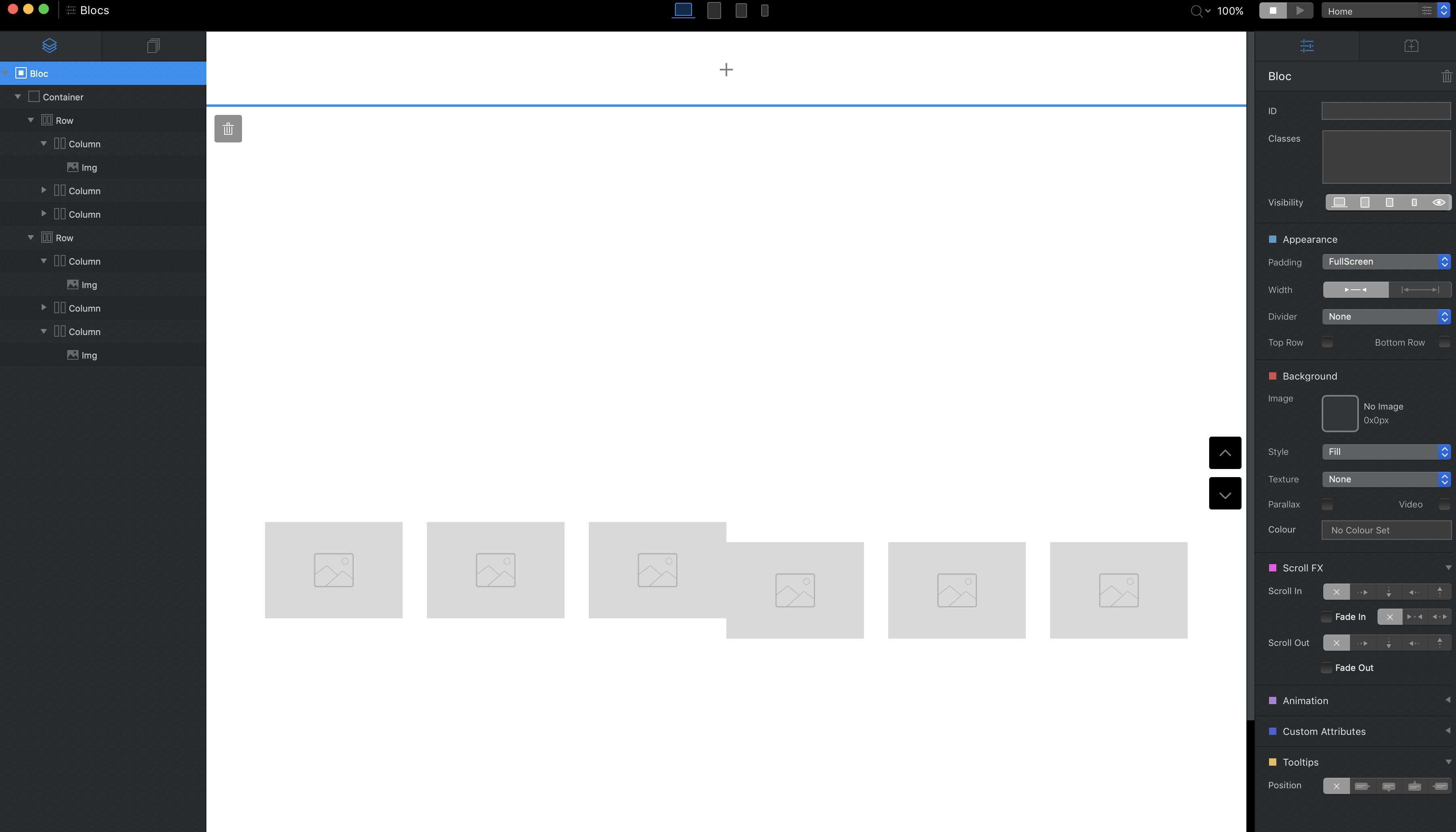
I have created a bloc using the 3 column structure which I duplicate in the same bloc. Under each padding it looks fine but when I go Full Screen they are no longer aligned vertically:
Many thanks for putting up the video. I had found ways to work around this although was and still wondering why it changes when full screen is applied.
You learn something every day. If you would have started the same way and just duplicated the last column 3 times (not the row once) then add the padding to the top image everything will be perfect.
@Jakerlund showed another way, but I think just using a three column and duplicating the last column is a little easier.
I had no idea that duplicating the first three column would react like it did.
I was just curious how to make it work.
It’s clear that bootstrap 3 and 4 works different and that things we’re used to do doesn’t behave the same in BS4.
But it’s good to find these quirks and ways around them.
However what I’m trying to point out is that the behaviour is not consistent when you have for example the padding of 200 the two rows are one above the other but then when you change to full screen they collide.
I’m used to the fact that sometimes other behaviours are not consistent reason why I’ve been finding work arounds either in the way you actually built things or by adding some code.
From my experience, I have also noted that wrapping elements around a DIV usually helps as well.
Would expect to be healing slowly but sorry to hear it is still painful
I totally agree - I am a bit the same as I do not stand things not working the way I would expect. The good thing is that it challenges us to find other ways.


