Hi everyone,
I’ve updated my site to GDPR regulations (hopefully) and suddenly I’m stuck with a strange problem:
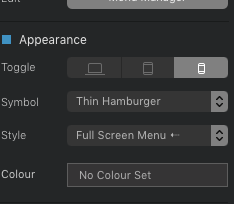
The menu is always displayed as a Hamburger with drop down functionality. I want it as a plain text menu in desktop view – toggle is switched on the mobile symbol (I get symbols instead of text saying mobile only etc. like in the documentation)
https://help.blocsapp.com/toggle-navigation-breakpoint/
The mobile symbol at »toggle« is light grey (active), desktop and tablet symbols are dark grey (inactive).
Here’s the site in question: lisalaura.de
Any ideas what I could be missing?
Thanks a lot!
Best,
Simpletext
Check this one. Maybe you accidentally have switch it to desktop version.
Thanks! My settings are exactly like yours.
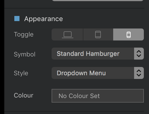
You have used a hero block. The first one. Normally the hamburger menu appears if you have selected a desktop version to appear on it. If the mobile icon is selected that option will just shown up on mobile.
So maybe this is bug! Who knows 
Thanks again! It does look like a bug, especially since I haven’t changed any of the settings in the menu and it worked fine before. Any ideas on how to work around this one without having to build a new site from scratch?
Maybe you can try to use navigation block separately form hero.
Nav block
Content block
I like to separate those two always. Once you can better control nav on all screens.
the second option what you can try is to create a new hero block under your current. Maybe this solves your problem. Because when am embedding hero block i have the menu right.
And so far i can see. You have hidden the nav part. The global area is hidden.
If you dont want to display that par just in page setting exclude the checkmarksample.bloc (2.1 MB)
see sample project. how it works what you want to have.


