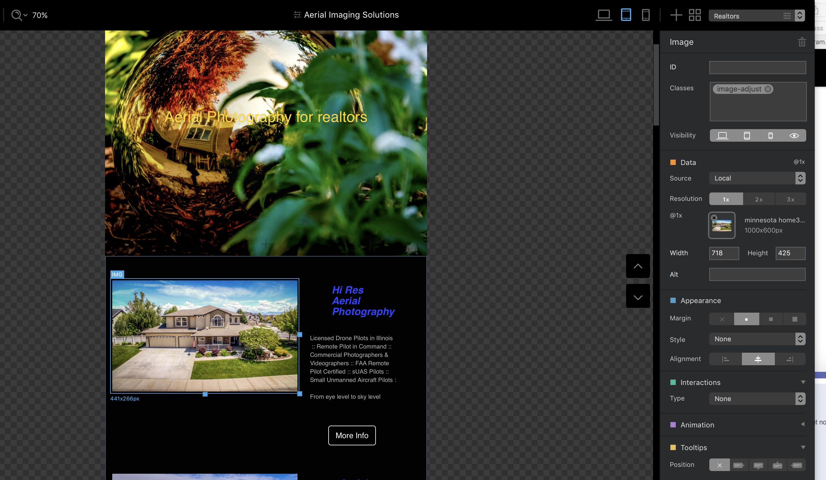
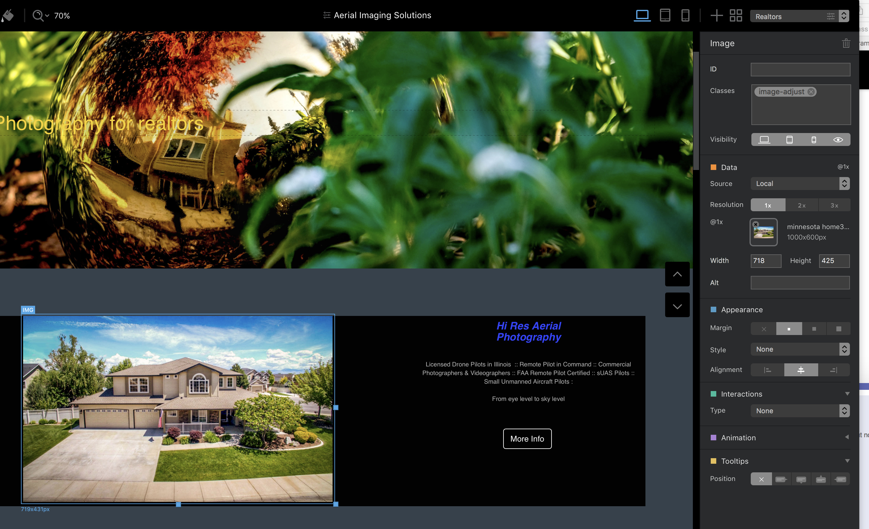
I am working on sizing my images and do not understand why the sizes do not change. I attached three screen shots view points. The class is the same on all.
The image size 1000 x 600 pix and 718 W / 425 H is identical on all three views. I don’t understand why no changes. Yet the images all scale with the view points and look good.
What are the three resolutions? Do these equate to the small/ medium and large images that I am creating?
Thanks in advance.
Rich
When adding images to blocs, it’s not the resolution that’s so important - it’s to do with the dimensions. Basically, when you add an image to an image bric it will, by default, expand or contract to fit the size of the bric (or the width of the column that the bric sits in). When used this way, images will automatically scale to fit the device viewport (responsive) Therefore, when adding images you should always make the dimensions to fit the largest viewport and leave blocs to scale accordingly. If you want to change the display size, i.e. make the image display smaller than the width of the column, you can set a custom class that increases the margins or padding of the images. By using this option you will not lose the responsiveness built into blocs, meaning that the image will still respond to different device variants. However, if you attempt to set the dimensions manually in the sidebar, Blocs will display a warning that you will lose responsiveness.
For most projects all you need to do is make an image to the dimensions required for the desktop version and set the resolution to 144 instead of 72. This should keep the image sharp on hi-res screens. Alternatively, you can make 2x and 3x images to use on different devices. Personally, I don’t think it’s worth the effort. If the images are good to start with, they will display just fine at most screen resolutions.