Hi all,
This is a general question on what do you think is best, and some advice on the BEST! way for a modern website to work.
My question is, I have a website I am working on for my own personal business at the moment and I have 2 drop downs in the menu, there are only 5-7 items in the drop down and then on the page this gives the user more options within.
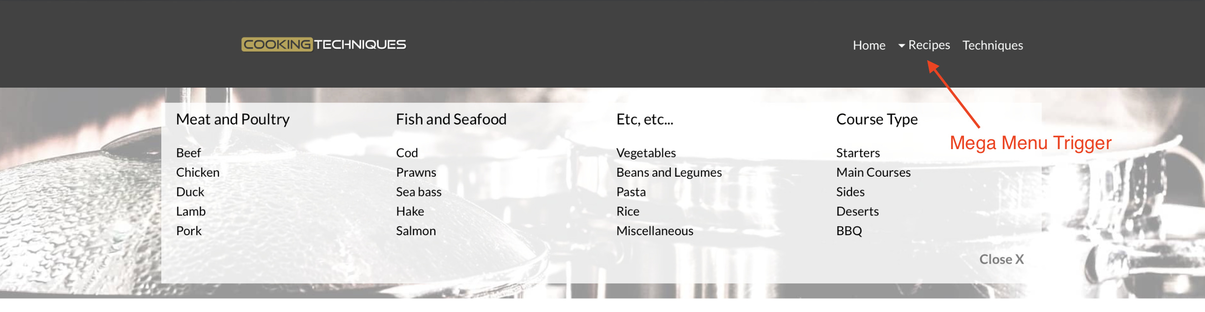
Example of what I have with Trade hire being the header in the menu and then drop down.
Option 1
Trade Hire
PA systems
Lighting
Draping
Video
Special FX
Event Extras
Now above is option 1 (and Trade Hire when clicked on will open the drop down)
Option 2
Trade Hire
(and then when you click, it gives images of each option and then click it to go into it)
I find option 1 does give the user quicker access for the menu when browsing?..but Option 2 seems to me the modern way with no drop downs.
I guess its personal preference!
My guess is that option two may be better. I’ve never really been a great lover of drop-down menus, especially since the advent of mobile browsing. For sites where there is a need to give users quick access to specific parts of a comprehensive site, I prefer to use a mega menu option. This allows you greater freedom of the style and layout of the menu. Furthermore, the mega-menu can be adapted to look good on mobile versions of the site. For example. your main menu could deal with broad sectors of the site, with each option opening a mega-menu containing all the sub options. This can include image links as well as text. You simply style the menu as a block as if it was part of the page then use the visibility options to bring it into view.
I’ve used this type of menu on a cookery site I’m developing and the client is very happy with the way it works - even on mobiles. Furthermore, you don’t have to create these types of menus just at the top of the page - you could intersperse them in various sections of your page and have them open from in-page links rather than the main navbar.
1 Like
Thanks you @hendon52 , that is great advice.
Part of my website will have lots of options and I think a mega-menu will look good for quick browsing.
What I have done at the moment is designed it in both the basic drop down and non, and will let my wife and a few others take a look and see what they prefer.
I have noticed looking around a lot is that its a much 50/50 split, and i guess what works etc.
Talking of the mega-menu you have designed, what wold this look like in mobile ? and are there any websites out there that have a mega menu as would give me a good in-sight to how this will look.
Thanks again, really appreciate your time to help.
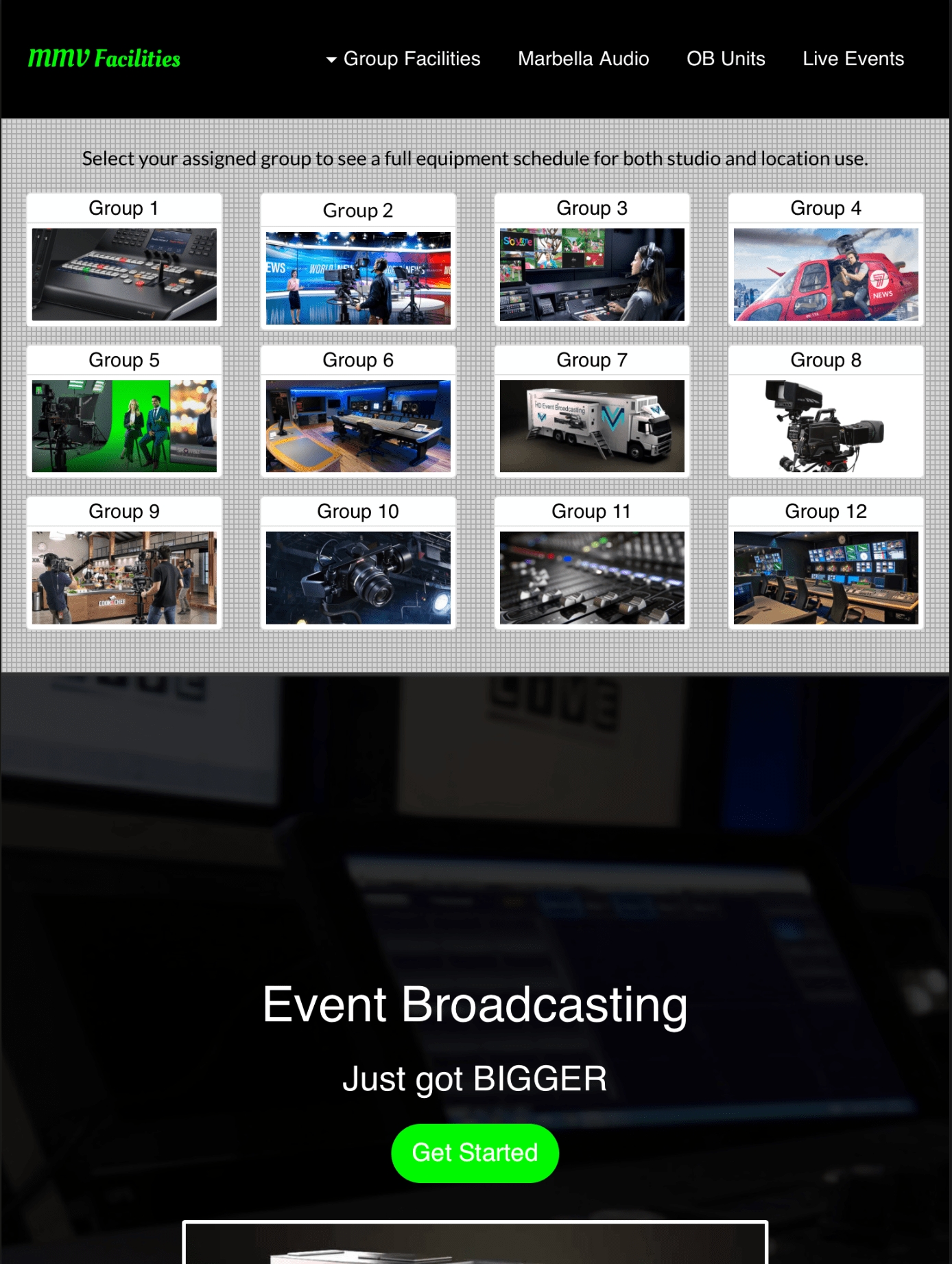
We made a menu system very similar to your current needs for a facilities house in the media business. It’s for in house use by their media partners, but it does illustrate the sort of thing that can be done.
The screenshot below shows the basic page with the normal menu at the top of the page:
Clicking on the Group Facilities link drops the mega-menu into view:
In the live intranet, clicking on the individual links opens a modal listing the equipment schedules and also includes a link to a PDF download.
The mega-menu was adjusted for each device variant and gives the following results:
iPad
Phablet
Phone
Because the top menu AND the mega-menu were placed in the top global area, the menu is available on all pages of the site.
Unfortunately, I can’t upload the whole site, but I have uploaded the sample page portion with the menu so you can take a look on different devices. THIS IS THE LINK
1 Like
brilliant - thanks for sharing, gives me more ideas for my site and sites to come - thanks.