I’m building my navigation from scratch because Blocs built-in navigation is inadequate for my needs. PROBLEM: When my menu dropdown is displayed in LG and then display size is switched to MD or smaller, I want that dropdown to automatically be hidden (actually: close).
I’ve read this:
I can type “d-lg-none” with success in the Classes field of the right sidebar when my dropdown is selected in MD or SM or XS, and when I preview and switch to LG, that dropdown is hidden. (Not closed though, because when I switch from LG back to a smaller screen size, the dropdown is still displayed. Not sure how to close it, but I guess hiding it is adequate.)
The problem is that Blocs doesn’t allow me to type class names with spaces into the Classes field of the right sidebar. I’ve made a menu dropdown especially for LG-only and I want that hidden when switching to MD or smaller. To do that, all I need to do is just type the following into Classes in the right sidebar:
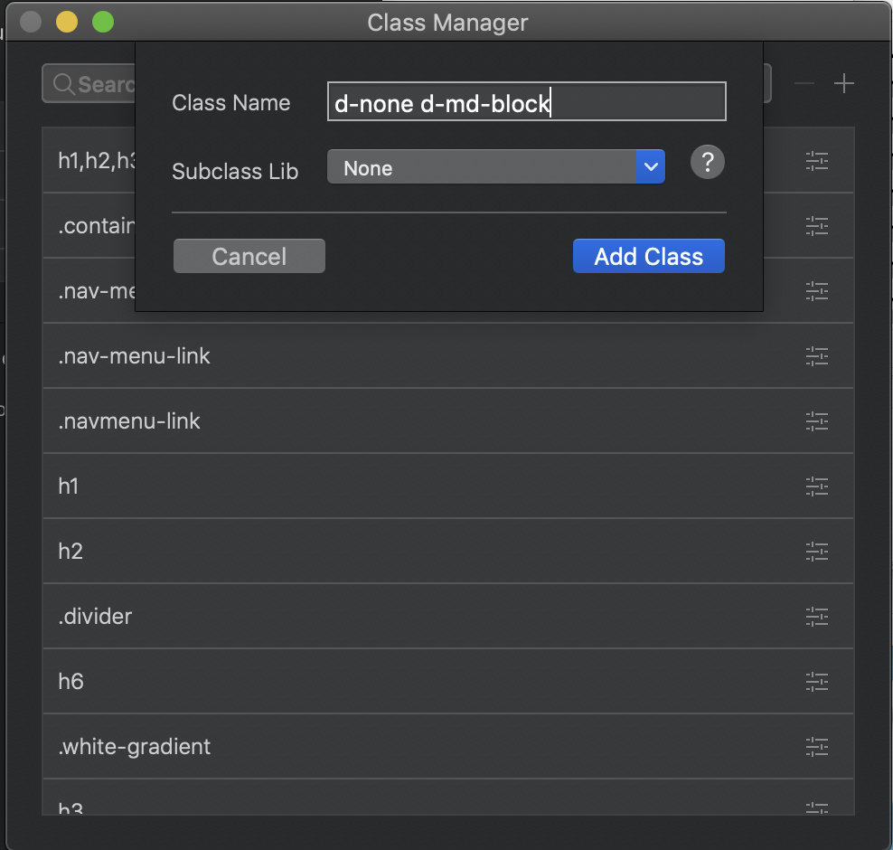
d-none d-md-block
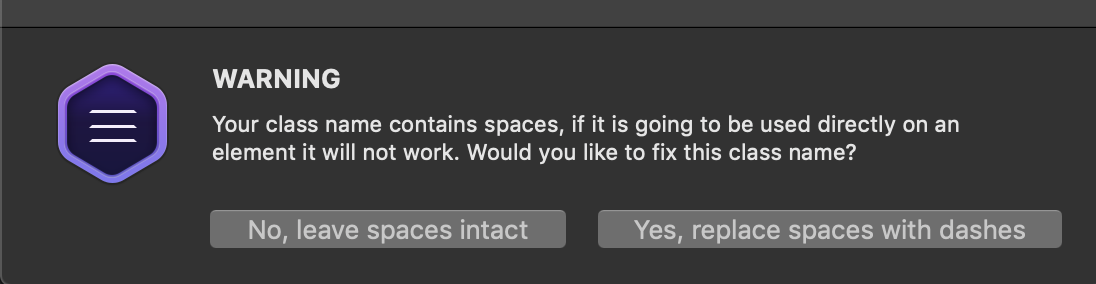
But Blocs won’t allow it. Blocs automatically adds a hyphen where that space is, thereby breaking the code!
So how do I accomplish my aim?
Here’s my Blocs 3.2.2 document so you can easily test it and see what’s going on:
Open the document and Preview in Blocs. You should be in LG. Click “製品” to make the dropdown appear. Now click “MD” and note the dropdown still displays, which is a problem. I want it to be closed automatically when the breakpoint switch occurs. How can I do that?
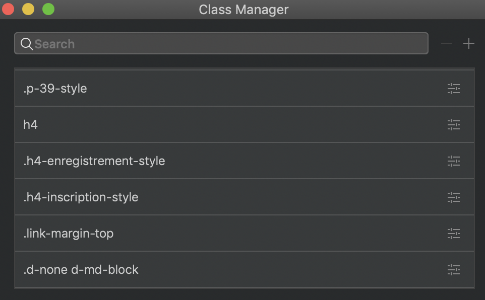
Just a note on the creation of the class. Instead of using the righthand side bar, you can create the class directly from the Class Manager. Thus being able to keep the spaces intact. See below screenshots:
Yes, I tried that even before writing my opening post. It’s easy to add classes with spaces in the class manager just as you describe. But what I don’t know how to do is then associate that newly created class to a particular object in Blocs.
With the right sidebar, it’s easy to perform such association. For example, I click on a particular object in the left sidebar to select it, then I type a class name in the Classes field of the right sidebar. Easy. Done. But again, I can’t do that with classes that have spaces in the name. And creating a class with spaces in the name via Class manager (as you describe) only creates the class but doesn’t associate that class with anything. How do I tie that newly created class (with spaces) to a particular object in Blocs?
The way I have been doing it to tie the created class to the object is by copy pasting it from the class manager to the righthand side class window. Then I define the newly created class attributes in the page/project header.
When copied paste the class will be broken by space.
Not sure if this will help you as I have not followed the actual solution you are trying to apply.
This is more a general reply and how I proceed.
Another option directly responding to the original post would be to add media queries to the Page/Project Header. Are you familiar with these ?
As I said in my opening post, I want to use the following Bootstrap class on an object in Blocs in order to hide it from certain breakpoints:
d-none d-md-block
Bootstrap 4 knows that class name and will act when it sees it. But the classname must be tied to the objects exactly as shown, with the space.
And like I said in my opening post, when I use another Bootstrap class like “ d-lg-none ” it works great, and that’s because there is no space and I can type it in the right sidebar.
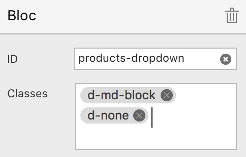
Hey, you’re right! Adding them as two separate classes in the right sidebar works. (I feel stupid that I didn’t think about that before!)
Thank you for your guidance.
One last question though…
Instead of hiding the object across breakpoints, is it possible for me to CLOSE it when switching to another breakpoint? The reason CLOSE is better than HIDE is because when I HIDE it and return to the breakpoint where it’s visible, it’s still open. I’d rather have it auto-close when the display size changes across a breakpoint. Any idea if that’s possible?
My first reply was to assist with classes, but now that I have read again the entire post request I realise that it is not a display property (hidden) you are actually looking for but a close one. So to my understanding those classes are not adequate.
Then to the actual issue I questioned myself: how would someone on the internet go from the LG version to a smaller version or the reverse without changing the device itself ?
Sure but if the person just clicked the dropdown menu in portrait then rotates his/her iPad: would you really want the dropdown menu to be closed ? Meaning the person would have to select again the dropdown once in landscape.
I suppose we could continue to debate the issue, but is it possible to close it or not? If impossible to close the object across breakpoints, then I will just forget about it. But if it is possible, I’d like to implement it, then toy with it to see if I really like it after much testing.
I assume it could with writing some js code, but too time consuming for me right now and not really my area of expertise. Perhaps someone else can dive in for instance @Pealco ?
It’s morning here in Japan, so I now have time to reply to a part of your earlier post I missed last night.
If I could create a single complex dropdown that would collapse nicely across all breakpoints, you’re right about leaving it open NOT being a problem. But right now, (as anyone can see from the Blocs document I uploaded in my opening post), I have a dropdown menu for LG, and then I totally rebuilt it in a separate Bloc for MD and smaller. What that means is this. If you have an iPad that triggers LG in landscape orientation, when you rotate the iPad to portrait orientation, you’ll most likely get MD, which is a totally different dropdown that won’t be already dropped down! So the user would then need to tap to make it drop down in MD, and then they might close it. But if they then rotated their iPad back to LG, there’s that LG dropdown still dropped down! So hopefully this explains why I want to CLOSE rather than hide my dropdown.
Another problem I discovered today is that the supposed “solution” I fond last night is no solution at all. Namely, I did this:
But the problem is that when I preview in Blocs, the result is unexpected. The presence of those two Bootstrap classes allows me to click the navi link in LG to make my dropdown display, but then when I try to close it, it won’t close. This is unexpected seeing I would expect to be able to display or hide the dropdown when in LG, and then when in MD or smaller that LG dropdown should auto-hide. But that’s not the way it works. Odd, but I don’t see a way to fix it.
<div class="d-lg-none">hide on screens wider than lg</div>
I added that “d-lg-none” class to the dropdown Bloc I created for MD and smaller screens, and although it does work to hide my Bloc, it hides it “on screens wider than MD.” So either the documentation is wrong, or something is strange about Blocs. I won’t complain though because at least I can hide that particular Bloc from displaying in LG, which is what I want. I just cannot use two Classes, as mentioned above, to hide my LG-mode dropdown Bloc when I switch to MD and smaller. Odd. Very odd.
Hello @JDW, I found this for you, hope it will help you:
The hidden-* and visible-* classes no longer exist in Bootstrap 4. If you want to hide an element on specific tiers or breakpoints in Bootstrap 4, use the d-*display classes accordingly.
Remember that extra-small/mobile (formerly xs ) is the default (implied) breakpoint, unless overridden by a larger breakpoint. Therefore, the -xs infix no longer exists in Bootstrap 4 .
Also, note that d-*-block can be replaced with d-*-inline , d-*-flex , d-*-table-cell , d-*-table etc… depending on the display type of the element. Read more on the display classes
“Bloc #burger-menu” is my dropdown that displays only in MD and smaller.
“Bloc #products-dropdown” is my dropdown that displays only in LG.
Now select each of those Blocs and look at the Classes I assigned the right sidebar, then preview. Click LG. Click “製品” to make the dropdown appear. Try to close it. You can’t. That’s a problem. Next, click MD and note the dropdown vanishes! That’s good. But click LG again and note the drop down is still there (bad) and you can’t close it!


 If impossible to close the object across breakpoints, then I will just forget about it. But if it is possible, I’d like to implement it, then toy with it to see if I really like it after much testing.