How can I style the hover and active states for nav items? I’ve tried adding .nav li to the class manager and then style that by selecting :active and :hover but when I close the modal and come back into it, the styles are not saved.
Trying to do the same but can’t style. More importantly why isn’t there a styled navigation with hover states its always a trivial thing with blocs. BlocsApp should def learn to borrow the fundamentals from places like wix, squarespace… to provide at least 2-3 starter website templates and enable deconstructions of blocs and saving of blocs.
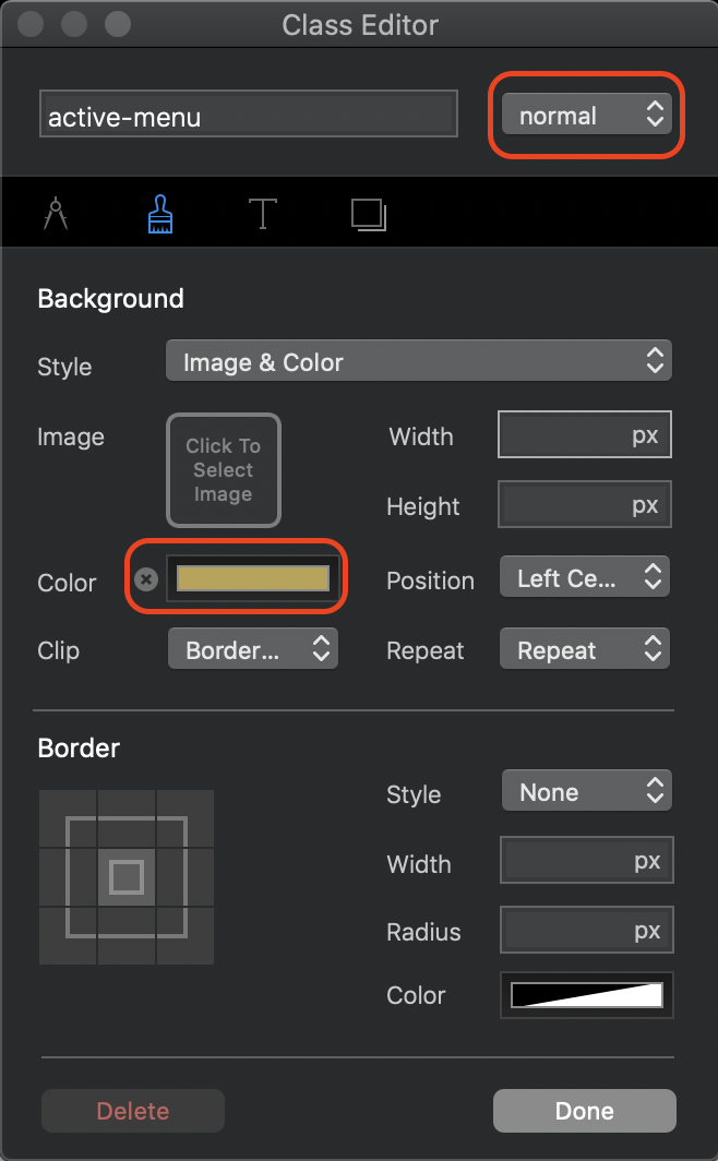
Create an active state class in the class manager (not in the properties panel) Go to window/class manager from the blocs menu bar. Add a class such as active-menu and add the style you want for your active links. Add your styling to the NORMAL state of the class editor - don’t use the hover or active states. In the example below, I set the link to show a solid background colour, but you can add any styling options you want.
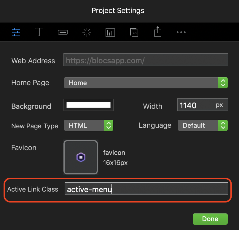
That’s all there is to it. You don’t have to add any additional classes in the properties panel. The class is automatically applied by Blocs on the relevant pages of your site when they are active.
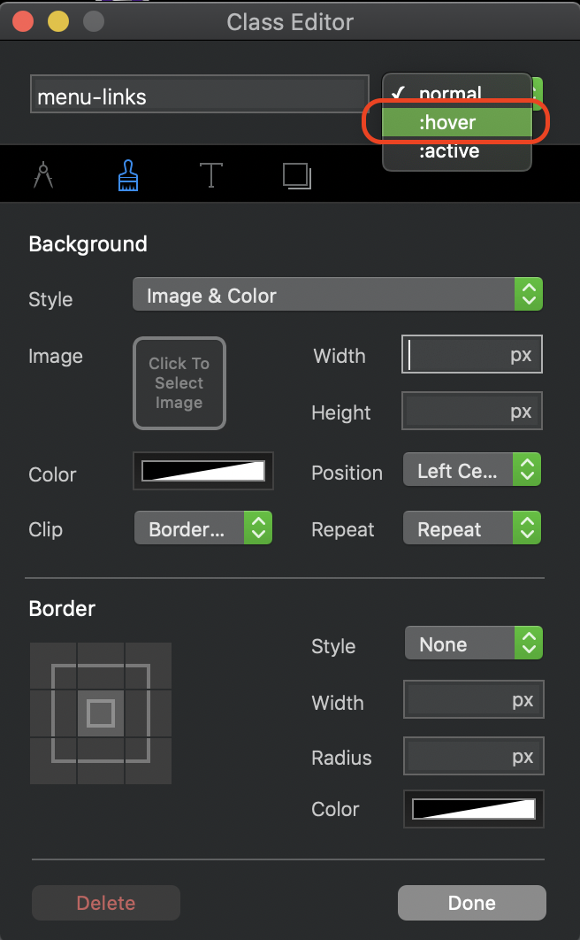
The hover state is easily set by adding a custom class and selecting the hover state option in the class editor window.