Looking for a tip here: I want to build an “on hover” drop down menu where the navi/link used to open the drop down is also clickable. Take a look at this WordPress site: rehmann.de. Now hover your mouse over the word “NOTARE” in the navi. It will open a drop down menu. But you can also click on the word NOTARE and which is linked to a landing page with an overview of all the items listed in the drop down menu.
This would be nice for a landing page showing an overview of some products:
I just answered @Dylan in another thread on this very topic. I think the site you linked in your post illustrates the problem these types of menu have. Essentially, If you get the drop-down to work on a desktop site, you have to have a different type of menu for the mobile device. On the site you linked to, the mobile menu is a static menu with all the options displayed which not only makes for a very long mobile menu, but also needs more work to create. I would have thought it would be cleaner and less work to just add the main link option as the first item in the Drop-Down. This will then work on-click on a desktop/laptop site or on-tap on mobiles.
Bootstrap is a mobile first framework. Although it’s easy to add a drop down on hover, making the drop down menu item clickable is only suitable for non touch based devices. Hence why it’s not native with bootstrap menus.
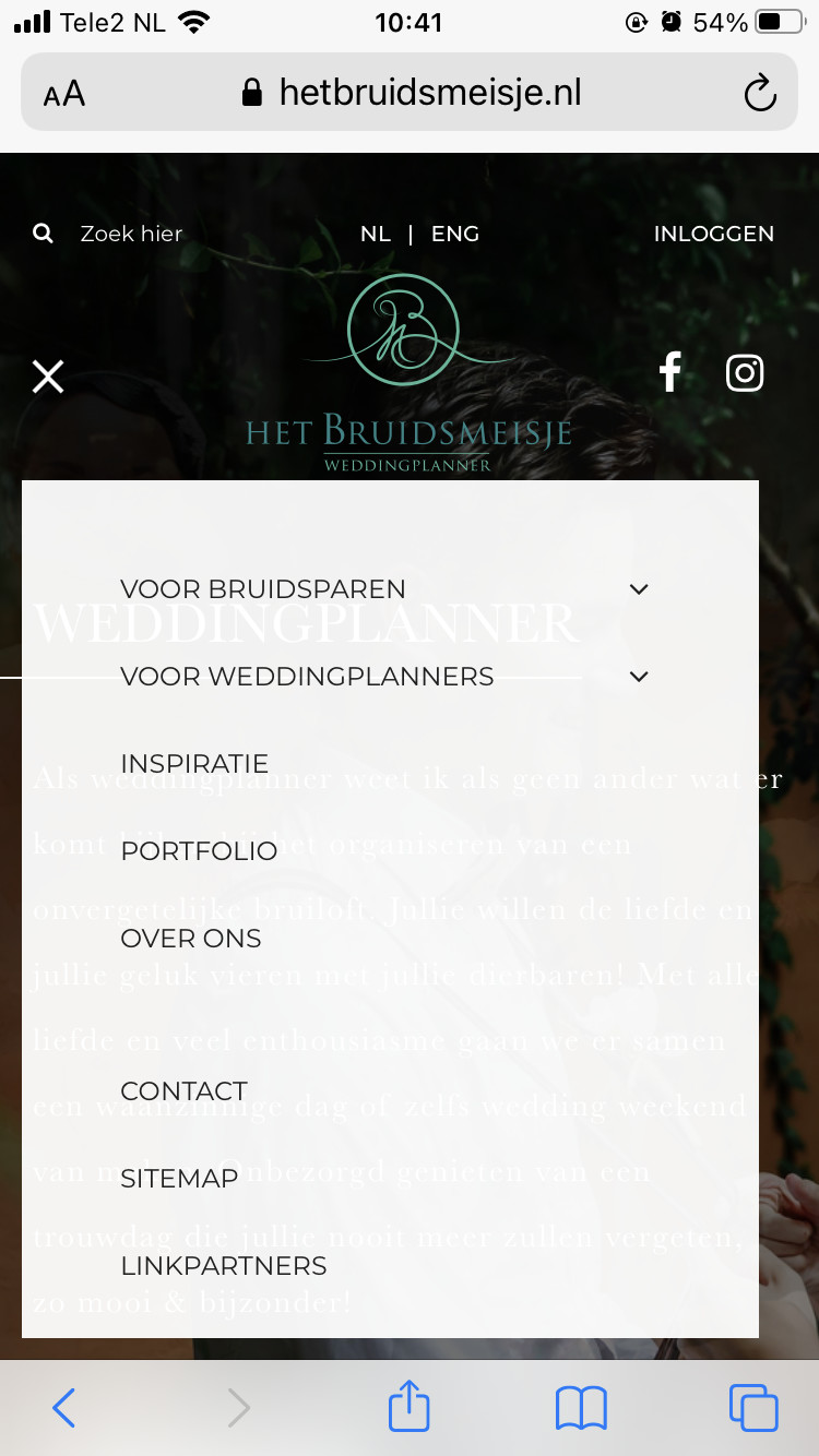
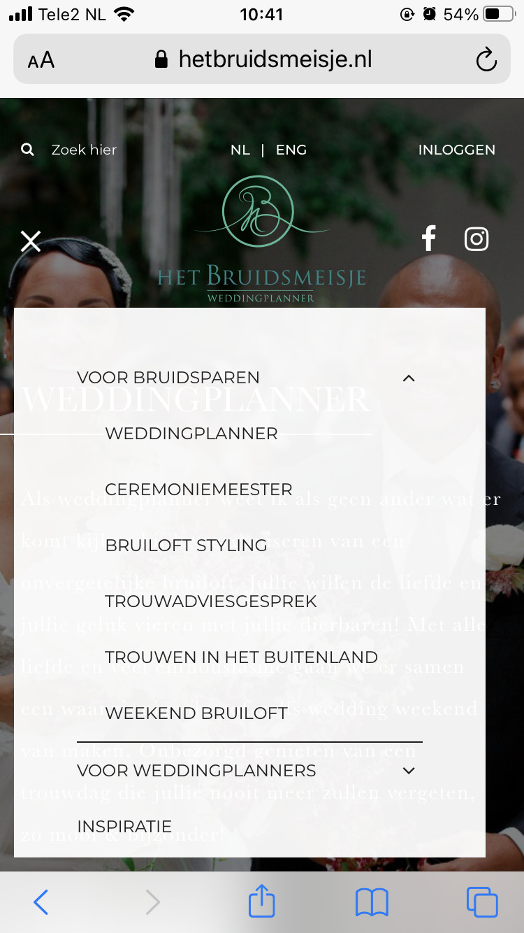
When I look at this website (see pictures) on my mobile device, I can click on and open the ‘voor bruidsparen’ page AND it opens the dropdown when I click on the icon next to it. Would this be possible in blocs?