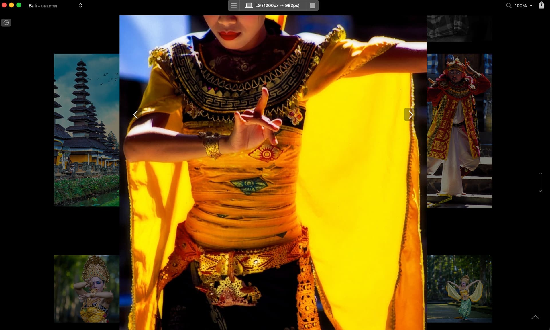
Setting lightbox for horizontal images limits and fits them nicely within the screen, but all images that are vertical are oversized. Is there anyway to limit and fit vertical images to remain within screen size?
Hi Tom, can you provide a screenshot ?
I would imagine setting max-height to 100vh in a class targeting the Lightbox Image. Don’t know which class to address though.
How big are your images? Blocs will have a W & H set in the data panel on the right hand side if you click on the image but your actual image size maybe much bigger, so when you are clicking the full image preview it is using the original sizes? Just above the Width and Height boxes in the data panel, you should see a @1x preview of your original image which will tell you the sizes, e.g 1500x5000px.
Just be aware, styling that class will affect every modal on your site.
I’d define a max height over a width,
Would this method not leave the original image size still loading in the project ? so if the image added to the assets is 1000 x 5000 px at 2mb , and you create a class to make it look correct on screen isn’t the project still going to be loading a 2mb image?
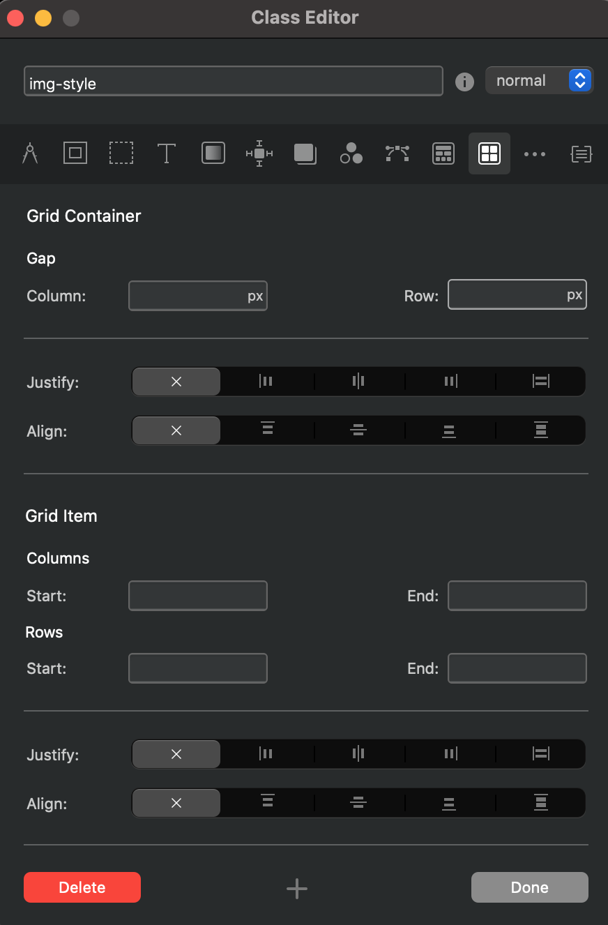
Which menu from the Class Editor should I use to set the height boundaries? See photo below: