Hi 
I would like to add such a header in my Bloc project.
In the specific logo left and right a navigation that splits in 3 columns (on desktop). Tablet and Mobile it will be a default full screen navigation with Hamburger menu.
Is it possible to realize it in blocs? Can you give me some hints?
Many thanks in advance!
You could do that by manually creating a 4-column header.
Basically this:
| LOGO | navigation links column 1 | navigation links column 2 | navigation links column 3 |
I tried that but the navigation comes to close to the logo. Do I need to set the column where the logo is to be 60% of the width or something? I would like my navigation to be at the really right …
example.bloc (1.4 MB)
I’ve added a quick and dirty example of how I would fix this.
Basically:
1st column: width 6
2nd/3rd/4th column: width 2
logo alignment: left
Many thanks for the file.
Is there a way I can prevent this for happening? When resizing the window (still in Desktop mode) the text brakes and generate 2 lines. This happens when the navigation items are too long. I am already at 14px font size, smaller will be too small then.
On Tablet and mobile I will only have an Hamburger menu, so there’s okay.
This is happening already at 1162px width, so still laptop size …
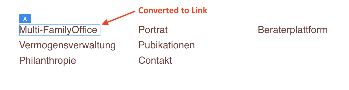
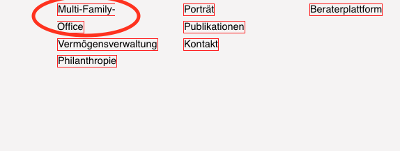
I think this issue can be resolved by choosing a narrow font for the links. Here is an example that uses paragraph text to create the menu items. Each Item is then selected and converted to a link. In the example the font used was PT Sans Narrow at 16 px
1 Like
The beauty of Blocs: one problem, several great solutions.
Nice addition to the thread, @Jerry !
1 Like
That’s also a solution.
It seams to work properly on desktop. When resizing the window, how can I prevent this from happening?
For the navigation lists I set a max width of 22%
Here my settings:
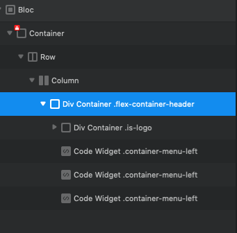

I’d wrap the links in another Div and apply flex. At the moment it looks like your logo and links are all in the same parent flex Div. ?
Eg.
Main Div with Logo and div for links.
3 Likes
I think that did the trick thanks to all of you guys!
1 Like