How can one prevent fullscreen images to have a weird cropped result between different devices?
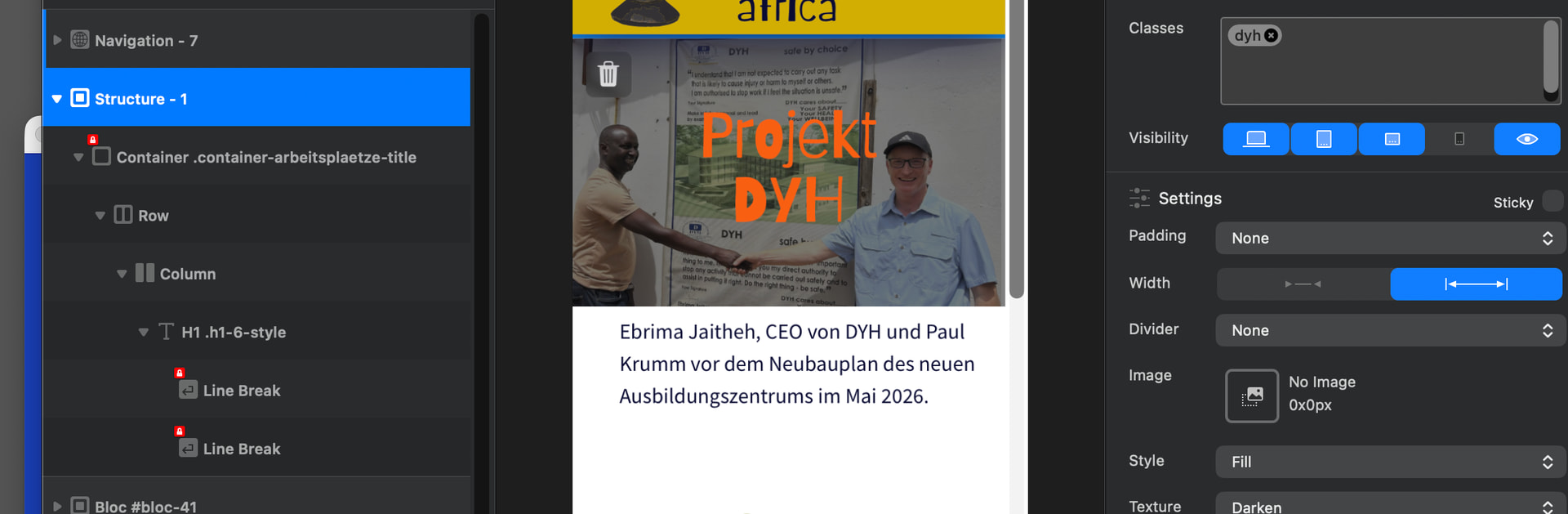
I put the image(s) directly inside the “Structure”

Results, published look like this:
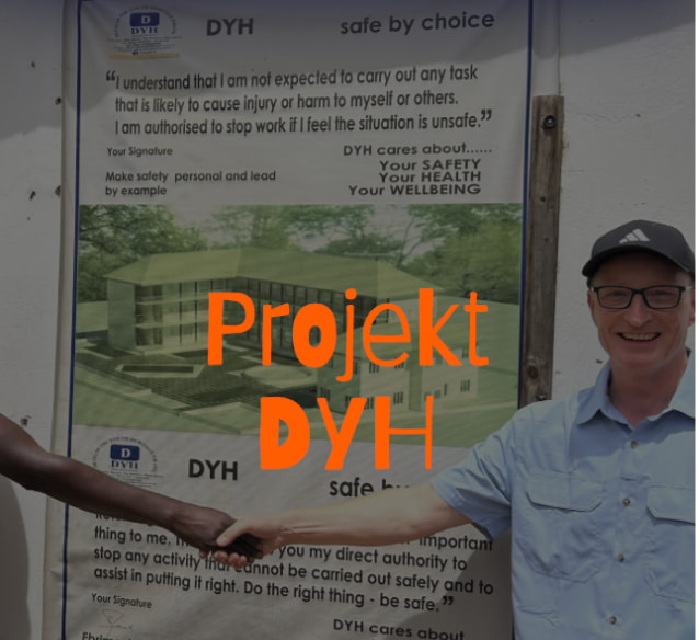
Thanks in advande and Kind Regards
Uwe
How can one prevent fullscreen images to have a weird cropped result between different devices?
I put the image(s) directly inside the “Structure”
Results, published look like this:
Thanks in advande and Kind Regards
Uwe
Have you tried jpg instead of webp?
I would create a /class/ where you can set individual devices, or create a rule in the class for the maximum resolution of the display width and the image will be based on that.
I will try with jpgs in stead of webp but give more chances to the class-input - may I ask what and how to create a class or a rule for classes to prevent strange cropping? I am not into code at all - I kind of “understand” classes like “object fit cover” but find it more wysiwyg if I create a frame as a placeholder and put any image into it. In this particular case the cropping is just bad and unpredictable by default, so a class makes sense to me.
Thanks in advance and Kind Regards,
Uwe
Hi @Uwe,
This is a classic Art Direction / Aspect Ratio issue on mobile devices, made more noticeable because text is baked into the image itself.
You don’t need to write any code to fix this! Just pick ONE of the following options that works best for your layout:
Instead of forcing one landscape image onto a tall phone screen, use two different crops:
Having text saved directly inside image files makes responsive scaling tricky on smaller screens.
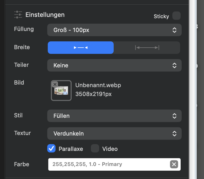
If this is set up as a background image in a Class:
cover (Default): Fills the whole space, but crops the sides on narrow mobile screens (which causes your issue).contain: Shows the entire image without cropping anything, but it will leave empty spacing above/below the image on tall phone screens to fit.Hope this helps clear things up!
Option 1: my first tryout - unfortunately the image itself gets quite worse in some cases as I used this feature quite often.
Option 2: my image is always seperated from text. So text could not be the issue. It is quite weird that fullscreen image doesn’t result in fullscreen but gets cropped.
Option 3: how do I put a class on it? Simply “write” contain and hit enter?
… and contain is not nice as you mentioned for mobile. Why couldn`t I use a fullscreen image and define the corresponding height for each breakpoint? Can I define heights for each breakpoint?
Thanks in advance and Kind Regards
P.S. Are fitting fullscreen images some feature to be put on a wishlist?
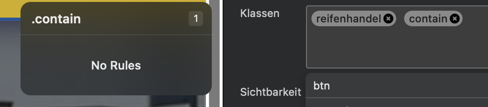
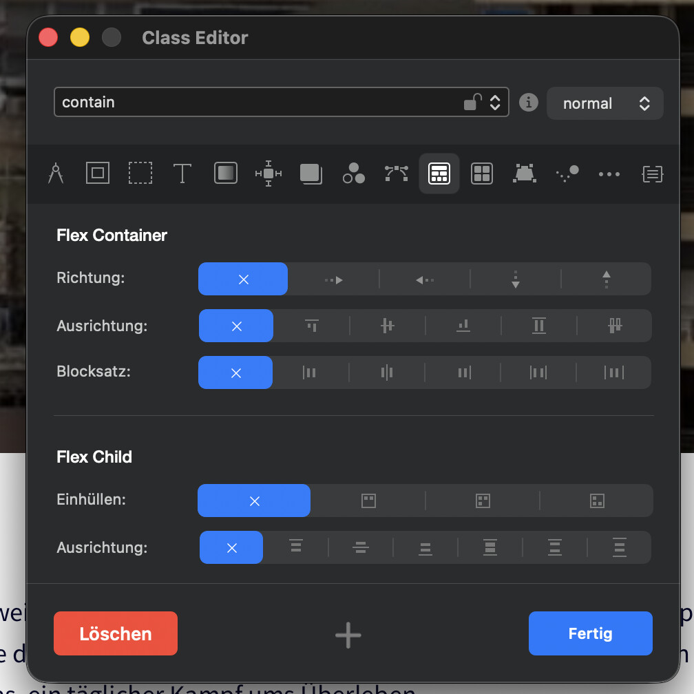
If I now click that “contain” class, one I am able to make some settings, I may have heard from Grid Container/Flex Container (highlighted in screenshot):
Could that also be a good way to handle this issue?
Thanks in advance and Kind Regards,
Uwe
Let’s clarify a few points and get this working for you.
To answer your main question: Yes, absolutely! Adjusting the container’s height per breakpoint is a very common solution for fullscreen background images.
Here is how to do it correctly in Blocs:
hero-banner) and apply it to your Bloc / Container.80vh or 600px on Desktop, but maybe 400px or 50vh on Mobile XS).Note: Since the image uses cover, it will still crop slightly to fit that new height, but by reducing the height on mobile, you drastically reduce how much gets cut off!
The Grid Container / Flex Container options you opened in your second screenshot control how child elements (like buttons or text blocks) align inside a container. They won’t affect how the background image scales, so you can safely ignore those settings for this issue.
Summary: Try setting custom heights in the Class Editor for each Breakpoint as described — that should give you much better control over how your background image looks on mobile!
Thanks a lot - I will work on that and come back here.
Kind Regards
Uwe
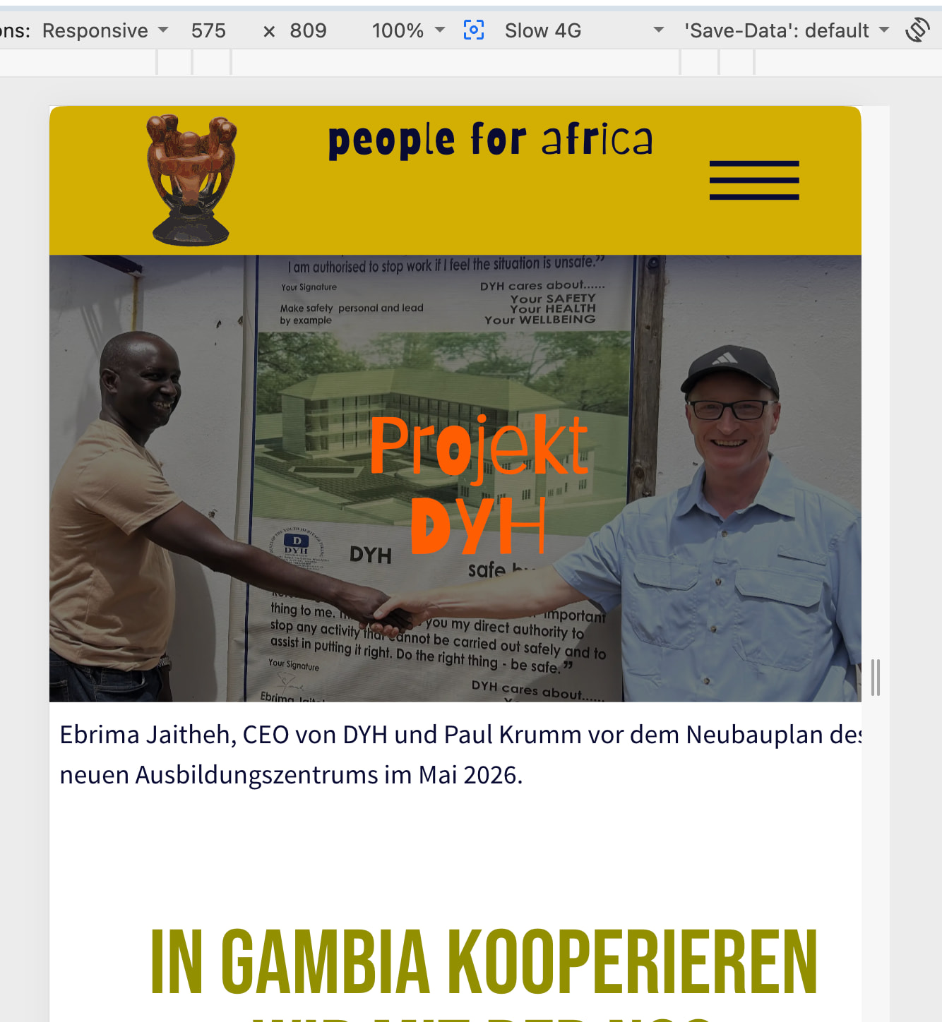
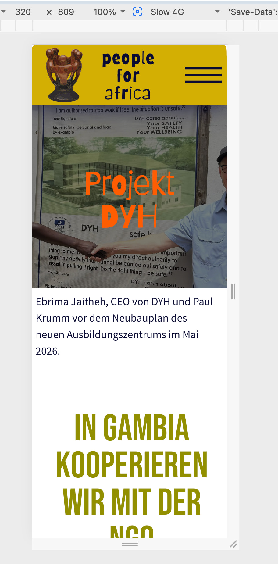
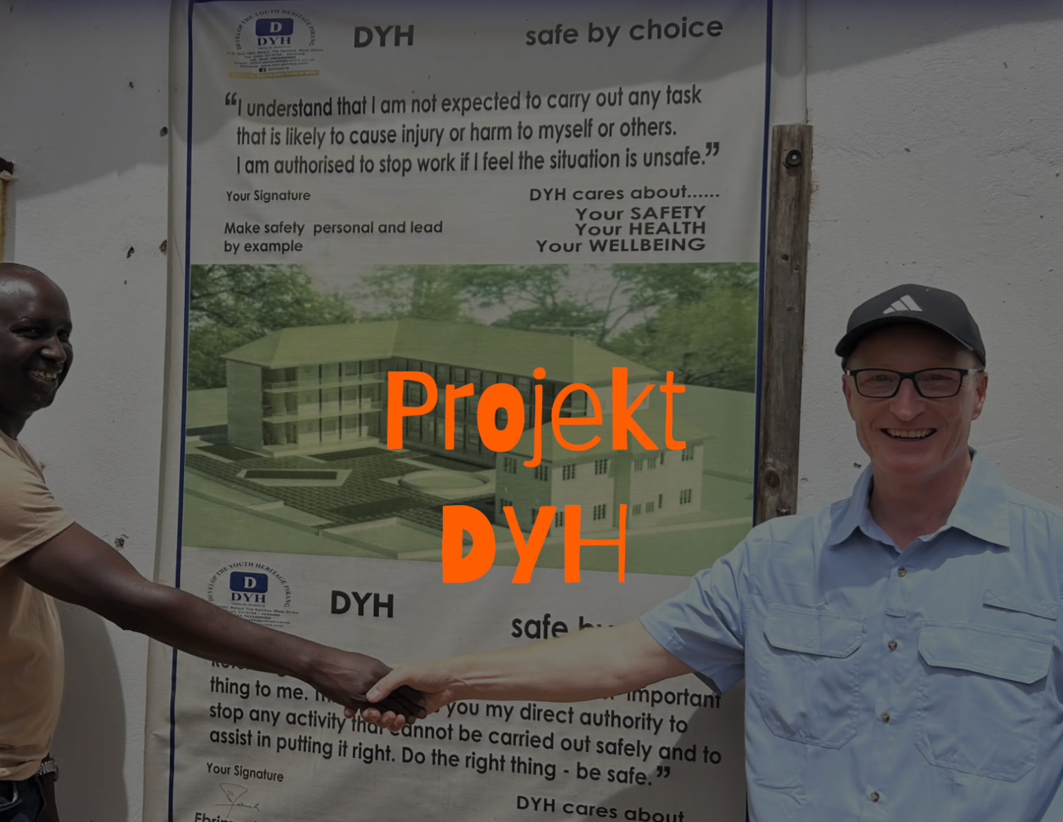
Although it now looks kind of ok in design view in blocs, it still crops for what reason?
Is there something else I’ll have to do to prevent the image from being cropped that weird?
Design view:
Webview:
I also tried some like “center” and what not but logically I don’t get why the image is cropped.
Using a different image for smaller breakpoints/devices will be the next tryout.
Thanks in advance and Kind Regards,
Uwe
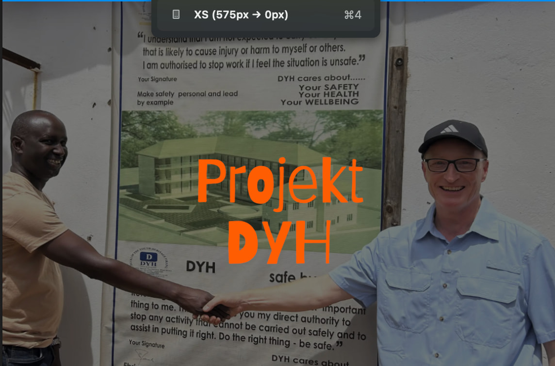
They’re different screen proportions in your design vs web view (575 x 809 vs 320 x 809), so the narrowness of this smallest screen size has to be taken into account. If this is the full height of the image you’re using, you need to lessen the height in design view to proportionally have more width at preview.
There’s no real easy way to explain that!
That screenshots are kind of displaying my issue - I cannot find a way to get my mobile device show what is intended - from much earlier coming from Adobe Muse and knowing Sitely, images on mobiles change often from fixed width ()desktop devices) to fluid width, means fullscreen images always show 100% full width on mobile, no matter the device. For some reason there’s no easy way to let me have full screen images on (all) mobiles without cropping. It looks fine on 575 px but not on 320 px. I am aware of trying and using the same image in a different crop (done by Affinity or Capture One …) and also I will find a workaround to play around with visibility as “Ghost” already recommended but I can not believe that I am the only one, wanting to use a full screen image on mobile with no weird cropping. What am I doing wrong?
Where do I have to look to learn on how to get it? Or is this something for a wishlist?
Thanks in advance and Kind Regards,
Uwe
I played around with the class editor, it does not help here.
Also really it is not helpful to have the structure “hidden” in the right panel, it is still visible on canvas but is hidden, once it is published.
Does a project help here? To have a look at it? I can easily reduce it to just one page, if anyone chimes in here.
Thanks in advance and Kind Regards
Uwe
Hi @Uwe,
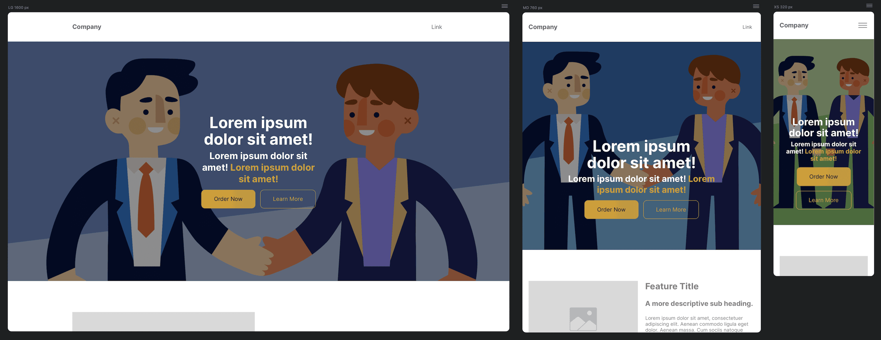
To keep it simple, here is a visual example of how Art Direction combined with cover delivers the cleanest result across all devices:
Instead of using a single photo, 3 optimized image sizes and crops are used:
hero-lg-2560x1440.png (16:9 Landscape)hero-md-1536x1152.png (4:3 Ratio)hero-sm-1080x1500.png (Portrait Crop)cover works so well here:Yes, by design cover will always crop parts of the image to ensure the block is 100% filled with no empty background gaps.
However, because a dedicated portrait-oriented photo is supplied for Mobile XS, that side-cropping becomes completely negligible. The main subjects, text, and buttons stay centered and fully visible, while the container fills the screen nicely without any weird gaps!