I could not find anything on this matter in the online manual.
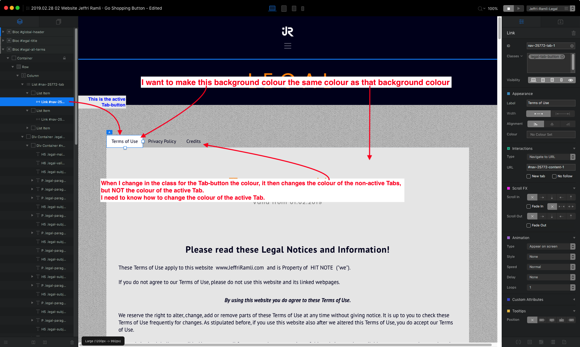
I have a Tabbed Content bric. I want to change the colour of the active Tab. I assigned a class to the active Tab-button.
However, what happens is, that I only can change the colour of all the other non-active Tabs (Tab-buttons) but not the colour of the active Tab-button.
How do I proceed to change the colour of the active Tab-button?
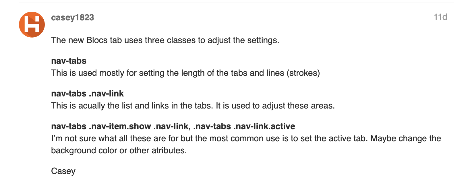
Add this class: Make sure you leave the spaces when asked. Then just open this class an set the background color. This will change the active tab color.
Are we talking here about a sub-class?
I could not find a sub-class named nav-tabs in Blocs. So I just added/created your mentioned class line in the Class Manager.
In your given class there is a comma. Is this intentional?
Is the class you gave me the whole long one (1) single class or are these 2 separate classes divided by the comma?
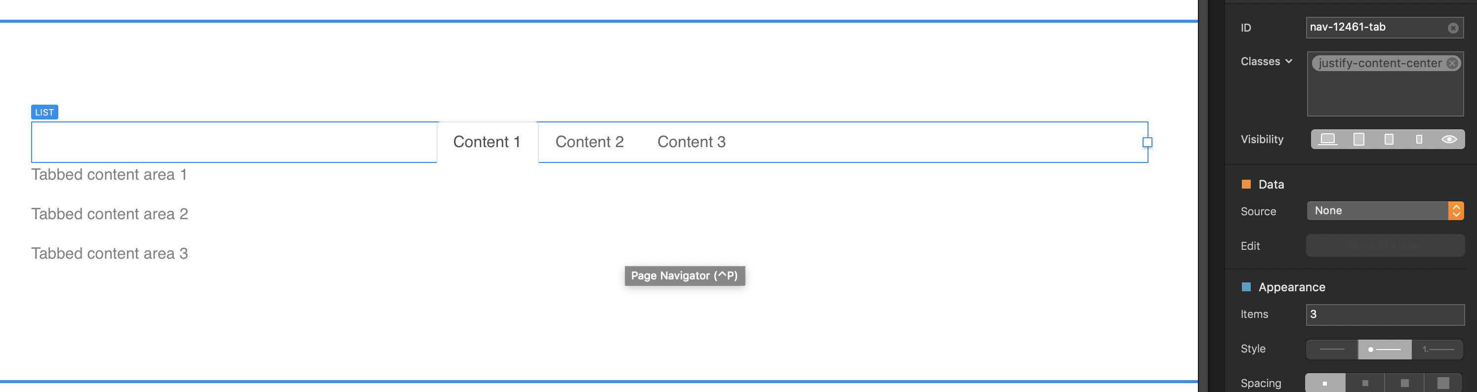
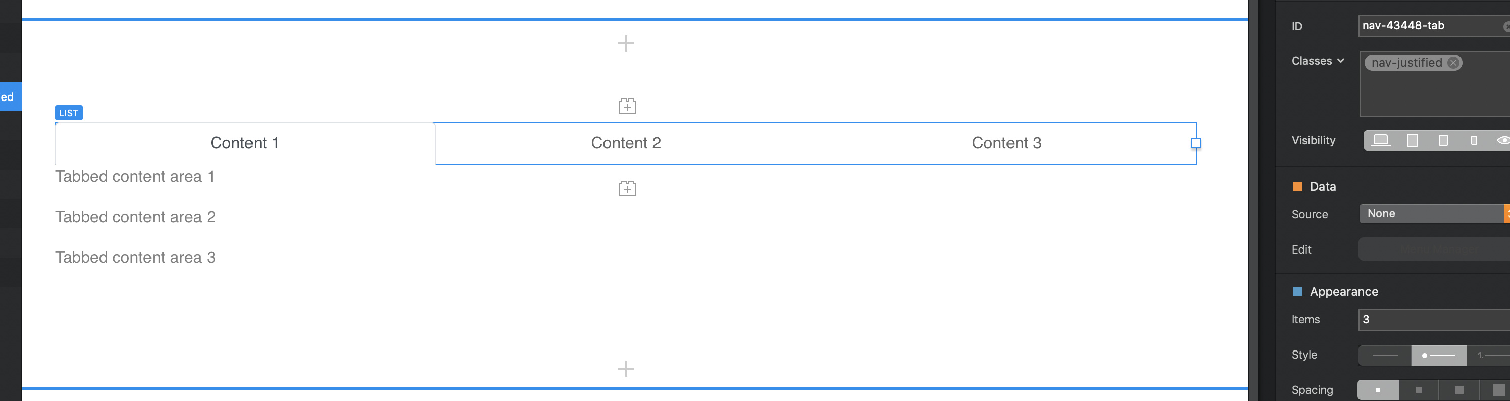
Do I have to enter these classes directly for the Tab-button (like in my screenshot at: Link #nav-25772-tab-1) or somewhere else in the tree? I guess if it is a sub-class it would function for all the Tabs on my Blocs Project.
Thanks very much. It is just the quirky behaviour of bloc that did not let me do it properly.
Hurray!
I could make it work. Nevertheless, for my better understanding, I would be grateful if you could explain to me what I did.
Did I create or manipulated a sub-class? And why are there so many classes in one line? I assume each of them is a class (nav-tabs and .nav-item.show and .nav-link, etc.)
There are 3 classes Tabs use. nav.tabs and nav-tabs .nav-link are the other two. These are applied to the tabs by just adding them in the class manager.
This is somewhat true, there are some premade subclasses in the class manager. It would be nice if there was more but I’m not sure when it’s too much. It would help users learn more about what classes control different aspects of features. But the info is easily found looking for bootstrap 4 classes.
Hi Casey1823 – These 3 Bootstrap classes are working for me…except one small, but important detail.
I can’t seem to get the ACTIVE state text color for the Tab trigger to stay put after I release the mouse.
My understanding is the ACTIVE state would be the Tab & its linked content container to be in focus, but the tab link text color returns to the ‘normal’ state, so it looks like the rest of the tabs links.
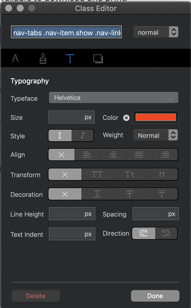
First, I’ve tried setting the 3 Tab trigger states in the nav-tabs .nav-link class, but the ‘active’ state (color) is only ‘active’ ‘on-click’ and when the mouse is released the text switches back to ‘normal’ color.
And then I tried setting the 3 states (after deleting them in nav-tabs. nav-link) using the nav-tabs .nav-item.show .nav-link, .nav-tabs .nav-link.active, but it didn’t set the ‘normal’ nor ‘hover’ states. It appears to me that this longer class doesn’t really do anything…
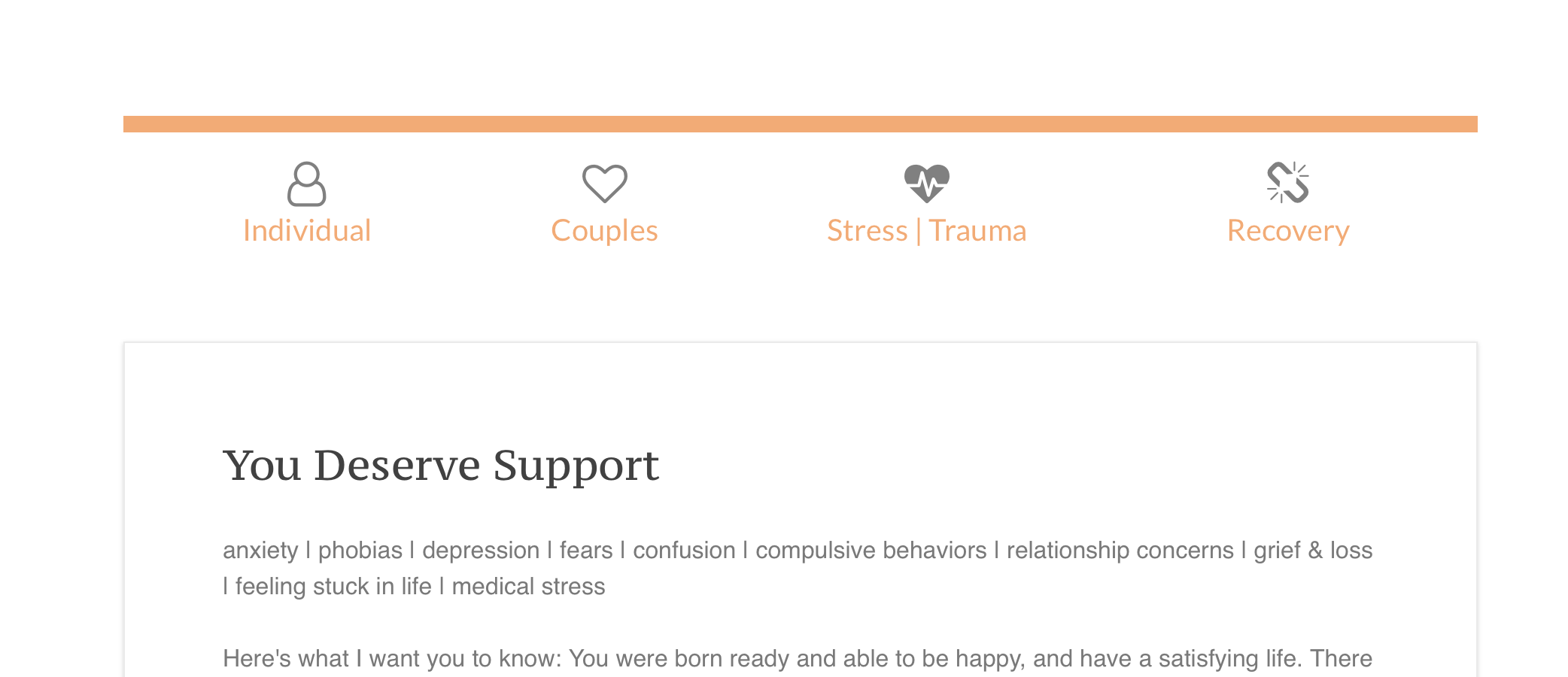
Here a pic of what I’m working with…the first Tab is in focus, but the Tab trigger text is in the ‘normal’ state (orange) instead of dark grey…
Ah, I see now. This class overrides the ‘normal’ state settings set in nav-tab .nav-link class, with a newly selected color set for the ‘normal’ state of this class.
Yeah, it’s funny sometimes how this stuff works. By the name, you would assume you would have to change the active state. Same thing with the new navigation active tab. It’s just in the normal state.
true…when i think a bit more on it, it seems there is some kind of syntactic logic.
Part of the confusion is the name active itself, which in coding language is not a persistent state, but an on-click or press state, and then it vanishes.
Not really sure what the value of that kind of state is, as typically a click is a millisecond action, and not something to pause and take in.
Hi y’all.
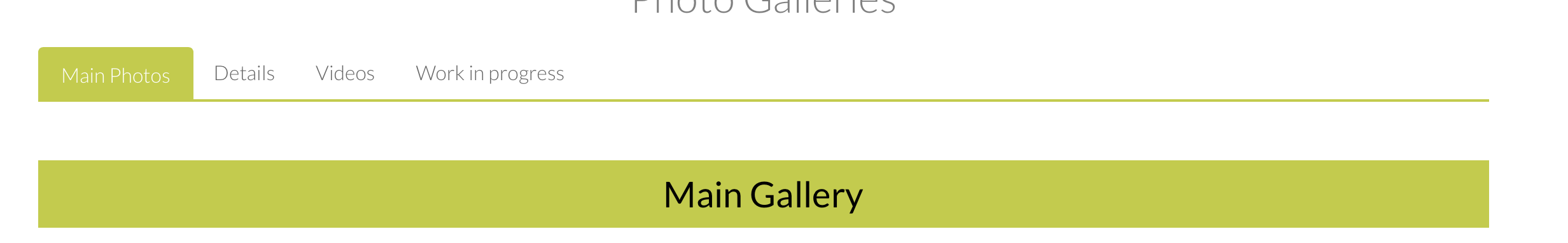
Is it possible to centre the tabs in a page and keep the border below full width?
I can use “.nav_tabs” class to alter the colour of the border and the overall width, but if I keep it to full page width, it defaults to the left.
I found this thread very informative. However, getting tabs to look right in the XS breakpoint is a pain in the booty. Right now, the tabs get stacked atop each other, yet the content sits below the lowest tab, which looks stupid. In other words, the topmost tab is detached from its content, which just doesn’t look right.
The example website below is a great solution. Open it in your browser, then reduce the browser window width to simulate the XS breakpoint. Note how the content ALWAYS sits directly below its associated tab, which is the right way to do tabs in XS.
How do I accomplish this with Blocs’ Tabbed Content? Surely there must be a way. If impossible, then how are the rest of you dealing with those stacked tabs in XS?
