How to change the colour of an active Tab-button? - SOLVED

Use this class for active tab.
nav-tabs .nav-item.show .nav-link, .nav-tabs .nav-link.active

casey

Set the text like the color in the class as below. In my example, the text on the active tab will be red.

Ah, I see now. This class overrides the ‘normal’ state settings set in nav-tab .nav-link class, with a newly selected color set for the ‘normal’ state of this class.

How counter intuitive…so thanks for guiding me.

IT WORKED! :heart_eyes:

Yeah, it’s funny sometimes how this stuff works. By the name, you would assume you would have to change the active state. Same thing with the new navigation active tab. It’s just in the normal state.

Glad to help.
Casey

true…when i think a bit more on it, it seems there is some kind of syntactic logic.

Part of the confusion is the name active itself, which in coding language is not a persistent state, but an on-click or press state, and then it vanishes.

Not really sure what the value of that kind of state is, as typically a click is a millisecond action, and not something to pause and take in.

thanks again, as always.

Hi y’all.
Is it possible to centre the tabs in a page and keep the border below full width?
I can use “.nav_tabs” class to alter the colour of the border and the overall width, but if I keep it to full page width, it defaults to the left.

Hey @apswoodwork

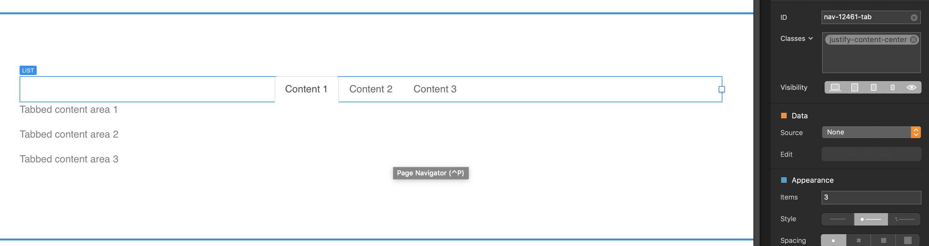
Yes, you can use a class called justify-content-center

Select the tab row and add the class. Eg.

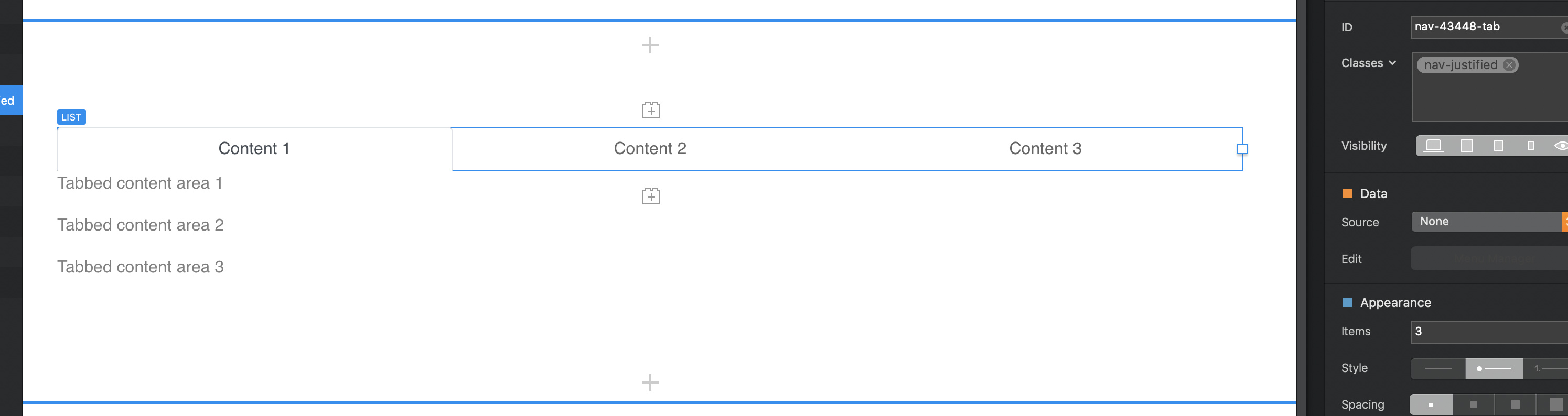
Or if you want the tabs to be equally spread out along 100% of the top use. nav-justified

1 Like

That works perfect along with the code to link to a specific tab.
:v:
Contact tab

Cool. Hey your terms headers have a hover on them you realise?

No I didn’t realise ta

1 Like

I found this thread very informative. However, getting tabs to look right in the XS breakpoint is a pain in the booty. Right now, the tabs get stacked atop each other, yet the content sits below the lowest tab, which looks stupid. In other words, the topmost tab is detached from its content, which just doesn’t look right.

The example website below is a great solution. Open it in your browser, then reduce the browser window width to simulate the XS breakpoint. Note how the content ALWAYS sits directly below its associated tab, which is the right way to do tabs in XS.

https://www.cssscript.com/demo/responsive-css-accordion-tabs-component/

How do I accomplish this with Blocs’ Tabbed Content? Surely there must be a way. If impossible, then how are the rest of you dealing with those stacked tabs in XS?

@JDW the answer is on the same website

Responsive CSS Only Accordion & Tabs Component | CSS Script

@PeteSharp

Maybe this is a question you can answer. I added the following code to change the tab’s background color on Hover, but the problem is it also changes the Active tab too, which I dislike. How do I alter the code below so it only changes the background color of the inactive tabs?

<style>
.nav a:hover {
  background: #d4d4d4 !important;
}
</style>

@JDW

You can add an attribute selector to the CSS. What that means is the style will only apply if the attribute matches.

When you look at the HTML you will see there is an attribute that is used to determine if a tab is active or not.

Targeting aria-selected="false" your code will be modified to look like this…

<style>
.nav a:hover[aria-selected="false"] {
  background: #d4d4d4 !important;
}
</style>

They are really useful actually.

1 Like

Haha, I don’t understand anything of this, anyone made a video to explain this slow and easy? as Blocs is make beautiful websites without code…

Which is true… but Blocs is very expandable, you can be a new user or an advance web developer (or in between) and Blocs is an excellent tool. Perfect… no, excellent… yes.

No app can cater for every possibility, but a great app will provide the tools to do more.

I agree, I would just like to understand things easier, like if somebody here made short end easy instructions, like a video? Video is so easy these days… Maybe Eldar already did it in this specific topic, I don’t know, but I can not find it.

Hello @JDW, try to add this code to page definitions code:

<style>
@media (max-width: 45em) {

.nav-item {
  width: 100%;
  margin-right: 0;
  margin-top: 0.2rem;
}
}
</style>

And check if this solve your problem…

What are “page definitions”?
I added your code in Page Settings > Add Code > Header, but it doesn’t do anything useful. In fact, I don’t see any change at all to the 3 tabs in XS except that your code shifts them to the left slightly.

What I want in the XS breakpoint is a way to make the tab to be connected to the top of its content. Right now, the tabs are vertically stacked in XS, which means the top 2 tabs are disconnected from the content below and look odd. I want to know if there is a way to make the tab associated with the content below to be physically connected to that content below, similar to how the following web page does it in XS (shrink your browser window width all the way to see “XS”):

https://www.cssscript.com/demo/responsive-css-accordion-tabs-component/

ok, I’m almost finishing a code that you will like, please wait 10 min…

EDIT: 44 min… sorry

1 Like

We pass all information about this new request to a new topic:

1 Like