Hey everyone, I have a form of aspergers, so I have a tendency to get to detailed.
To kind it short, I would like to be able to adjust any Card, Slider or Carousel image or video to any size in it height and width.
Hey everyone, I have a form of aspergers, so I have a tendency to get to detailed.
To kind it short, I would like to be able to adjust any Card, Slider or Carousel image or video to any size in it height and width.
This is all doable with classes. I think what you are saying is that you favor some sort of UI in the side bar for sizing of these elements.
It’s difficult to explain why, but that’s not really as practical as you are thinking. Classes are most appropriate for this. Most of the time you should actually be leaving these elements as responsive and adding classes to their contents to be honest.
The best place for this stuff when it is applicable is actually in a custom bric, like Card Designer.
A word of advice to get more replies is to post about an actual design problem or roadblock you are having on a site you are creating. That’s the only real way to select how things progress or get added to software anyway.
Hope this makes sense!
Thank you so much for your insight and sharing your knowledge with me.
I made this website for a friend. Kitchens Remodels | A2M Contractors
You can see from this carousel what I was trying to achieve. I tried to do this exact thing in car designer, but was unable to do that.
By the way when it comes to CSS object-, if I’m correct you cannot control that with a custom class.
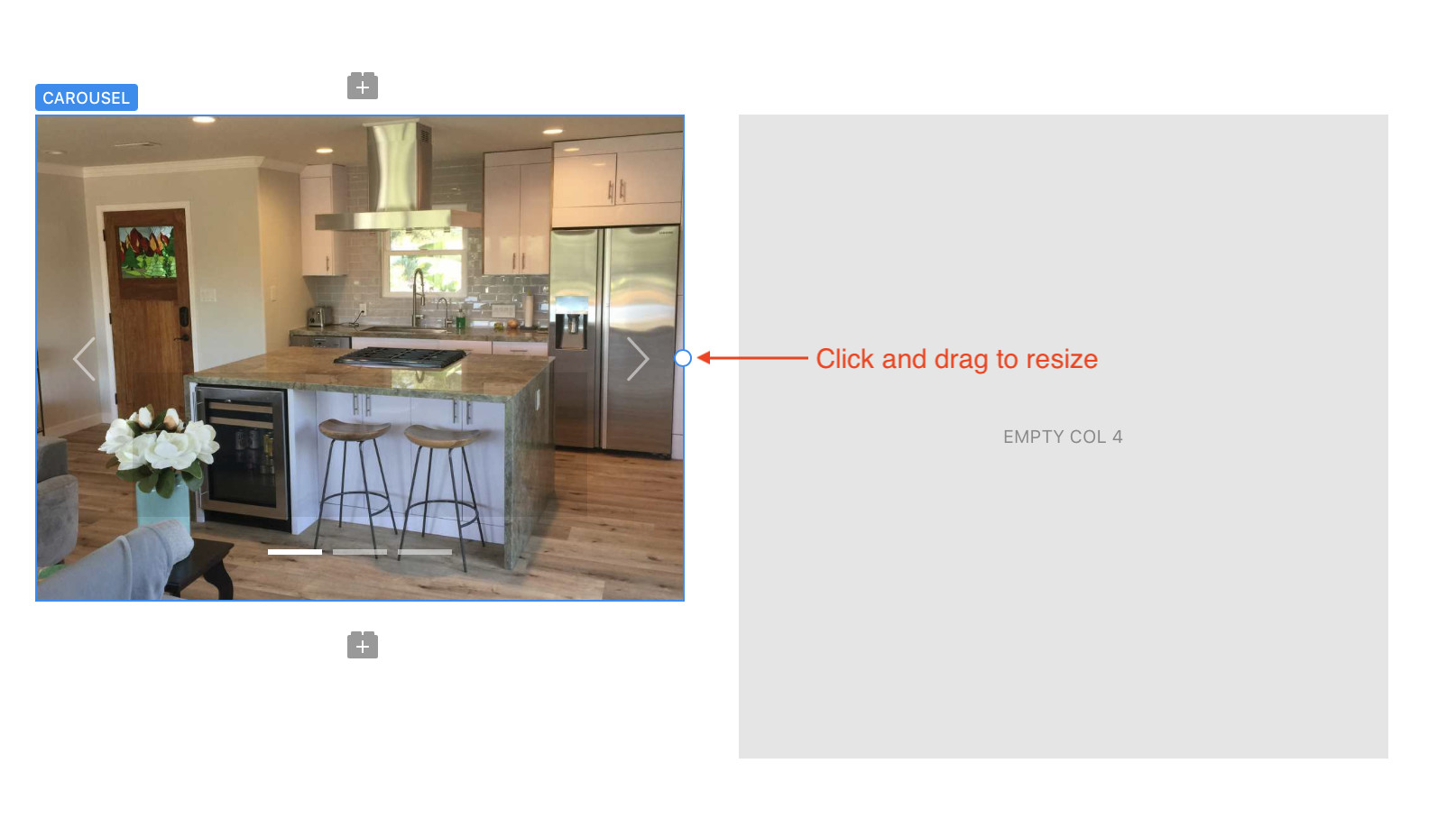
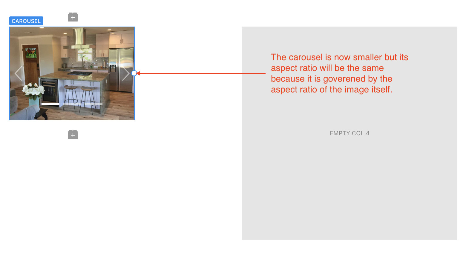
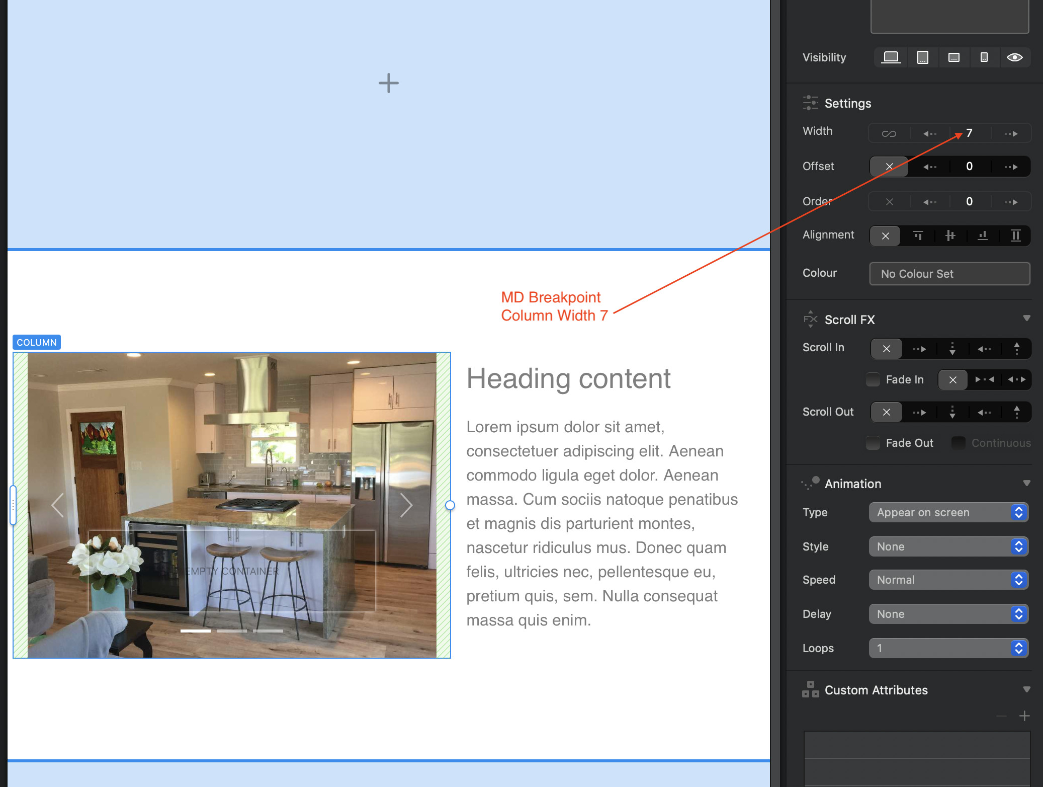
I think you may be overlooking the fact that the size and orientation of Cards, Sliders and Carousels are governed by their content. In the case of a carousel, the carousel itself will always expand or shrink to fit the WIDTH of the column containing it. Of course, it is possible to use the resize handles to adjust the width so that it is smaller than the underlying column. However, when you change the width, the height of the carousel will change proportionately to prevent distortion of your images - this is particularly important if you’re designing across different breakpoints. You can see what I mean below:
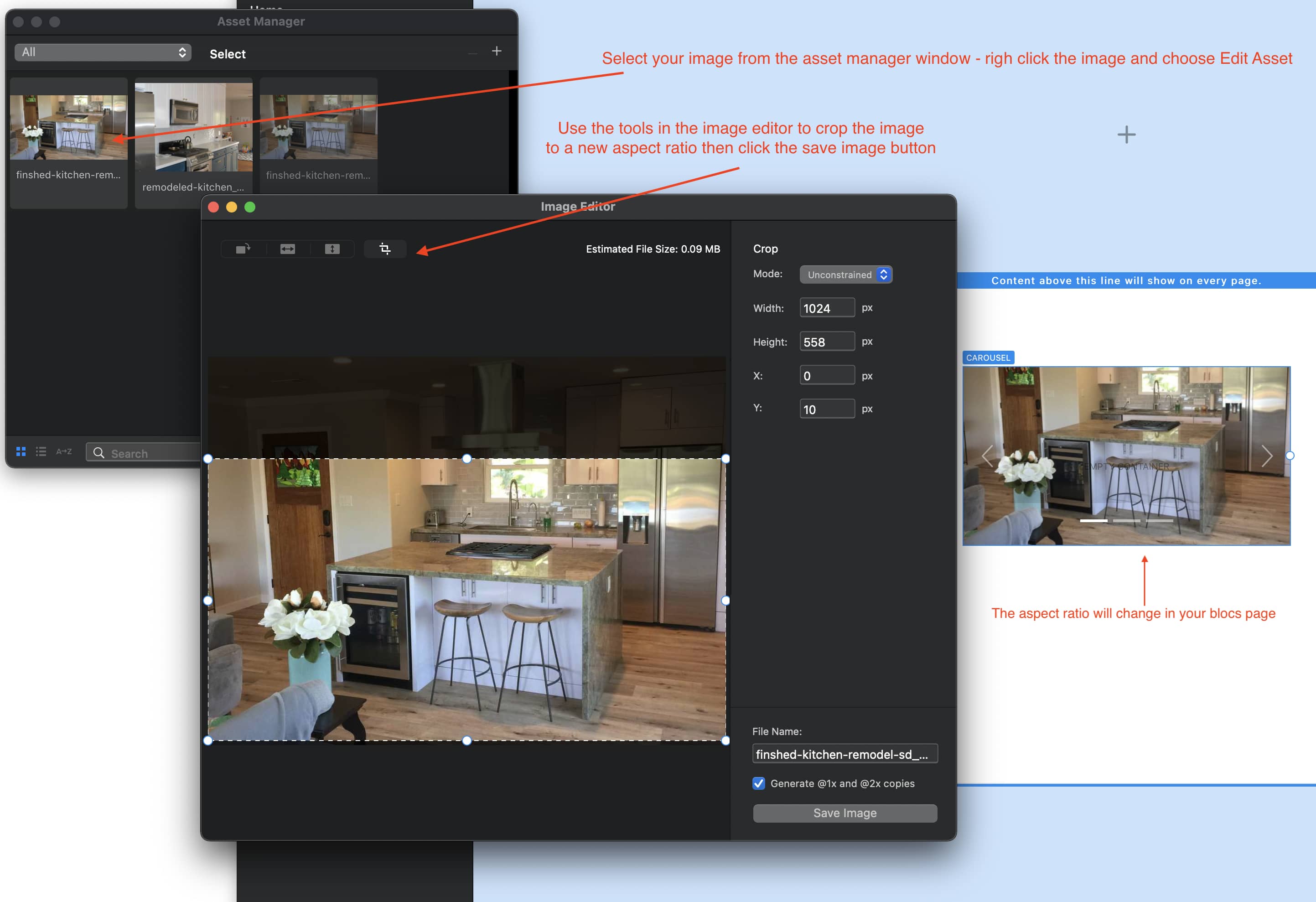
So, to ensure your carousel is consistently sized, make sure that your images in the carousel are consistently sized. To help you, you can use Blocs built in image editor. With this handy tool you can crop images so that they all have the correct aspect ratio. When you make changes, they will be reflected in your project.
That was really cool of you @hendon52 to take the time to make those instructions. Really the reason why I used the word “object” (CSS Style) is because the images are not the complete image in the carousel the way I need them to completely respond to the four efferent break points.
Not sure I’ve completely got it! If you mean you want your images/carousel to have a different aspect ratio at each breakpoint (maybe landscape on XL and square on mobiles) then you will probably have to make a carousel for each breakpoint. You would then use the visibility options to display the correct carousel on each breakpoint. This would require you to still crop your images to suit each aspect ratio/breakpoint.
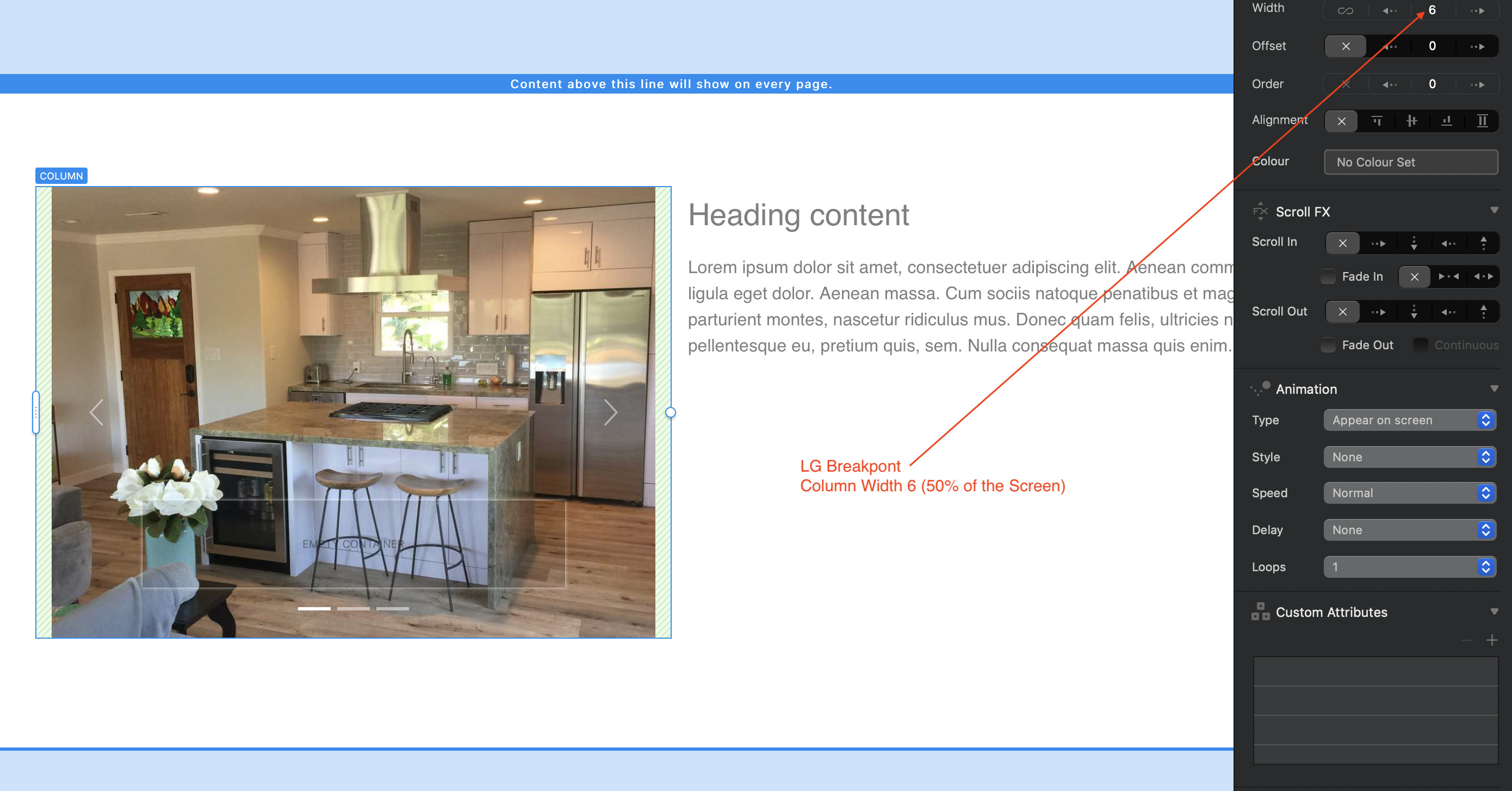
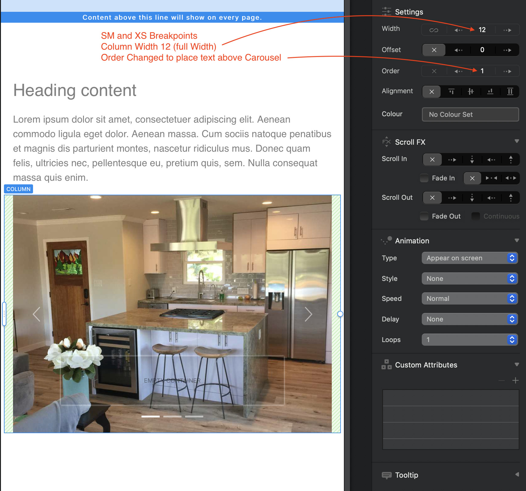
If I’ve misunderstood, and you simply want your carousel to position differently on each break point, but still have them show the same images at the same aspect ratio, you can do that by adjusting the column widths and column order at each breakpoint - maybe having a two column bloc at the XL size and possibly a one column block at the mobile breakpoint. Here are some examples:
@hendon52 It has something to do with
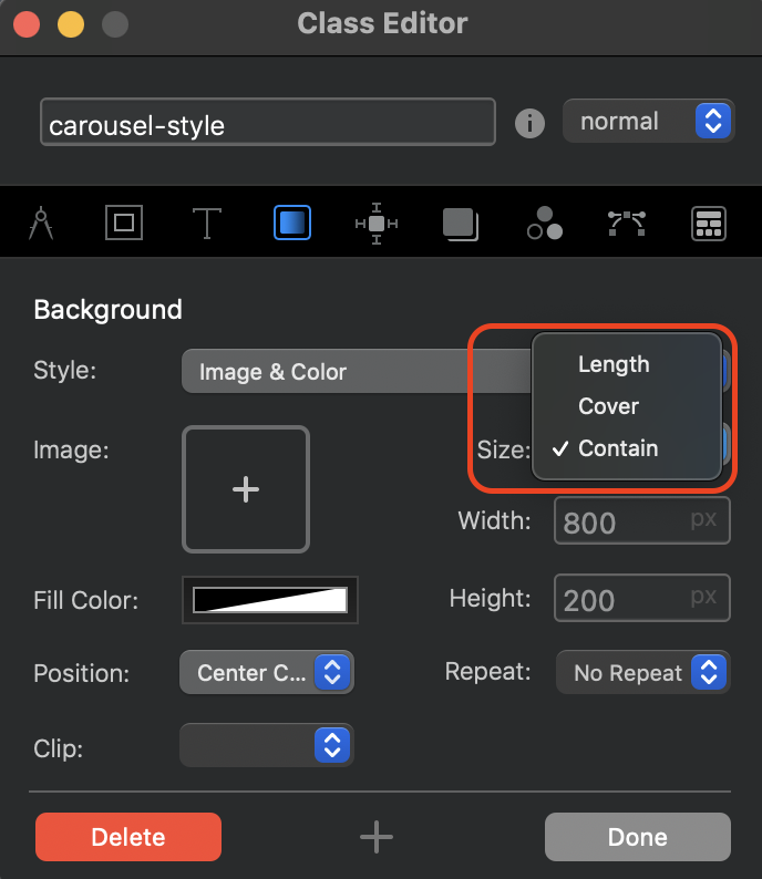
@KBConcepts Ok, I see what the CSS option does. However, in Blocs the default behaviour of an image contained in a carousel is the equivalent of the CSS contain value - the carousel is adjusted automatically to fit exactly around the image’s aspect ratio, thereby displaying the whole image. The size of the carousel is dictated by its width (which you can adjust in Blocs) - the height will then adjust according the the aspect ratio of the image. This is the preferred way of displaying images inside a containing object such as a carousel.
The other options, such as fill allows you too set a height and width in any way you wish, with the result being a squished or stretched image (not a preferred option). One of the other options is the cover css option which allows the image to cover the the size of the carousel which will often result in cropping your image if the aspect ratio is different from that of the original image . Finally, there is the scale-down option which basically does what blocs does out of the box - it will scale the containing object proportional to its original dimensions.
A couple of these options can be seen in Blocs when you create a custom class. They will be found in the Background tab: see below:
Of course, you could write your own bit of css to have the web browser do it automatically, but it seems like a lot of fiddling for something that may produce an unpredictable result.
I can’t thank you enough for taking the time to write out in detail what’s going on and how it works. Because you have made this very clear I would consider this case to be solved, even though I wish it was easier.