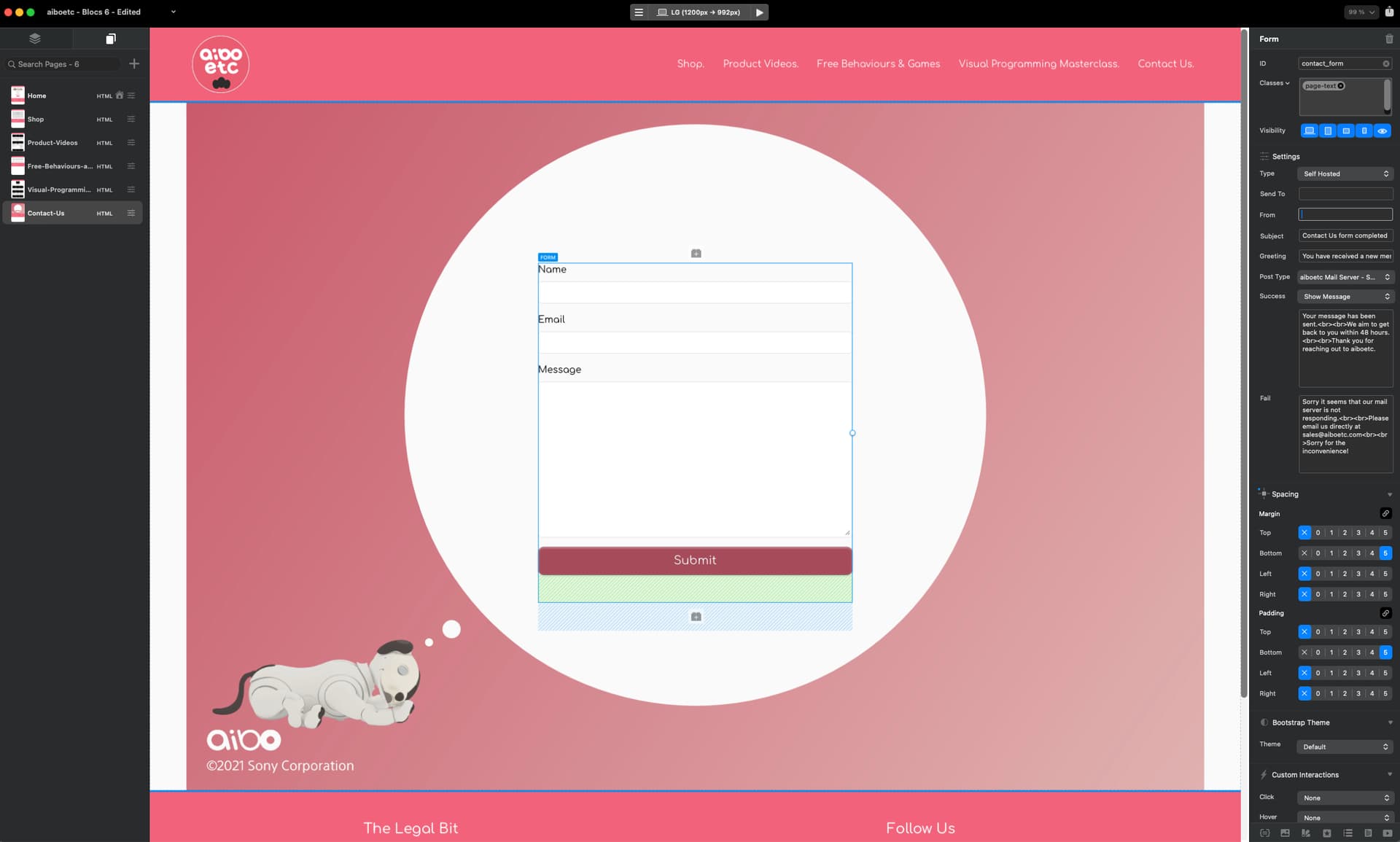
Here is my form. (I’ve made the emails blank for security)
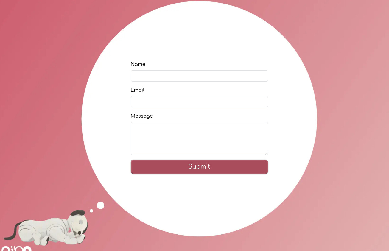
When I am on the web page in a real browser this is what I see:
But after I’ve filled it in and submitted it this is what happens to the layout:
What’s going on and how do I fix this?
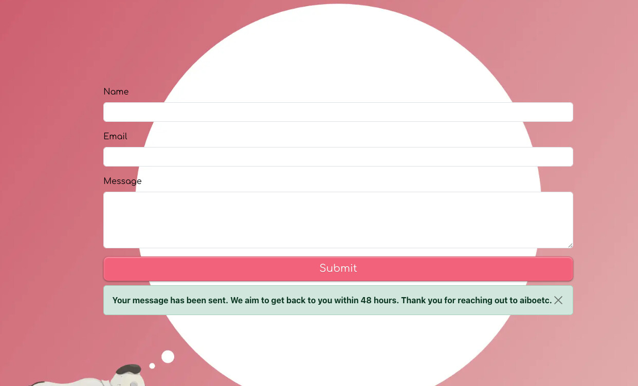
Here is my form. (I’ve made the emails blank for security)
When I am on the web page in a real browser this is what I see:
But after I’ve filled it in and submitted it this is what happens to the layout:
What’s going on and how do I fix this?
I’m not sure what is happening to the layout here, I would need a copy of the original project, to inspect further.
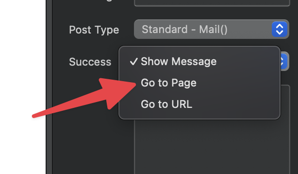
However, have you considered using the Go to Page Success Action. Then you can create a more customised look when a form is sent successfully, rather than an empty form.
It’s just a option. If you want me to take a look at your project and help you correct the current layout please submit a bug and I will follow that up with you via our support desk.
I’ll send you the project or you can take a look at the website - aiboetc.com as I’ve now got the publishing working. It’s the form on the contact page.
I’ll take a look.
Hey @TEMPEST_114
Thanks for sharing your project.
The problem looks like it’s caused by the <br> tags not being rendered in your success message. That’s a separate issue and post that I’m also looking into.
This particular problem is coming from the length of the success message, because there are no line returns rendering, it’s being forced onto a single line and causing the form to expand in size as its wider than the form input fields.
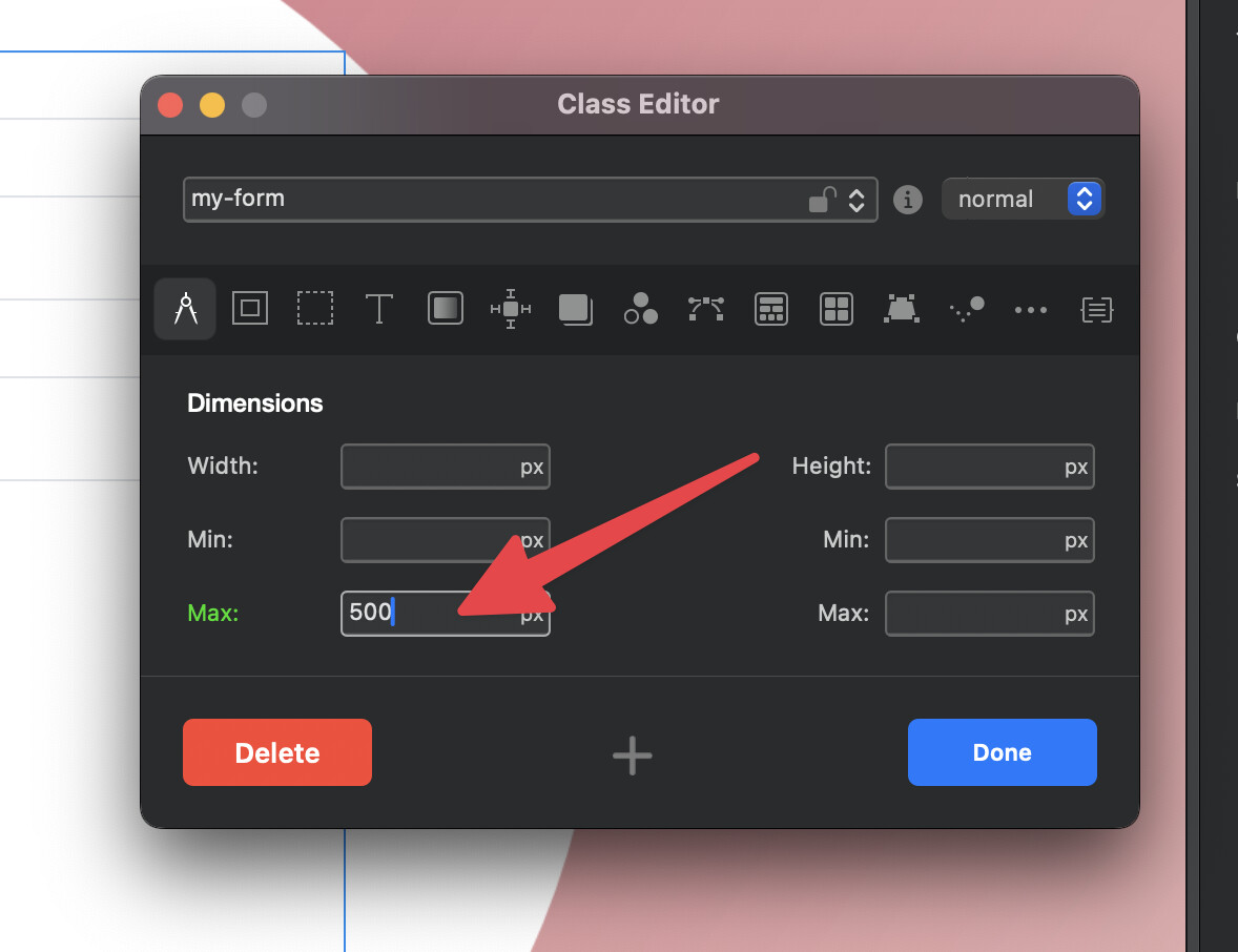
There are a few solutions but the easiest is the following:
When the success alert is populated with the text, it will no longer force the form size to increase.
Because you are using a stacked container at full width, the form can expand as it has no container such as a column to restrict it maximum width. This custom class rule prevents that.
I hope that helps.
Thank you so much @Norm ! Sorry it was PEBKAC!
No problemo ![]()