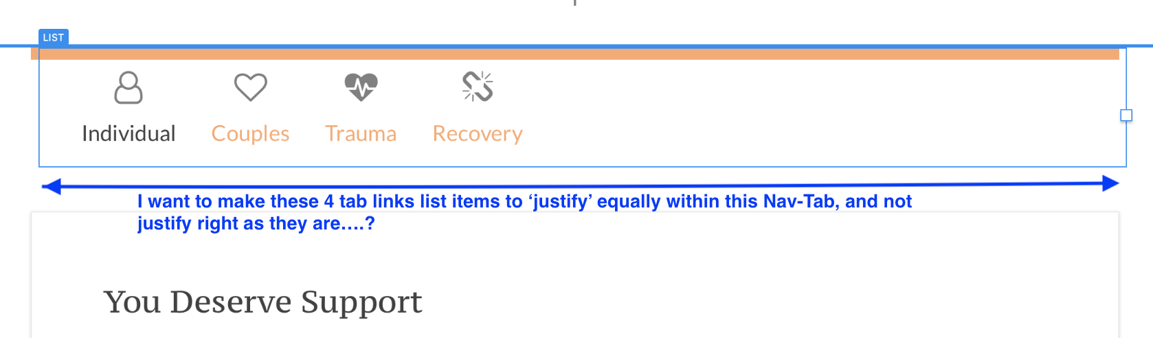
Hi - Does anyone know how to get the Tabs List Links to fill the space equally?
[forgive the typo in screen capture, should read ‘not justify left…’]
Here’s the Bootstrap 4 documentation on ‘Fill’ and ‘Justified’ class, with a note I added to explain the nav-tab classes I already have and understand.
Thanks!
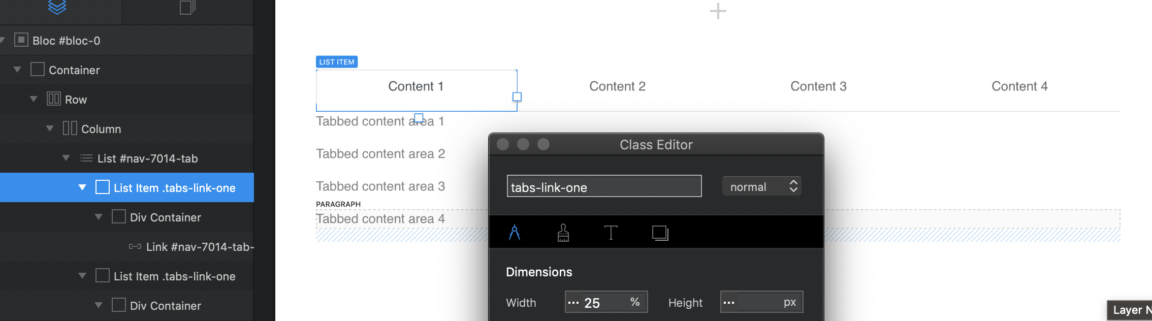
Just create a class for the “list item” (not the link) then center the link. Set the class width to 25%. This will work on probably three of the breakpoints, you’ll have to adjust the smallest breakpoint.
casey
1 Like
Thanks you Casey!  I did actually try that, but with too many classes bumping into one-another, the icon div, the link div, the list itself, it wasn’t working, and so I just made a fresh file with fresh Tab bric and now its working better…much appreciated
When the icon or the link is centered using the right panel alignement control, I noticed that blocs creates a div, for which ever element’s alignment is changed, and so I now moved the icon and link into the same div container to simplify it…
I had already built the site with Tabs for the larger breakpoints, and Accordian for smaller break points, (same content in each), but then editing the text info needs to be done twice, so I’m now trying to see if I canuse just the Tabs satisfactorily for all breakpoints.
Thanks again.
well…after experimenting with this, it seems the 25% for the list container breaks any responsiveness to the list when the window gets smaller…so this method doesn’t achieve the desired results.
By not setting any % or px or vw in the dimensions window, the natural responsiveness returns, however, this method positions all Tab links to the left side, so that’s not going to work for me…
I believe the Bootstrap 4 documentation’s solution, to use ‘fill’ or ‘justified’ is the correct solution, but I don’t know how to utilize it in blocs 3… Does anyone???
Not sure what you mean? Setting the “list item” to 25% it will keep the 4 items at 25% percent of the screen width on all sizes. (responsive)
Casey
My apologies…what I mean is the auto-stacking that the class nav-tabs does on the smaller devices goes away…which makes sense as setting % overrides the natural behavior of the standard class. Still wished I new how to deploy nav-fill in Blocs 3.
But, I thought about it more, and tested and discovered that if I use the 25% strategy as you suggested, and then on the smallest size I change that to 50%, then a I get two 'rows" of 2 list-items stacked…and that might work just fine…just need to tweak the alignments of all the elements a bit more to make it prettier (such details matter).
Thanks again!
That’s exactly how I would use the smallest breakpoint (50%) You’ll find the documentation for Bootstrap will vary in Blocs. The docs refer to what is achievable coding using Bootstrap. Blocs provide the ease of not having to code and then using classes to alter each element.
Casey
Oh, I’m confused then, I thought Blocs uses Bootstrap 4 classes throughout? If not, where does the nav-tab classes shared here in the Forum come from?
It does use Bootstrap 4 classes. But when a custom bric is added it’s made to use in Blocs. The classes used in Blocs for an element can be found using inspect element. The three classes shared for tabs come from looking at inspect element.
casey
got it…but what is their origin? Were they created by the creators of Bootstrap 4 or were they created by Norm for the Tab bric?
Norm for Blocs, using Bootstrap
Casey