I’m working with Blocs 4.1.1 on a MacBook Pro 15" Retina attached to an external 27" 4K screen. When previewing work in Blocs, I adjust the preview window to 1920 x 1080 resolution as most displays including laptops are closer to that resolution. When I preview the site on my MacBook Pro 15" Retina, it looks more a less correct except the text that sits on top of the full-screen images in Hero Blocs tends to move vertically but is still acceptable in terms of where it sits on the image.
However, when exported and previewed on a MacBook Pro M1 that is set to default resolution, everything looks a touch bigger in the browser (using both Safari and Chrome). Reducing it one notch in the browser by pressing command-minus once makes the site look absolutely correct in terms of over-all size and visual balance. How can I overcome such problems so that the site looks right across Macs and PC’s using Safari and Chrome?
I am using M1 MacBook Air, and I think it has the same resolution as your MacBook. Depending on what resolution you choose in the Displays settings, it can look a bit big. You can select ‘Scaled’ -> More Space to make it look like you want, but it will obviously make everything smaller on your screen.
Hi @Eldar - thank you so much for your prompt reply, I really appreciate it. You are right in terms of what you have explained. I am using my old MacBook Pro 15" Retina to design the site, when I preview the work in Safari on this machine after exporting it, it looks more-a-less right in terms of size. However, when I preview it on the MacBook Pro M1 which is set to default resolution, everything looks a bit big. If I press Command-minus (Zoom-out by one notch) in Safari, everything looks right.
Just like you, I am very particular about design, typography, size and visual balance. Is there a way to maintain the overall look and feel of a website regardless of platform, OS, resolution, browser?
I know absolute consistency is not possible but it should look close regardless of resolution and aspect ratio.
I learnt from @PeteSharp and @Jerry that it is possible to insert HTML and CSS code in the project header in order to apply an action across the entire site. Is there code that can reduce (Zoom-out) all content/pages by a certain percentage (e.g. 95% or 90% of original size) except the full screen images in hero blocs?
Better still, code designed to detect common resolutions and aspect ratios and accordingly apply the correct reductions in order to narrow down on the differences and maintain a good level of visual consistency?
@Eldar - I think I need to go through some of your training videos that explain the responsive and break-point aspects. I love your training videos, you are truly talented in that respect.
What is the best approach to designing sites that are viewed on full HD screens and Apple retina screens. Any way to simulate these in Blocs preview, I suppose the ability to set a custom resolution in preview would help. How can one set breakpoints for resolutions above 1080 x 1920?
One of the problems that I am faced with between viewing full screen hero bloc images on full HD screens and Apple retina screens is that the centred heading text brics tend to move and overlap the background image in a way that looks obtrusive and wrong. The only solution in my mind so far would be to incorporate the heading text within the image but I need buttons beneath the headings on some full screen blocs so again; that will be a challenge.
If you want to preview a page at full screen size, click on the full screen icon at the top-left corner of the blocs preview screen (its standard on OSX windows). When you’re done previewing, click the icon again to restore the window back to the working size you originally had.
An alternative method would be to use the View/Preview In Browser option from the main menu.
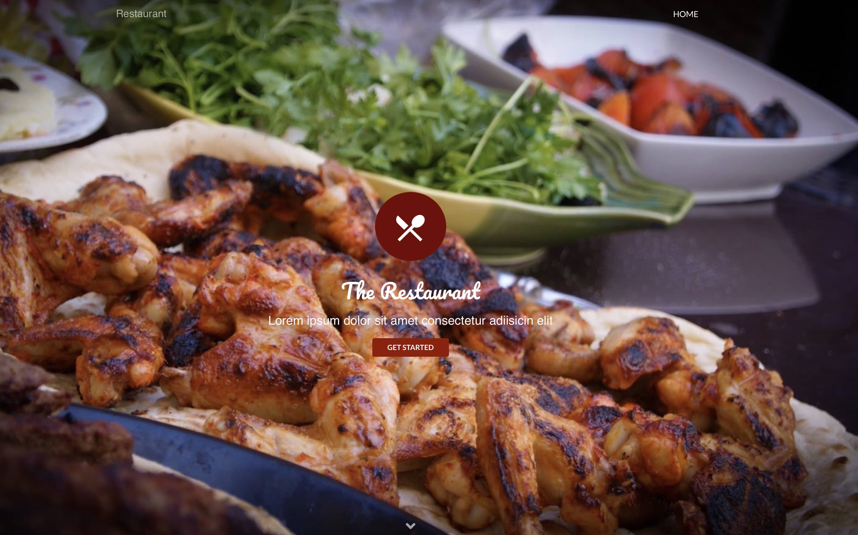
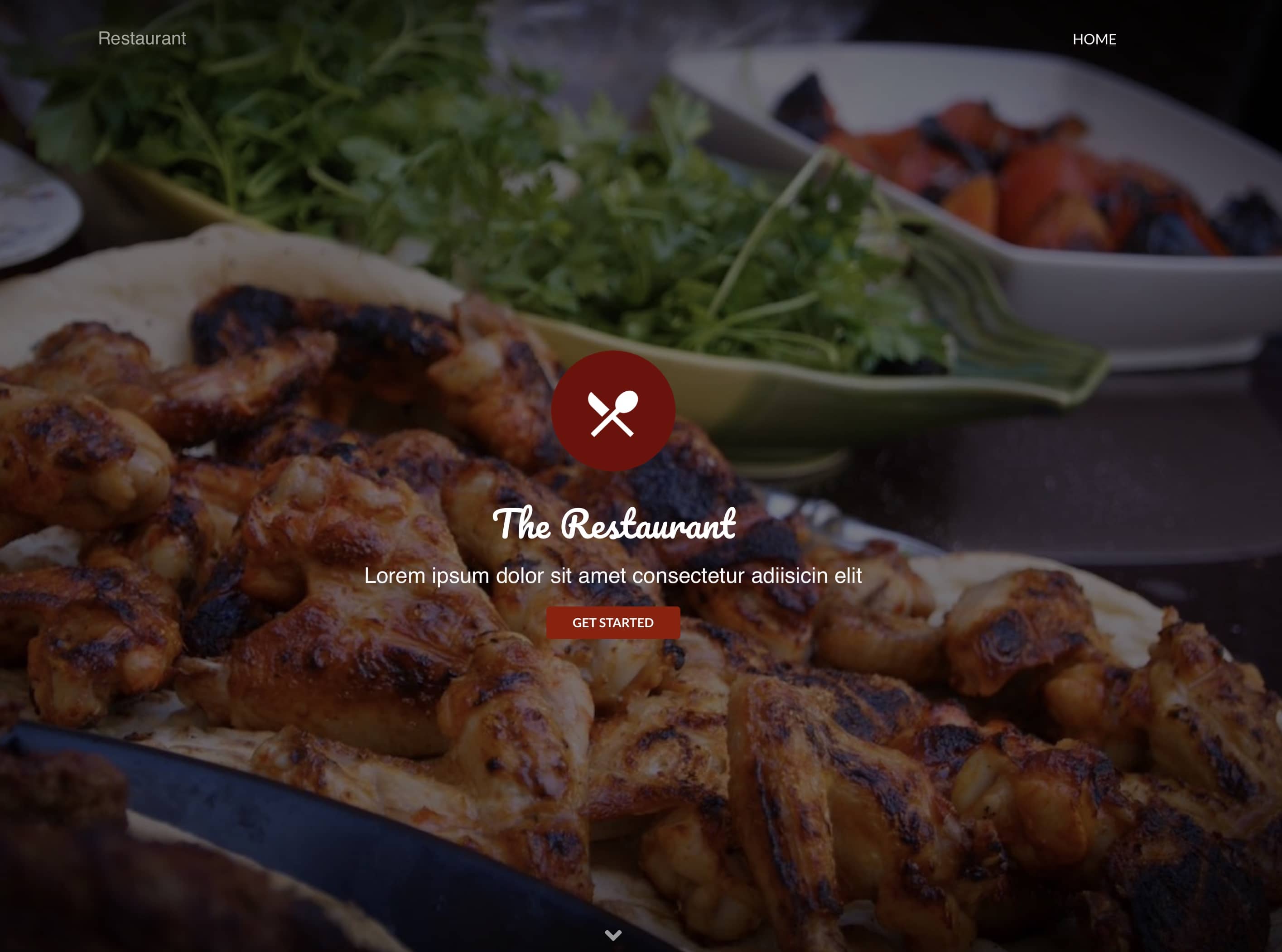
All full screen size blocs will centre content vertically within the screen as standard and should have little effect on the placement of content in relation to the image (the image scales proportionally to the size of the browser window). Of course, if the window is scaled disproportionally, it will effect how much of the image gets displayed. You can minimise the effect of misplaced content at full screen by ensuring that your background image is the same proportions as the majority of desktop/laptop displays (16x9) and make sure there is nothing important that can be obstructed by the content. If your page doesn’t look right at full screen, maybe due to contrasting areas in the background image making the content difficult to read, it may be an indication that your image isn’t suitable as a background image. If your image does have contrasting area that make your text hard to read at certain sizes your best option is to smooth out the contrast with the Darken Overlay. Here is an example without and with an overlay:
Thank you @hendon52, the problem I am faced with is that the text on top of the hero bloc background image resizes and moves depending on screen resolution when viewing the pages in full screen mode as you have explained. The only way I was able to come to a compromise is to work directly on my laptop screen and then switch resolutions to see how it effected the image and position of the overlaid typography. I even resorted to a different more recent laptop to see how everything looks just to make sure. This way I was able to work on a sensible compromise whilst maintaining text brics in Blocs as opposed to hard stamping them into the images.
I think it would be very useful for @Norm to build a smart previewing facility where different screen resolutions could be defined and saved. When in preview mode, the user should be able to apply the various screen resolutions to be able to see various outcomes. Currently, Blocs can resize the preview window to two different screen resolutions only.
@Samazar the whole idea of responsive design is you are not locked into a resolution. Bootstrap is what’s called a mobile first responsive framework.
There are a bunch of things you can do, to keep things relative sizes by using rem, em, vh, vw, % and of course flex can be your friend for positioning.
There could be a different way to build what you are having issues with, so it works better. But you haven’t really given much information.
Responsive design is not the same as adaptive design. Where you have a page design for each screen size, which these days is a bad idea as there are a lot of them.
On another note, the makers of Blocs also make this app that works with Blocs. It’s getting an update soon I believe.
Hey @PeteSharp, thank you very much indeed for your useful input. I will certainly look into some of the stuff that you have suggested. I will try and do screen shots to illustrate the issues I am having as I know you may be able to point me in the right direction.