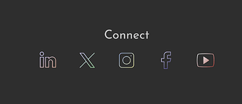
hello all
i am using some animated icons from lordicon.com
here the code (without the link part for paid icon) that I use from their website
<script src="https://cdn.lordicon.com/lordicon.js"></script>
<lord-icon trigger="hover" colors="primary:#e4e4e4,secondary:#e4e4e4" style=**"width:50px;height:50px"** src="https://cdn.lordicon.com/xxxxxx.json">
</lord-icon>
I use them in 50x50px
I would like to make them 24x24px on mobile device and 50x50px on desktop
I thought that using
row and 4 columns and div container in each, with the code widget for the animated icon
will let me choose through the div container to make them at the size I want depending of the break point:
but it doesn’t work, and I tried to play with positioning, size, padding etc but only the script code reduce not the icon itself when looking in preview
is there a solution to make a code widget of an animated icon in different size depending of the breakpoint?
like an image or gif
I tried to search on the bootstrap 5 classes but didn’t find something useful ![]()
thx
here on XS and LG same size
XS:

LG:

