I have been building my second client project in blocs.
the client delivered the style and layout and I made it with blocs
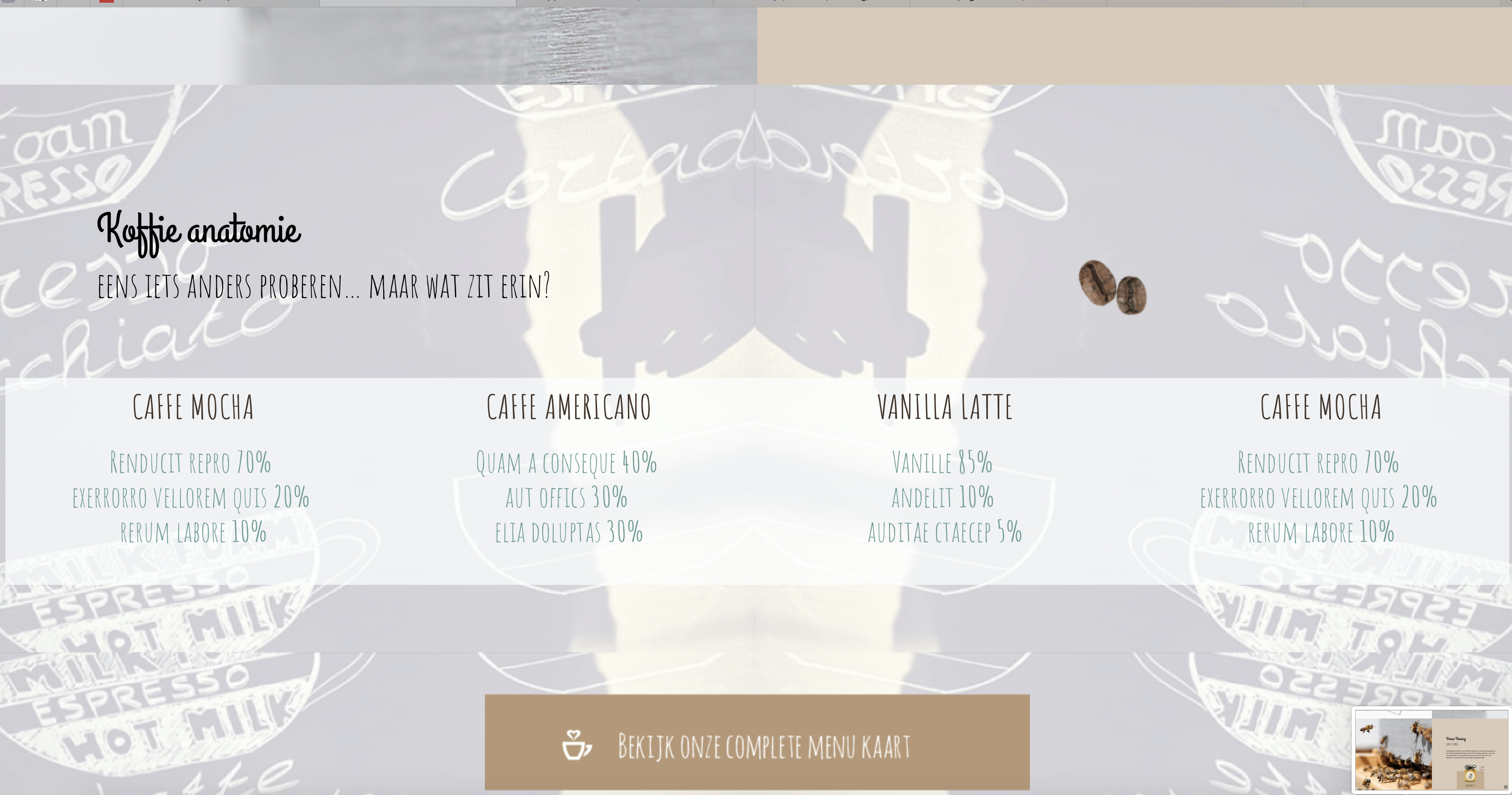
http://www.webv2.koffiebijdeburen.nl/#1
let me know what you think
I have been building my second client project in blocs.
the client delivered the style and layout and I made it with blocs
http://www.webv2.koffiebijdeburen.nl/#1
let me know what you think
Contact section too small on mobile. Nice site. Can use some animation on the content to spice up.
Ziet er goed uit.
Hello @Nyokhix
Opinion
Divide the Grid into two parts with span6 to separate them into images and text on your mobile page!
Try switching to mobile view span12
I think I understand what you mean but not completely
The overall looks good. Im not sure about the fonts, but I like the scroll effect. How do you achieve that?
hey, nice page. but the scroll effect doesn’t work good. some blocs are to big. you can see it at these pictures.
What I can see for sure is since the release of Blocs.Store and some cool new Brics like Snap Scroll, the quality and variety of websites we can built with Blocs has been greatly improved!
It is achieved by the snap scroll brick
it can be bought in the blocs store!
I also saw that later on but the blocs are set to full screen so I don’t get how the exceed the full size

Overall a great looking web page and it works well on the desktop, but it is another story on mobile, sorry! The font is far too small to read clearly and I can’t make out your contact details.
The other really big issue on mobile is that I’m forced from sub-section to sub-section and when I try to slide the sub-section to read what is beyond my view-real estate then I get forced onto the next sub-section - not good!
Padding on the 4th sub-section isn’t there allowing the text to knock hard-up to the image on its left and the screen edge on the right.
Good luck with it all ! 
thank you for the feedback, I am currently still working on the mobile version trying to turn of the snap scroll on the mobile view