Hi my friends,
I hope for your help,
I can’t understand why iframe inserted I only see it in Blocs and if I export the site in FTP it is not visible
https://www.immagini-amo.it/clienti/paolascribs/villa/
Hello @blasco I had that problem before and was related to export options, and I can’t remember if it was from minify or lazy loads, try to unselect all and try, if it works then you select one by one unit you find the one that affects iframe. (Let me know later…)
1 Like
I tried to export without including anything in the export panel but the problem remains !!!
OK, change the iframe address from http to https
1 Like
How a small character changes your life !!! 
Thank you @Pealco 
1 Like
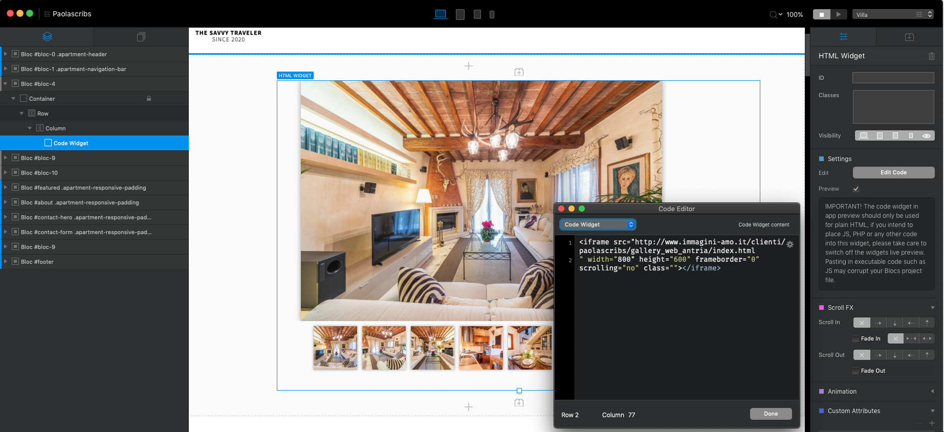
By the way I use a different code to include iframe so it become responsive.
There you have it if you want, if you want just use in a bloc not full screen you can ignore the width and height, to change the address is where I insert your address (try with your code open the responsive and check if it works for you, if not you can try this code):
<div style="--aspect-ratio: 16/9;">
  <iframe src="https://www.immagini-amo.it/clienti/paolascribs/gallery_web_antria/index.html#" width="1600" height="900" frameborder="0">
  </iframe>
</div>
<style>
[style*="--aspect-ratio"] > :first-child {
  width: 100%;
}
[style*="--aspect-ratio"] > img {
  height: auto;
}
@supports (--custom:property) {
  [style*="--aspect-ratio"] {
    position: relative;
  }
  [style*="--aspect-ratio"]::before {
    content: "";
    display: block;
    padding-bottom: calc(100% / (var(--aspect-ratio)));
  }
  [style*="--aspect-ratio"] > :first-child {
    position: absolute;
    top: 0;
    left: 0;
    height: 100%;
  }
}
</style>it works much better and is now responsive. Unfortunately it is not the best for a smartphone …
A strange thing is that I duplicated the bloc and applied the changes you recommended to the second block. I have removed the visibility to the first one but in the export I see it equally
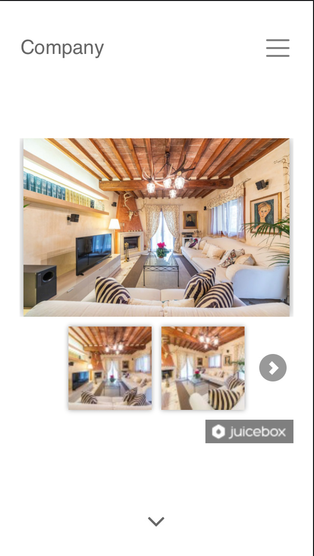
 Dont know why, but about smartphone is juicebox that do that, is not nothing about iframe, what you can do is in mobile viewport hide the iframe and add a gallery directly.
1 Like
Hello @blasco, find a solution, this html widget make it available to LG, MD and SM but hide it to XS:

Then go to mobile (XS) viewport and add a new code widget with the same code I insert on top but change the aspect-ratio to 9/10 and hide this widget for LG,MD and SM: (or play with aspect ratio until you see only a picture with arrows to change photos)

And Voila is much nicer:
2 Likes