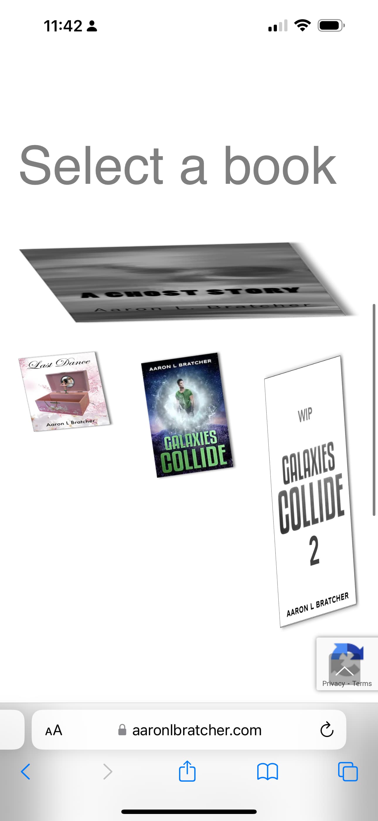
I have a website that looks great on the larger display, but on a phone the images are squished in strange ways. Each image size is set to 240 x 321 with proportionally up or down scaling.
The images are in a single row, each image with it’s own column.
The main image on your desk top looks quite low res and blurred too, there are crisper images in the public domain of that book of yours that are better quality that would look much shaper and stand out more when people see your website, so hoping you have the originally copies of those being its your own book!
Just saw some of your reviews - great work by the way !!! during covid I wanted to write a book and started it and got a few hrs into it and kind of gave up…one day maybe !!!..
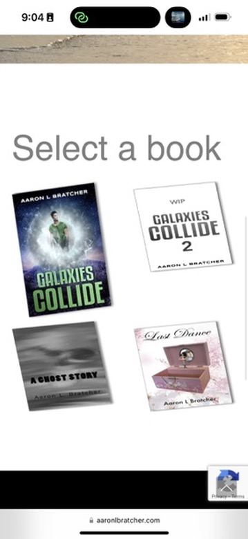
Thats not the live preview in Blocs though. Thats just what it looks like on the design canvas as you edit it. If you press the Preview button in blocs, does that come out the same as the ‘actual’ phone view. ?
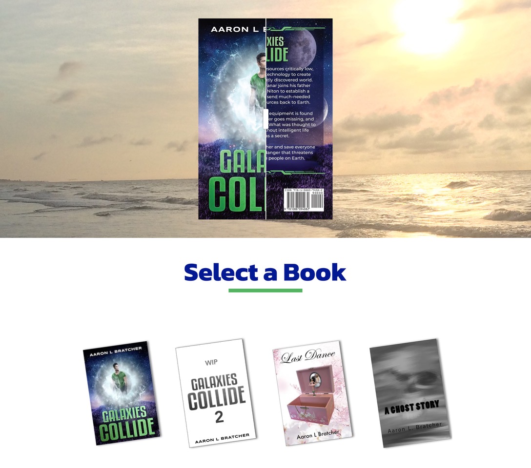
Right, had a quick play during a cuppa and knocked this up in 10 mins which hopefully you can use for reference for your own (needs a little tidying up…but will give you an idea)
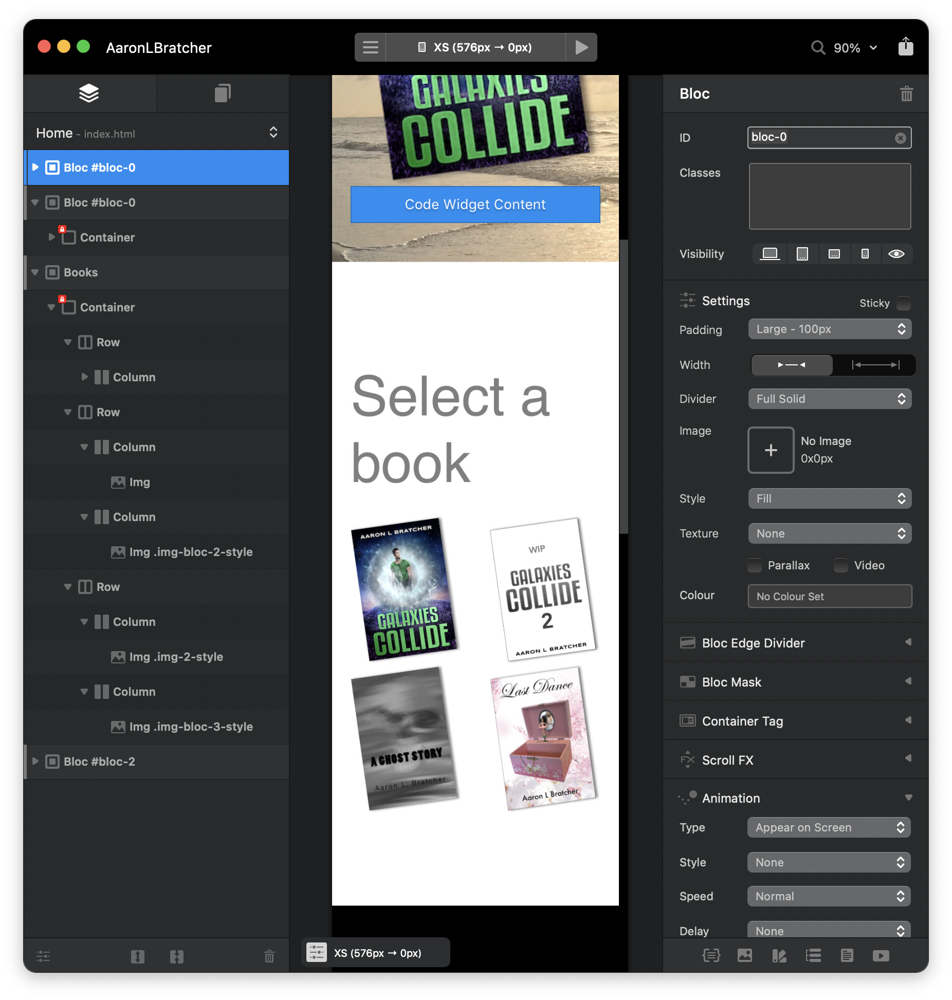
I resized your images so they are all the same size and you might again need some better quality images and I have sized them and used a class too for size and space.
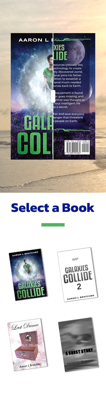
Had a little play with the header using your book and an image comparison slider which shows the back of the book! just an option or use a flip…just an idea! link to the bric : LINK
Anyway I have sent you the file directly to you - to give you an idea of what I did.
p.s. are you using classes ? For best practice, i’d use classes on your site and then edit the class, for each breakpoint you want to be different. If that makes sense.