I recall successfully using a code to make a webpage responsive. When I was using Rapidweaver, it automatically handled the responsive aspect of the site quite well. However, with Blocs, it seems that I need to individually work on all the different sizes. Is this the case? Or is there a method to accomplish this more efficiently?
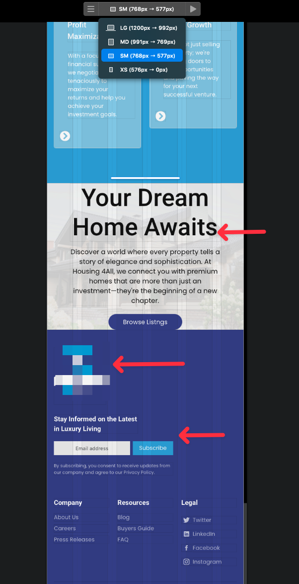
Blocs does some mobile optimization for you automatically, but you still need to check all of the four breakpoints (devices sizes), and adjust them to be as perfect as possible.
All of the sections in the Minimalist Library are fully optimized for all 4 breakpoints (depending on my preference, of cource, which you can adjust to your liking), but if you are building something from scratch, you do need to check all 4 breakpoints.
P.S. I am explaining it in detail (including the mobile-first principle) in my email response to you (sent it just now).
3 Likes
Thank you for your invaluable assistance and unwavering patience, my dear friend. Once again, I am able to conquer any challenge with the utmost ease, thanks to the sheer simplicity of your teachings and tutorials.