JotForm iFrame will not be responsive!

I Really need help with that but first I would thank the founder for this great program it helped me a lot !!!

I tried the last two days just to get this iframe responsive but I don’t really have a plan… on Mac it looks pretty awesome just how we want it but not on my phone

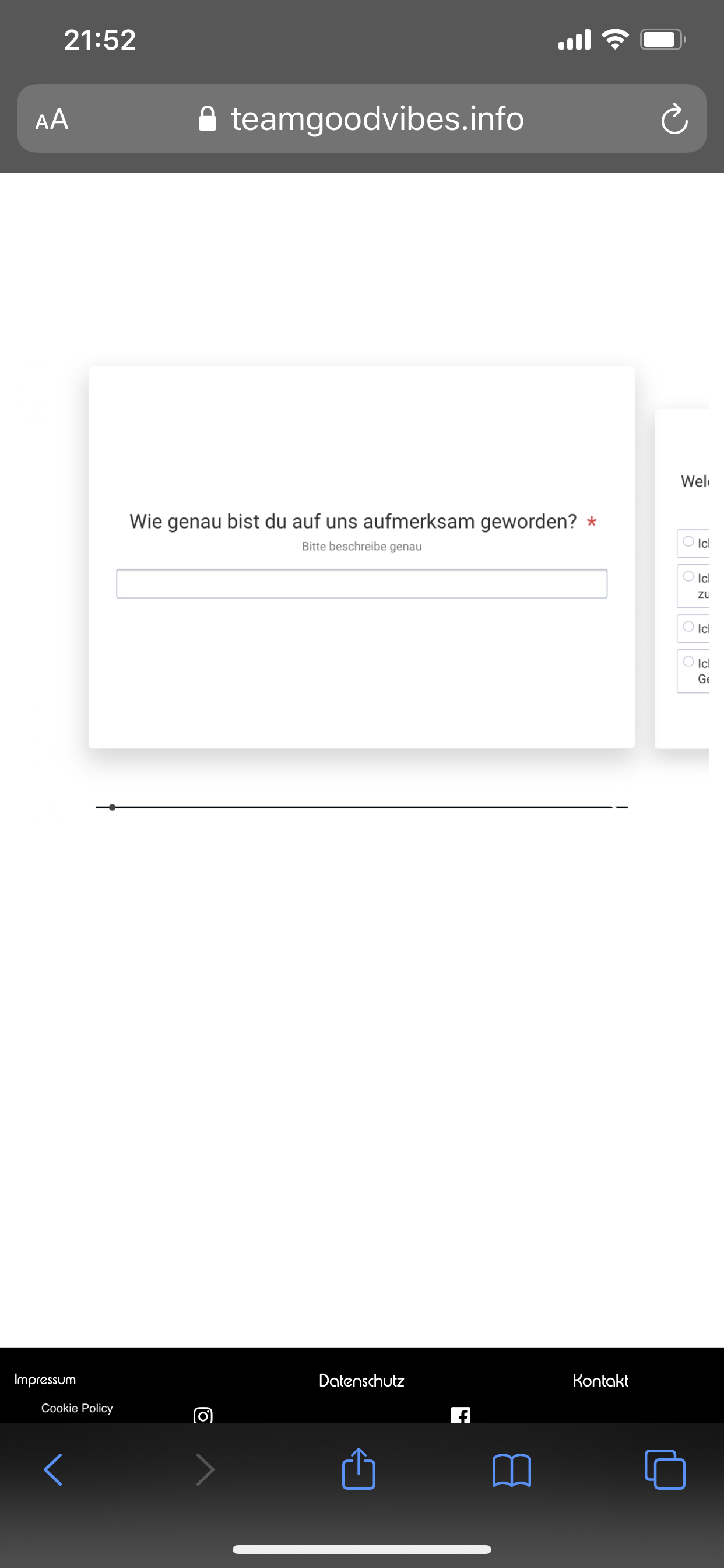
(link where the iframe is implemented)
https://teamgoodvibes.info/bewerbung-seminar/!

IMG_AD8C7BE7A537-1|231x500

Responsive level = 0,0

The Code: (fullscreen is turned on but does not make any difference)

    <iframe
  id="JotFormIFrame-201084529927359"
  title="Warme Leads"
  onload="window.parent.scrollTo(0,0)"
  allowtransparency="true"
  allowfullscreen="true"
  allow="geolocation; microphone; camera"
  src="https://form.jotform.com/201084529927359"
  frameborder="0"
  style="
  min-width: 100%;
  height:539px;
  border:none;"
  scrolling="no"
>
</iframe>
<script type="text/javascript">
  var ifr = document.getElementById("JotFormIFrame-201084529927359");
  if(window.location.href && window.location.href.indexOf("?") > -1) {
    var get = window.location.href.substr(window.location.href.indexOf("?") + 1);
    if(ifr && get.length > 0) {
      var src = ifr.src;
      src = src.indexOf("?") > -1 ? src + "&" + get : src  + "?" + get;
      ifr.src = src;
    }
  }
  window.handleIFrameMessage = function(e) {
    if (typeof e.data === 'object') { return; }
    var args = e.data.split(":");
    if (args.length > 2) { iframe = document.getElementById("JotFormIFrame-" + args[(args.length - 1)]); } else { iframe = document.getElementById("JotFormIFrame"); }
    if (!iframe) { return; }
    switch (args[0]) {
      case "scrollIntoView":
        iframe.scrollIntoView();
        break;
      case "setHeight":
        iframe.style.height = args[1] + "px";
        break;
      case "collapseErrorPage":
        if (iframe.clientHeight > window.innerHeight) {
          iframe.style.height = window.innerHeight + "px";
        }
        break;
      case "reloadPage":
        window.location.reload();
        break;
      case "loadScript":
        var src = args[1];
        if (args.length > 3) {
            src = args[1] + ':' + args[2];
        }
        var script = document.createElement('script');
        script.src = src;
        script.type = 'text/javascript';
        document.body.appendChild(script);
        break;
      case "exitFullscreen":
        if      (window.document.exitFullscreen)        window.document.exitFullscreen();
        else if (window.document.mozCancelFullScreen)   window.document.mozCancelFullScreen();
        else if (window.document.mozCancelFullscreen)   window.document.mozCancelFullScreen();
        else if (window.document.webkitExitFullscreen)  window.document.webkitExitFullscreen();
        else if (window.document.msExitFullscreen)      window.document.msExitFullscreen();
        break;
    }
    var isJotForm = (e.origin.indexOf("jotform") > -1) ? true : false;
    if(isJotForm && "contentWindow" in iframe && "postMessage" in iframe.contentWindow) {
      var urls = {"docurl":encodeURIComponent(document.URL),"referrer":encodeURIComponent(document.referrer)};
      iframe.contentWindow.postMessage(JSON.stringify({"type":"urls","value":urls}), "*");
    }
  };
  if (window.addEventListener) {
    window.addEventListener("message", handleIFrameMessage, false);
  } else if (window.attachEvent) {
    window.attachEvent("onmessage", handleIFrameMessage);
  }
  </script>

I hope someone can really help me with that.

greetings from Germany :de:

Bootstrap has some embed classes you can apply to make iframes responsive.

The best thing to do is make your own class with the correct ratio to suit. The default bootstrap ones are suited for media.

https://v4-alpha.getbootstrap.com/utilities/responsive-helpers/

Hey @PeteSharp thanks for your help!

I tried to add the bootstrap code around the iframe but It did not change what did I do wrong ?

<div class="embed-responsive embed-responsive-16by9"><iframe class="embed-responsive-item" src="https://form.jotform.com/201084529927359" allowfullscreen=""></iframe></div>

Hey @TeamGoodVibes

Maybe check out this earlier post of mine about how you can setup a responsive iframe. The one you used, uses a ratio of 16:9, The default ones are really suited for media. But you can use the Bootstrap method and make one any ratio you want.

Hey thanks for your answer! But I don’t really get it how I use this bootstrap codes…

I think the problem is that the new iPhones have display ratio of 9:19.5 ??

I tried it with your code but still looks shitty on iPhone :sweat:

I don’t really have a plan how bootstrap works do you have some instructions for me what I exactly have to do?

<style>
.embed-responsive-210by297 {
 padding-bottom: 141.42%;
 }
  </style>
   <div class="embed-responsive embed-responsive-210by297">
     <iframe class="embed-responsive-item" src="https://form.jotform.com/201084529927359">       

        </iframe>
        </div>

do i have to link the bootstrap.css with href in the header of the page ? Blocs does that automatically I guess ? sorry for my dump questions but I don’t have any plan of that… And I really need to get that step done I am wasting so much hours with that…

okay I found someone on Fiverr.com from Pakistan who made a code for me

i had to insert it to the header now it works fine :heart_eyes:

   <meta charset="utf-8">
 <meta name="keywords" content="">
 <meta name="description" content=""> 
 <meta name="viewport" content="width=device-width, initial-scale=1.0, viewport-fit=cover">
 <link rel="shortcut icon" type="image/png" href="../favicon.ico"> 
 <link rel="stylesheet" type="text/css" href="../css/bootstrap.css"> 
  <link rel="stylesheet" type="text/css" href="../style.css"> 
 <link rel="stylesheet" type="text/css" href="../css/animate.css">
 <link rel="stylesheet" type="text/css" href="../css/cookieconsent.min.css"> 
  <link rel="stylesheet" type="text/css" href="../css/font-awesome.min.css"> 
  <link rel="stylesheet" type="text/css" href="../css/feather.min.css"> 
   <link href='https://fonts.googleapis.com/css?family=Lato:100,300,400,700,900&display=swap&subset=latin,latin-ext' rel='stylesheet' type='text/css'>

https://teamgoodvibes.info/bewerbung-seminar/