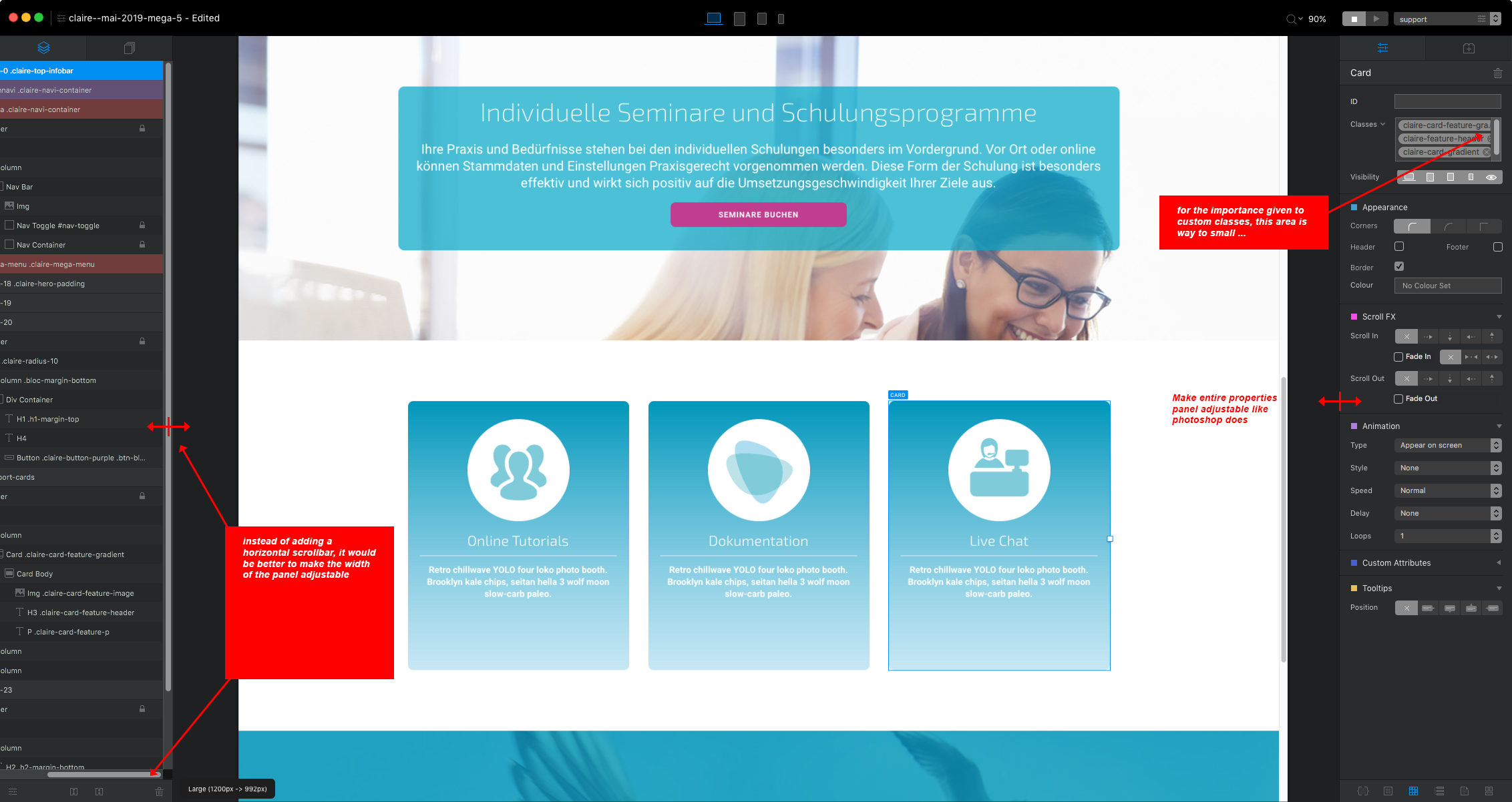
I find myself spending a lot of time trying to get around usability issues in Blocs. For example: the classes section in the blocs settings panel at the right. If you make custom classes with long names (my-custom-button-blue—etc), it is hard to delete the class, because in most cases the (X) to the right is not visible. So I have to use the backspace key. Add to this the fact that some items have 3 or 4 custom classes, editing and deleting things starts to get pretty cumbersome.
My wish: make BOTH the layer tree and the properties panel adjustable - like Photoshop does. Give the user the choice if he wants a properties panel that’s really wide, or a layer tree that’s really narrow, etc.
In general, I would like to see future updates of Blocs concentrate on interface improvements instead of adding more new features.
Improvements for interface customisation are in the works.
It also looks like you have scroll bars forced on the UI, the deleting class issue is not a problem when scroll bars are allowed to naturally hide after use.
Thanks Norm for the tip! I can’t find anything in the preferences regarding forcing / not forcing Scrollbars in the UI. Can you give me a tip as to where I can turn this off?
I really hope we get a version where the RIGHT side Menu can be adjusted for width. First, toggling scrollbar visibility in my OS settings has an effect on all Apps and the OS, which is not really acceptable to me, because there are many areas where the scrollbars are needed.
Second of all, it still does not solver the problem when a user has really long names for CSS styles. I have a lot of styles that have long names, otherwise I forget what they were made for. For example: “card-version2-image-rectangle” … And since I have another CSS style named “card-version2-image-round” … well, I guess you see what I’m getting at.
Also, alt tags for images. It’s time-consuming to have to “scroll through” the text in the alt image text field because the entire alt text is longer than the fixed width of the right menu.
And what would be even cooler: the ability to "undock both the left and the right sidebars - for users that have 2 monitors …
@gary
+++1 for the 2nd monitor option.
A screen or iPad at a push, but let’s free up the workspace.
Even a live preview on a 2nd screen?
I’m being a greedy Blochead now