is there any way to limit the width a page will open? the alignment of my page works, up until a certain width, then things start to distort. any ideas?
ps. i am a “amatuer” in blocks. perhaps the solution is obvious, but i cant find it. my problem is the “video” section of my website. the buttons scale up to the width of the window, but the “print section” doesnt match their scale. whats wierd is that i copied the video section (and removed the video background) when i made the print section… they should act identical? i figure my solution is to limit the page/window width?? since i can not find a way to keep the middle video section from getting out of alignment?
for example
since i am on a roll with stupid questions. i think i found out how to make a class that limits the width. but then that section no longer is “centered”. how does one center a row horizontally?
Blocs is built on an underlying grid structure of 12 grid columns. You can see the grid by holding down the shift key. If you want to keep the grid visible while you create your site, go to Page/Page Guides in the main menu.
When you add something like a full width structure bloc, the row will contain one column that spans all 12 grid columns. You can adjust this column by dragging its resize handle or, by setting a width in the appearance section. If you set the width, for example to span 10 grid columns, it will be aligned left on the page, leaving two grid columns empty on the right of the page. To centre the column you would apply an offset in the appearance section of the right sidebar. If you set the offset to 1, the column will be centred on the page with one empty grid column on the left and the right of the page.
If you set the column width to say 11 grid columns, you can’t use the offset option because it would just make the column right aligned on the page. Therefore, you would create a custom class (named something like column-centre). In the class editor you would select the right and left margins and set the margin to auto. This will align the column with even spacing on either side. This is how the class would look:
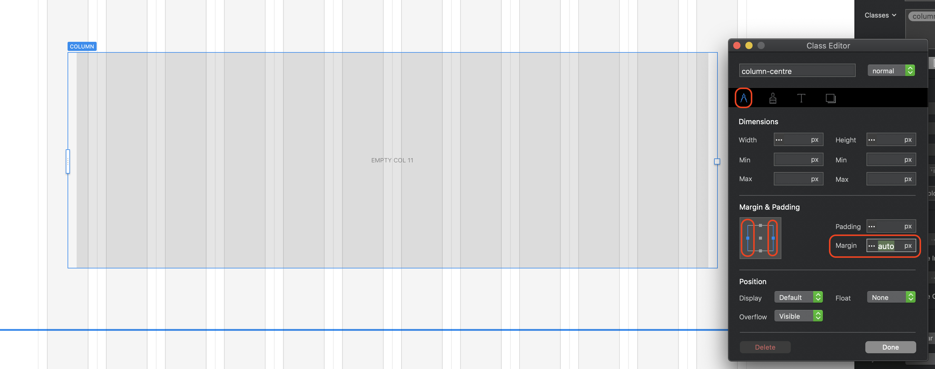
You will notice that the column on the page has half an empty grid column set on either side, as opposed to the normal one column, which effectively centres it in the page.
Of course, if you wish your entire page to be limited in width, you would set up your page width in the site properties dialog, like so:
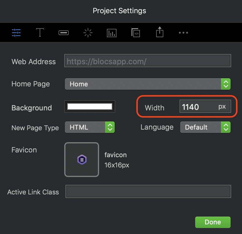
The page will still be built on a 12 column grid structure but it will just be a narrower page.
To summarise, if you set your column width to an even number of grid columns, use the offset option to centre the column. If your column width is set to an odd number of grid columns, use the custom class option.
2 Likes
very interesting! i will look into the column thing, as the project settings width has no effect what so ever. i didnt realize there was the possiblity of "auto’ though! Thanks!
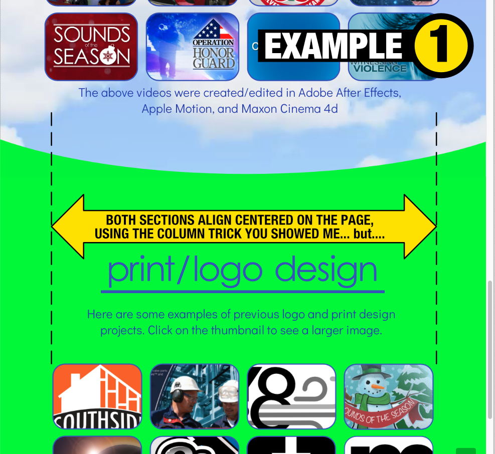
im afraid none of that effected my problem. perhaps this makes more sense. at a certain size, both sections of buttons line up (example1 below)
however, when you expand the width of the window (that project settings apparently has no effect on) - you get a continued scaling on the middle section, but not the lower section (which is the size it needs to stay)
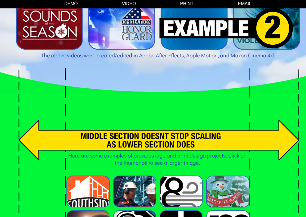
The middle video and the lower print sections are laid out as you suggested, with 1 column on the outside, and the middle being told its to stay at 10 columns (for 12 total). this works, up until you open the site on a imac with a much larger screen than the macbook pro i made it on 
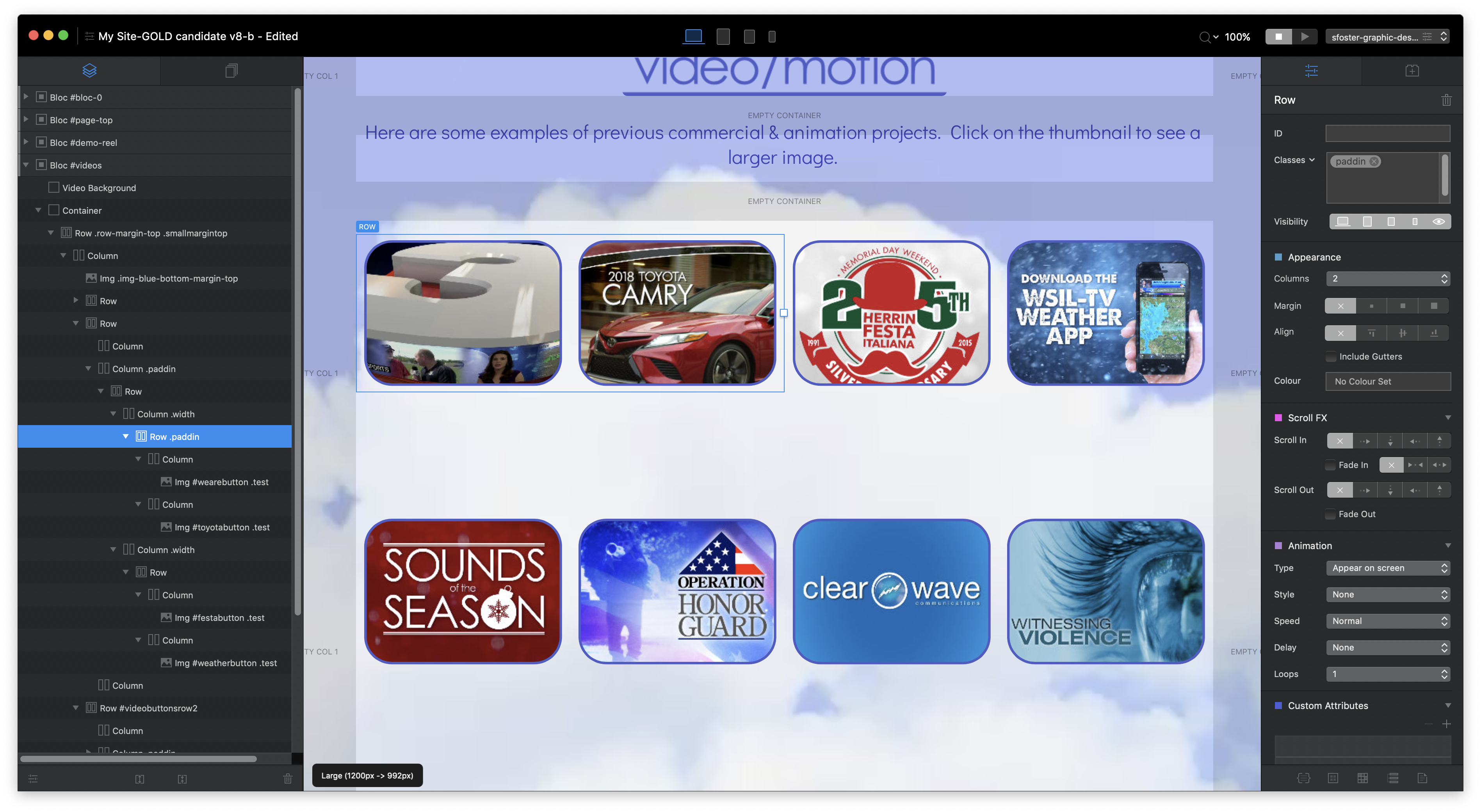

what id like to do, is to solidly cap the width the page is allowed to be. otherwise ill have to figure out why two duplicated sections (i made the video first, and then dupilcated it to make the print) act so differently. (the video section does have a video background, i think thats the only difference.
being a novice, well… i’ve probably missed one button somewhere and screwed myself up.
what do you think?
aha! you ARE a genius sir! i found the “missing piece!” your auto class on the outside columns just needed a class that set the max width of the CENTER column and BINGO it works! (you probably said that am was in too big of a hurry to have it “stick”)
Thanks again!!
1 Like
i still would be interested to know why the Project Settings “width” appears to not work as expected. Could be useful in the future
The width setting changes the width of the entire page. What exactly isn’t it doing that you were expecting it to do? Is it having no affect on page width at all?
what id like is it to remove the ability to make the window wider than you set it. Perhaps i am looking at it a bit wrong. But from what i can tell that setting seems to have no effect at all.
So browser window width, not web page width?
The settings in Blocs only refer to optimum screen breakpoints, not the actual browser window.
Not sure if you can limit that, but there are people more informed than me around here!
Unfortunately, there is no way to limit browser width. On PC’s and laptops people can open their browsers at any size - from small to full screen. There is no way of predicting what users will do. Therefore, web pages are designed for a maximum PAGE width. This is the widest width at which web pages look good from a design and readability perspective. Anyone who has their browser window open at full screen will usually see space on either side of the web page. You can, of course, limit the effect of space on either side of the screen by creating full-width elements that extend outside of the webpage (backgrounds are a prime example of this.)
The page width settings in blocs refers to the maximum width of the content area of the page. Although it may appear to have no effect, it does in reality. Set it to say 800px - it may still look wide in the design interface, but if you preview in a browser, you will see it is quite a narrow page. Go back and set to something like 1200px - when viewed in a browser it will be much wider. In either case, the main page content will be restricted to the width of the page set in your project file. Here are some examples below:
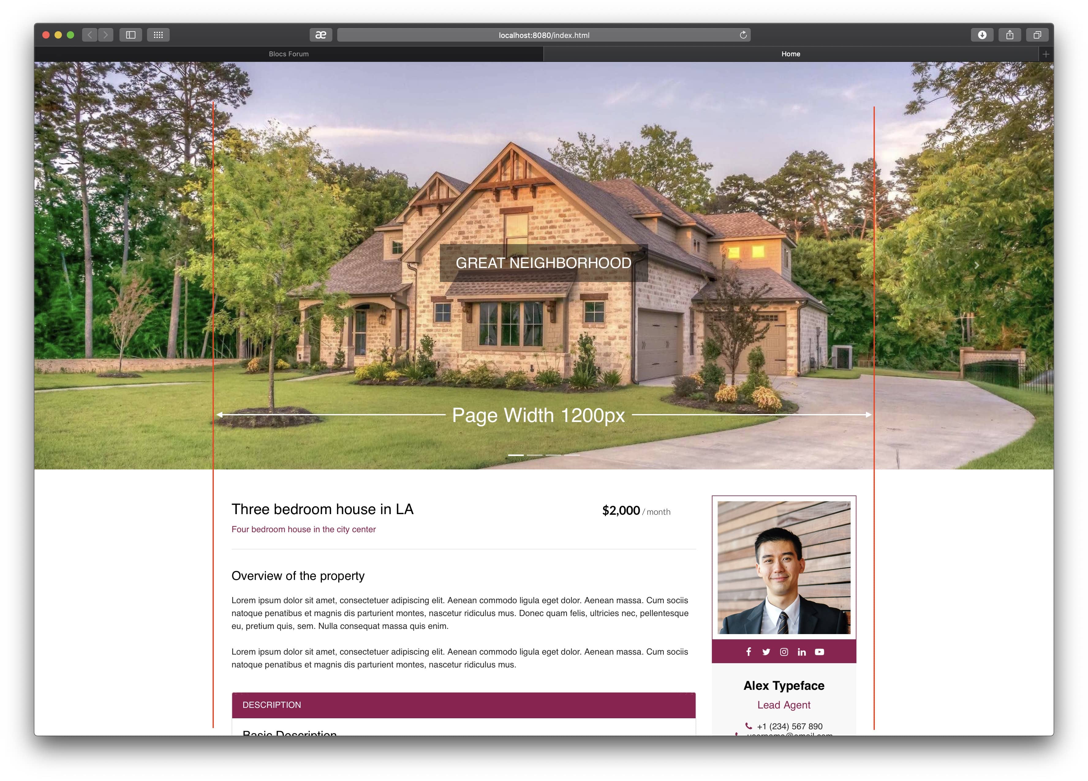
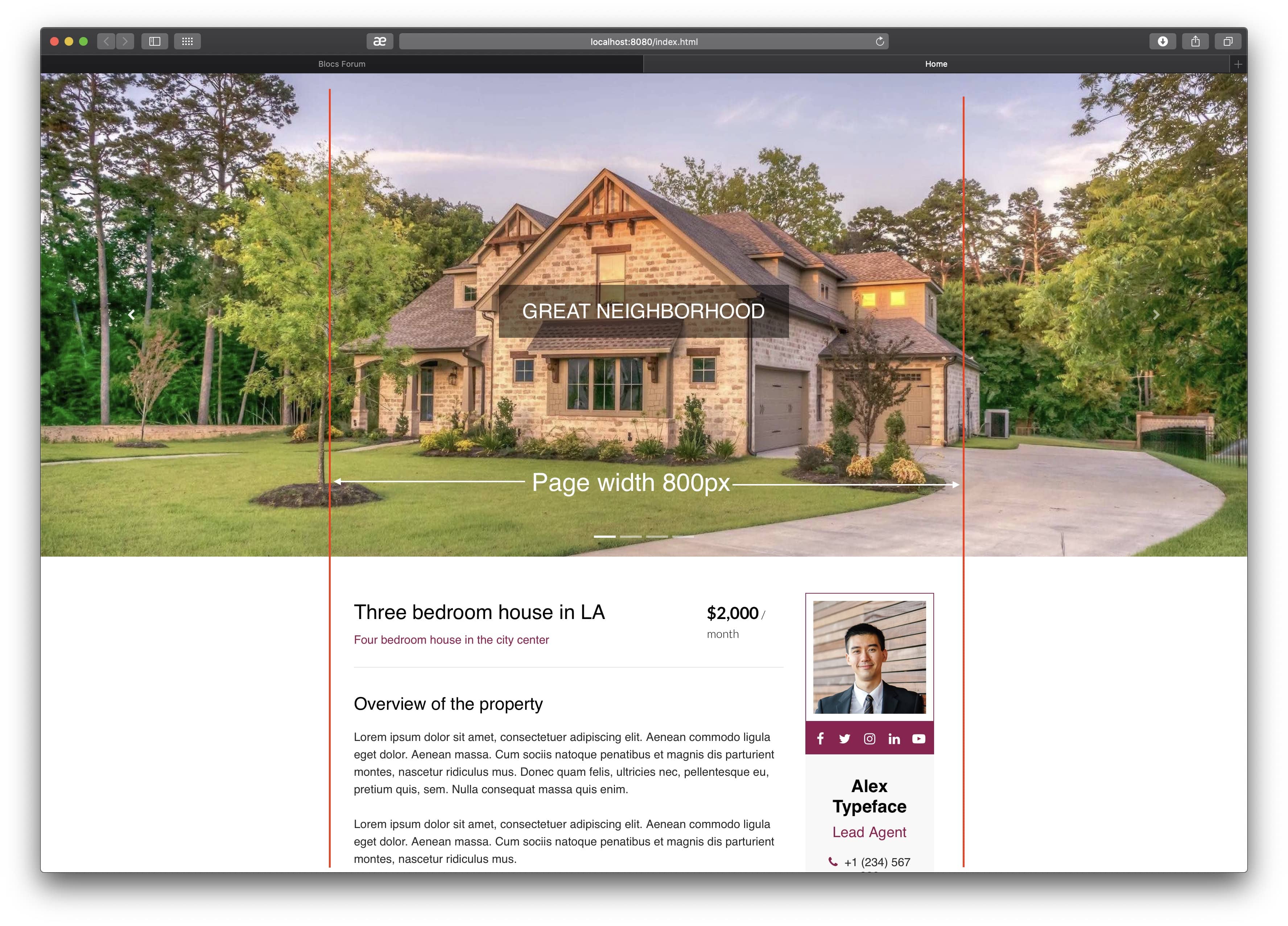
Page designs courtesy of @Eldar
As you can see, the only item that stretches to the full width of the browser window is the background image in a carousel at the top of the page. This has been designed to spread across the browser, regardless of the size of the browser window.
On tablet and mobile devices, this all becomes irrelevant because the browser window on these devices cannot be adjusted by the user. Therefore, no matter what width you set for your pages, they will always adjust to the width of the device viewport. This is why we have separate layouts for these breakpoints - so that we can design pages to be better viewed on these devices. If we only designed for a desktop breakpoint, mobile users would simply see a scaled down version of our page (without the space on either side) - making it difficult to read.
Great tip! Only 1 addition that made it work for me: I had to actually create 2 classes:
- column-left - set the left margin to auto
- column-right - set the right margin to auto
@gary there is a bootstrap class called .mx-auto that does left and right margin auto.
cool, thanks for the tip!