There is another platform that had a great plugin in place where you could state the recommended orientation and when it went into the non recommended then the screen would go dark and show an image of a tablet /phone being turned prompting the user to turn it.
When I had it, it was used a lot to be fair!..now I do not have it, I do not really miss it…but would be good to have.
@Ian - please post how you get on, as I would be interested in this too.
This is one of those things that even though it’s possible, one must ask should you be doing so in most general use cases. Instead you should consider if it’s really the optimal UX or if its just needing done to overcome some fault / feature within a site.
Blocs enables responsive design so instead of disabling the ability for people to rotate their own devices why not instead take the time to make all things work properly.
Its very rare in normal website cases for the to be required, but I would use it on some of mine due to the way the live stream is presented.
Often I have a live chat and polls on the right side of the live video. In portrait this makes the chat and polls sit under the live video, which is hard to follow scrolling up and down the screen, so for my case this would be great. It does not take the user long to realise which is the best way !!!
But this is hugely popular for certain requirements. I would not use it for normal websites though.
Thanks @Jerry my eyes glaze over when I see < followed by >. Gobbledygook to me!
Anyway, how does one differentiate between wanting only portrait v only landscape for breakpoints? I can’t see that in the coding, but maybe that’s because of my < to > dyslexia!
I’m a strictly amateur Blocs user, I don’t understand code and Blocs is now getting beyond me with all the (apparently) conflicting instructions in Settings v Custom Classes.
I need simplicity. That’s why I use Blocs.
What sparked the question was, I have a three-column Bloc on my website, the right-hand one of which would look fine in Portrait but rise higher than the other two in Landscape. That same column would do the same thing even when moved to the centre or left position.
Sh*t.
I spent a day rebuilding it with a brand new fresh out of the box Bloc - same thing happened.
Sh*t.
So I stripped out every single Setting on every single item in every single Bric and replaced them with Custom Classes. For every break point. It finally worked as I would have expected it to in the first place.
So, I thought, preventing the page from being viewed in Landscape and not Portrait - which was preferable anyway - would have avoided me wasting a whole freaking day.
I believe* every Blocs page already has that, so it’s not needed.
If you really want to go down this path * it will certainly drive some people really nuts from a UX standpoint. I would try this more robust version of Jerry’s more simpler suggestion. You will also certainly need to build a more tailored media query including widths, etc., to fit your actual needs. Also I’m not sure which you wanted but you can swap the reference of landscape for portrait as needed. Just play around with things until you get what you need based upon your requirements.
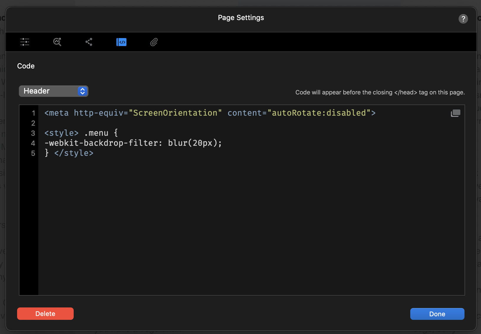
I would also suggest putting it in the header not the footer. :–)
<style>
@media screen and (orientation: landscape) {
  html {
    transform: rotate(-90deg);
    transform-origin: left top;
    width: 100vh;
    height: 100vw;
    overflow-x: hidden;
    position: absolute;
    top: 100%;
    left: 0;
  }
}
</style>
It think it may have originally resulted from this CSS-Tricks post, though I’ve seen it elsewhere also.
I’ve tried all the suggestions and what I’m finding is that if the desired result is achieved on an iPhone, the website is rotated 90 degs on a desktop, which is certainly entertaining but not ideal…
I’ve tried messing with the degs settings but to no avail… either desktop or iPhone is compromised.
As soon as I have more time I’ll do a more methodical experiment.