How is a user able to make present a horizontal scrollbar for the Layer Tree? I must be fortunate because regardless of length of unique layer renaming, id, number of classes, resizing the tree, resizing the Blocs app window to be as small as possible, maximizing Blocs to full screen, or anything I try no horizontal scrollbar appears for the Layer Tree. How can this be reproduced?
Would having the same initial warning persistent with each new project and each occurrence of a user adding something into the Global Area every time help?
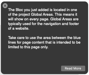
This is the Initial Warning:
It can be seen again via a reset – Preferences > Feedback > Reset Notifications
But of course then some users will ask for the annoying popup message to be shut off and the cycle will start all over. 
Could be a distinct app preference I guess.
I’m genuinely interested as I don’t find the Global Areas to be a point of contention at all. Though I’m not discounting that for some users they appear to genuinely be a struggling point.
To me there already seems to be ample visual indications (in addition to textual) regardless of being a new or an existing project. So by contrast for those whom find this aspect a constant stumbling matter I wonder if it’s then a visual obstacle, a language obstacle, or a mixture of each causing a true UI/UX shortcoming?
@Norm Is the Layer Tree the pain point for most whom have problems? If so I would suggest the following as possible changes.
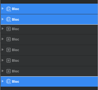
- Make the entire top layers / Bloc that are within the global areas blue all the time not just when selected in the layer tree. I also would change the little ‘box in box’ icon to a basic globe with caution symbol (or at least something different). The normal blocs outside of the global areas would never be blue and instead always be a shade of grey even when selected, though the icon could become blue when selected to show active. I would consider making a different separator between the potential three distinct areas in the layer tree (header global, content, footer global) also, so below to last bloc in the top global area, and above the first block in the bottom global area.
Here is a crude example:
- Additionally on the Design Canvas itself I would keep the blue bar stating “Content above this line will show on every page” visible all the time not just when hovering over the area. I would also append the verbiage “Global Area: content above this line will show on every page”. With the hover of that bar removed I would also add a see through blue overlay (like when the global areas are empty to start) over the entire global areas that then disappears when hovered and worked within.
The above general suggestions would allow the global areas to be denoted and differentiated more accurately as unique areas within the app. If these additional unique visual representations would’t offer help then it would seem more like authentic user error / failure along with an absolute unwillingness to learn the app and work environment at that point.
Of course it’s up to @Norm to decide on any usability changes vs subtle esthetics, though I don’t feel these changes would offset or alter the overall esthetics of the app much and instead would assist significantly in the usability of these different global areas, hopefully reducing user distress and confusion.
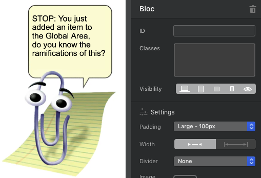
If all else fails, maybe it’s time to hire the retired MS Clippy to talk users through it.