Earlier this week Apple released a brand new Mac Book Air with a lovely new web page. 
I was scrolling through it when I saw a section that caught my eye and decided to remake it in Blocs 6 Plus using a combination of classes and a custom interaction.
This is what the end results looks like, click the + button bottom right to reveal a second pane of information.

I wanted to make this a re-usable section so that it could be easily used multiple times on the same site/page, here is how I did it.
The Interaction 
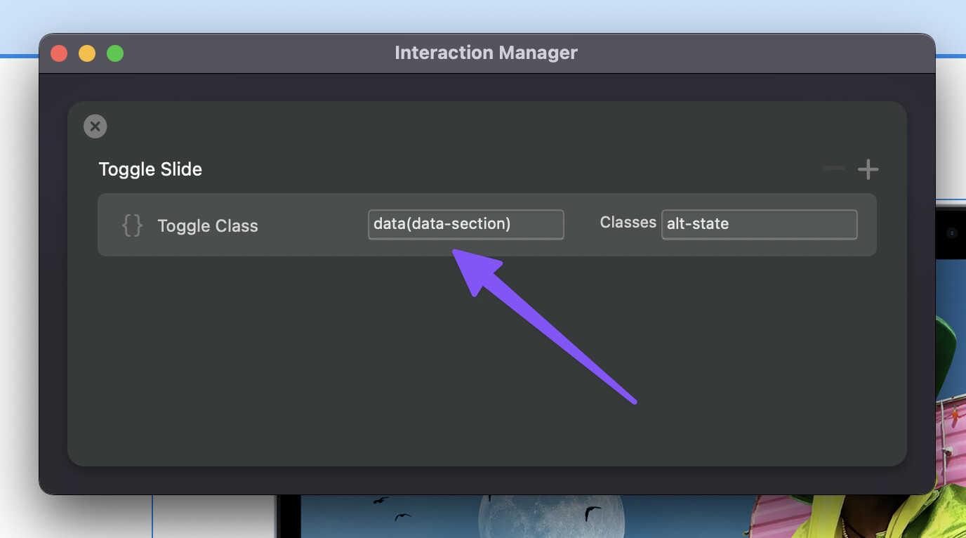
The custom interaction for this one is surprisingly simple, I use a toggle class interaction rule and I feed the target ID from the interaction trigger using data() to feed in the data attribute value data-section.
The Structure 
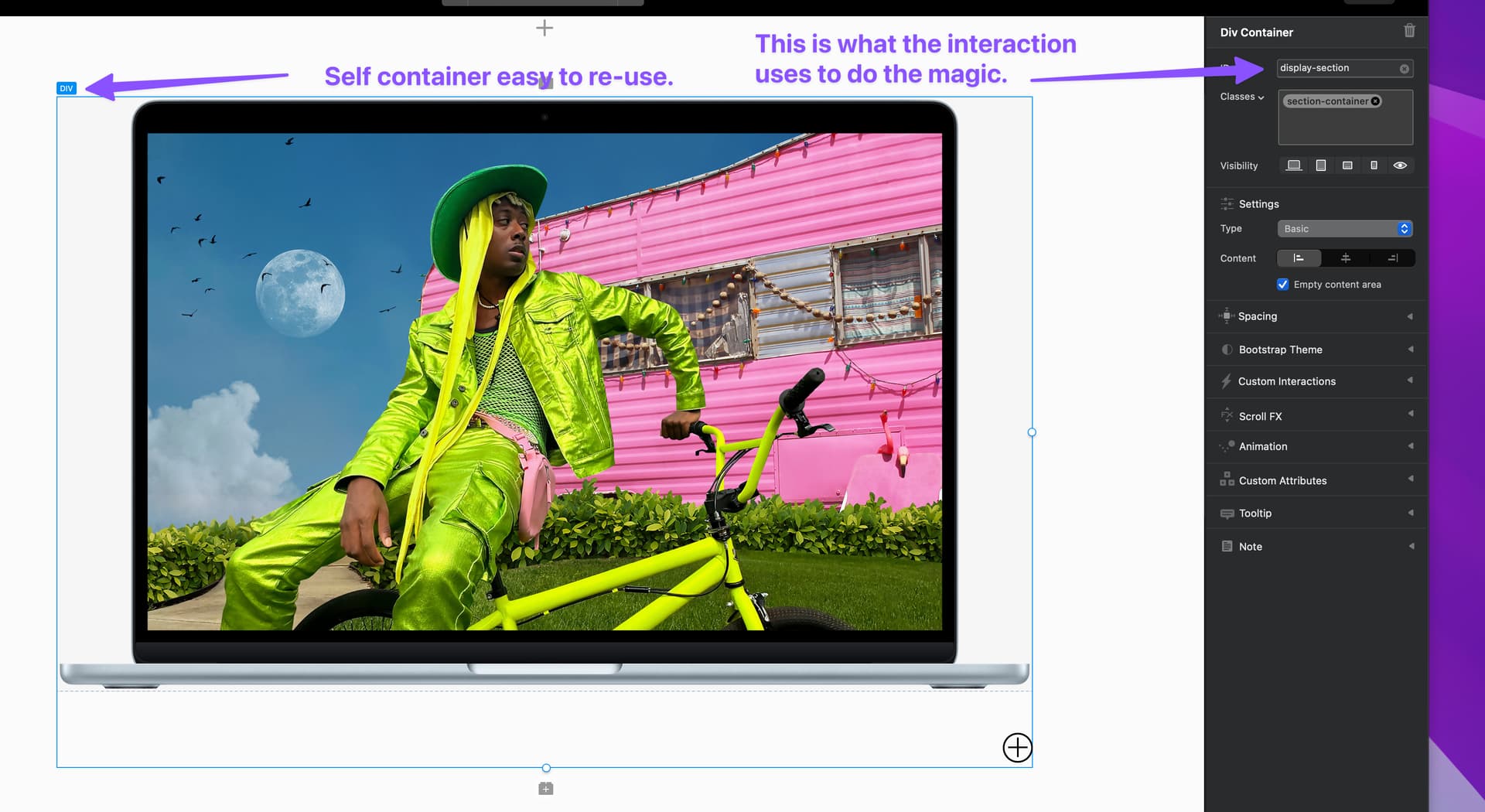
The entire component in housed in a single Div, that uses CSS Grid applied by a class so that I can get the two slides sections to overlap each other.
As you can see from this screen shot, the section has an ID applied (display-section). This main container div is the element my Custom Interaction toggles the alt-state class on.
The Trigger 
The trigger for the interaction is the little plus + button.
On this icon I have a click interaction set (Toggle Slide) and also a custom attribute data-section which is populated with the ID of the main container display-section.

When the trigger is clicked it passes the data-section value into the Custom Interaction which will use this value as the ID of the element to toggle the alt-state class on. 
The Animation
All of the animation is done using CSS transitions, transforms and a class to toggle it on and off for all elements at once.
If you look at the project you will see all animated elements have a base class e.g. .slide-1 and a second class with the alternative state e.g. .alt-state .slide-1
When the container doesn’t have have this alt-state class each element looks one way and when this class is added to the parent div container that original class is overridden with new values, because CSS transitions are used in the classes it animates. 

Rather than get into the weeds with how I animated each part, just take a look at the classes on the parts that animate. 
How to Re-use
As I mentioned at the start, this component is created so you can reuse it within a project easily. All you have to do is duplicate the main div that houses everything. Then change its ID and also update the trigger custom attribute data-section to this new ID.
Final Details 
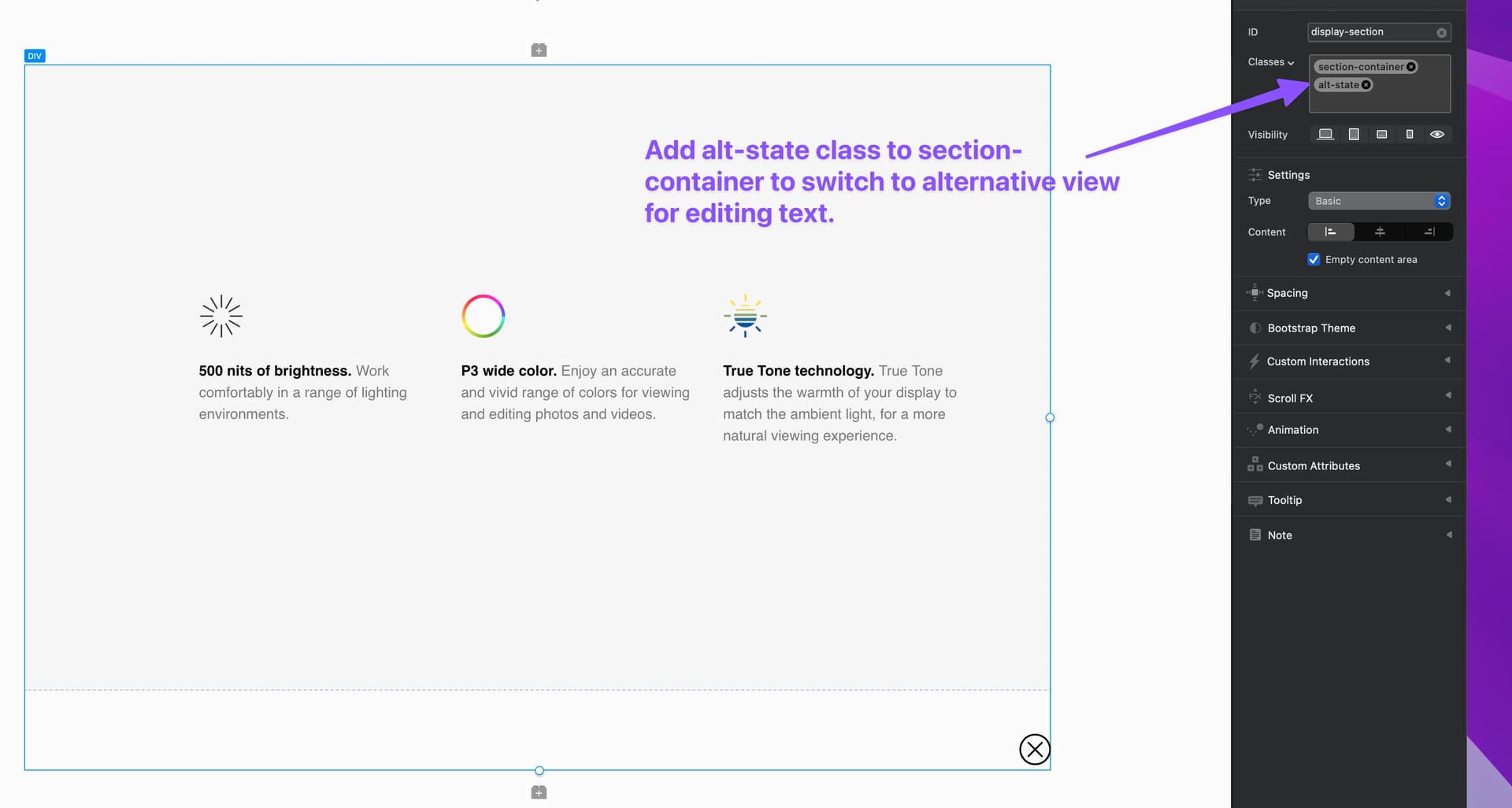
If you want to access the second pane of details for editing just select the main div container for component and apply the alt-state class to it. It will then show the hidden part of the UI.
Because the toggle control is managed within an Custom Interaction, it means you can apply more actions when the toggle is clicked if you want. Maybe play a sound, auto play a video on the second slide, or store a cookie to mark that the visitor has accessed this part of the website. Lots of possibilities now that this is done with a Custom Interaction.
Anyway that wraps this one up, as always you can download the experiment project below (Requires Blocs 6.1 beta 3 Minimum) 