I know Blocs maintains image proportions when I set only the Height or the Width, regardless of whether the units are px, % or vh. But when I mix px units and vh, image proportions are not maintained.
Here’s what I want to do. I have an image that I want to set to a fixed pixel size normally: 572px high:
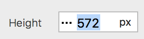
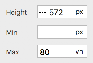
Doing that works great. No problems. BUT, I now want to make sure that image is no taller than the display height. (For example, if I rotate my iPhone to landscape, I don’t want the top and bottom of my image to be out of view. I want the whole image in view.) To do that seems easy, I just add Max 80vh:
The problem is that when I view my page in anything below LG or on small screens, my image gets smashed (proportions are not maintained).
Yes, I know I can maintain proportions by also adding a Max vw size, but since the dimensions of every device display is different, it’s impossible to choose a vw size.
Hence, I cannot figure out how to set an initial pixel size (in my case, Height) while also establishing a way to keep the image from being partially cut off on small screens. I need to set an initial pixel size because my image would be too large in LG otherwise.
Any ideas would be appreciated.
Thanks.