How can I make my footer always stick to the bottom of the page regardless the height of the elements inside?
Practically, when I had my copyright paragraph to the footer’s section it doesn’t really stick to the bottom of the page. There is always a blank space if the content of my page isn’t long enough.
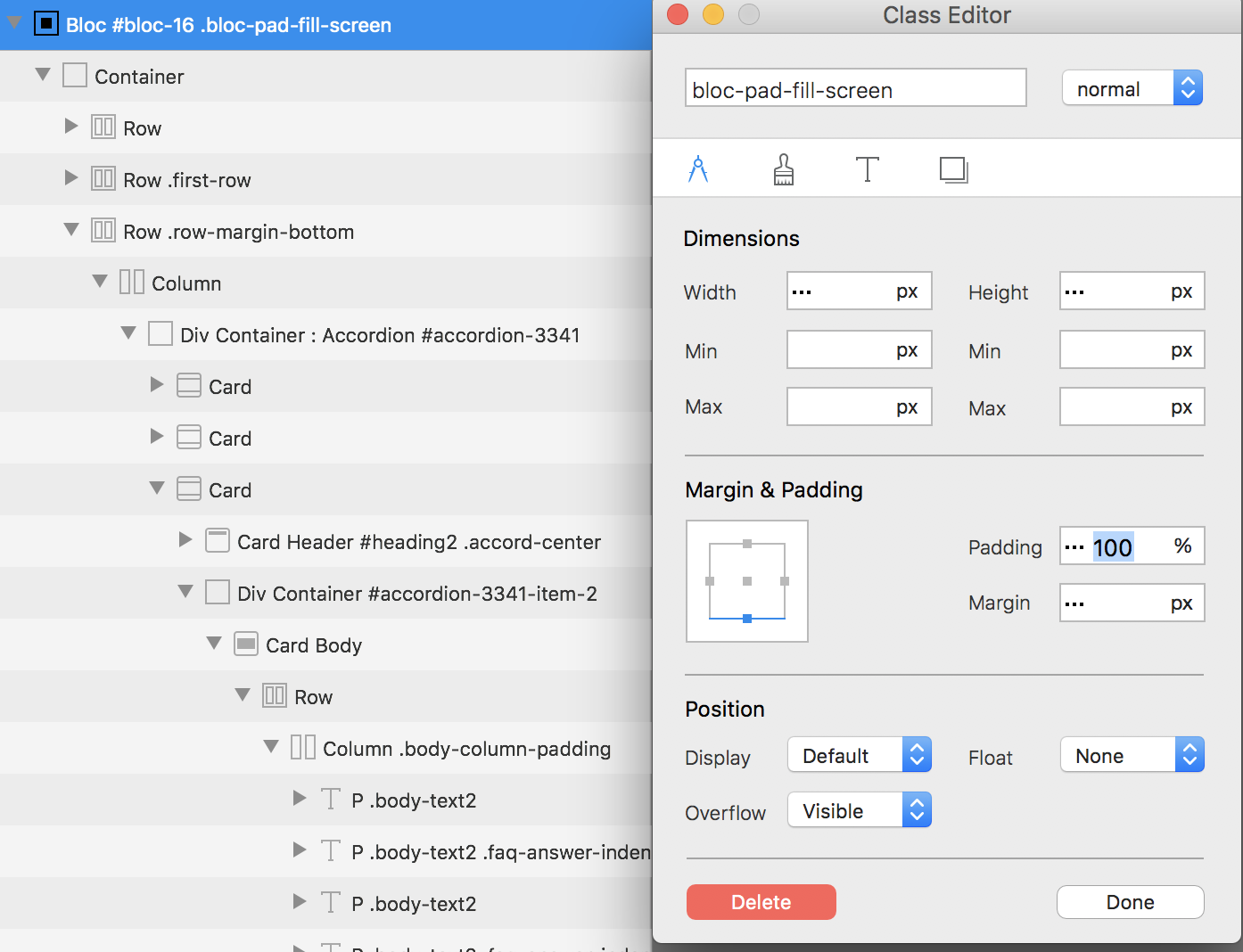
Select the Bloc in the dynamic area and set its padding to fill screen it will force the site to take up the entire screen cause if foot to be fixed to bottom of browser.
What happens when I make the Bottom Padding = 100% is that the gap between the bottom content (middle of my page) and the top of the footer is enormous! Yes, the footer stays at the bottom, which is what I want, but that gap is so bad this trick is unusable. Surely there must be a better way to get the footer to stick at the bottom of the browser window, regardless of the height of Bloc content above it, right?
Let’s ignore that 100% padding tip for now… Here’s how my page looks with a fixed bottom margin of 200px applied to the row containing that accordion:
You can see the problem. Even though I added that fixed 200px bottom margin, the footer is still floating too high above the bottom of the browser window on my large 27" iMac display.
What I want to happen is the black footer (yes, the footer is inside the Global area, by the way) should stay locked at the bottom of the display and the gray area under my accordion should vertically expand to fill whatever gap is there, depending on the height of the display. So on an iPhone that gap would be small because the screen is small, but on a 27" display, that gap would be larger.
Keep in mind I do NOT want a hovering “sticky” footer that always overlays content. I only want to see that footer when I scroll down far enough on the page to see it.
I’ve found some code online, but that doesn’t work, probably because the height of my foot is not exactly the same across all break points. For example, the footer height is the smallest in LG, and the height keeps growing as you go down to the other breakpoints. Hence, I cannot set a fixed footer height in CSS.
On the landing page of www.alfapartners.eu, I would like the footer to be as far as you can scroll.
In it’s current stade, the page scrolls past the footer and into white.
Thanks Jerry.
I thought it could be something like that, but the bloc doesn’t show in the “regular” Blocs interface; so that got me confused.
I’ll dig around to find where it’s at.
Have a good weekend.
So there was indeed a bloc beneath, which I thought was “hidden” as it was used to show a pop up screen (with the legal notice).
I followed your suggestion Jerry, and set this block’s size to 0.
Worked like a charm.
It took me a little bit of time to figure it out but I eventually managed

