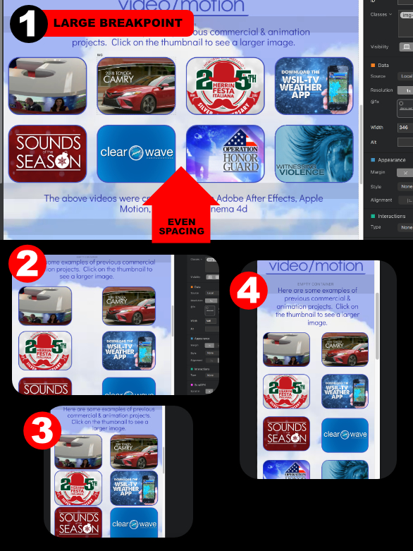
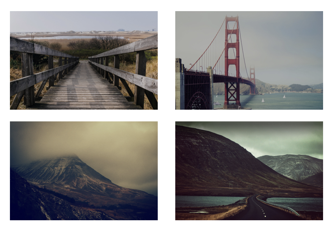
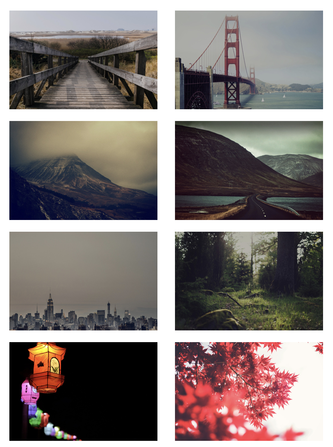
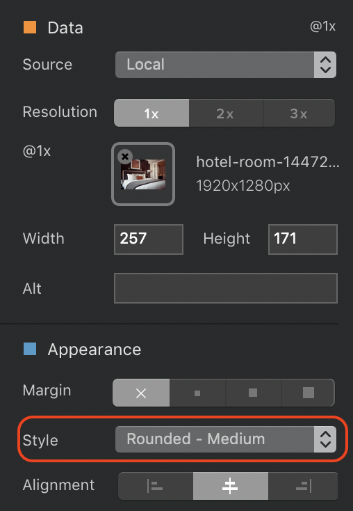
greetings! I am new around here, loving things so far, but i have ran into a strange problem… I want a nicely spaced “grid” of buttons/pictures as seen in section 1 of the attached picture. i created a 4 column row and placed a image in each column. The problem i have is at the other size breakpoints (as seen in image 2-4). How can i get nice CONSISTANT spacing between images (that still flows from rows of 4 to rows of two at the smaller sizes)?
(present underconstruction site is at www.sfostergraphics.com)
Thanks for any help!
This is my latest attempt.
http://www.sfostergraphics.com/dropbox/test/index.html
It’s a little better, but things don’t show up in safari like they do in blocs…
Help??
Hello @sfoster71, try create a 4 column rows, then deselect the gutters, and insert a Div brick in each column. Then click the div and choose center alignment, then inside the div put your button and again center the button.
Try if it fixes your problem.
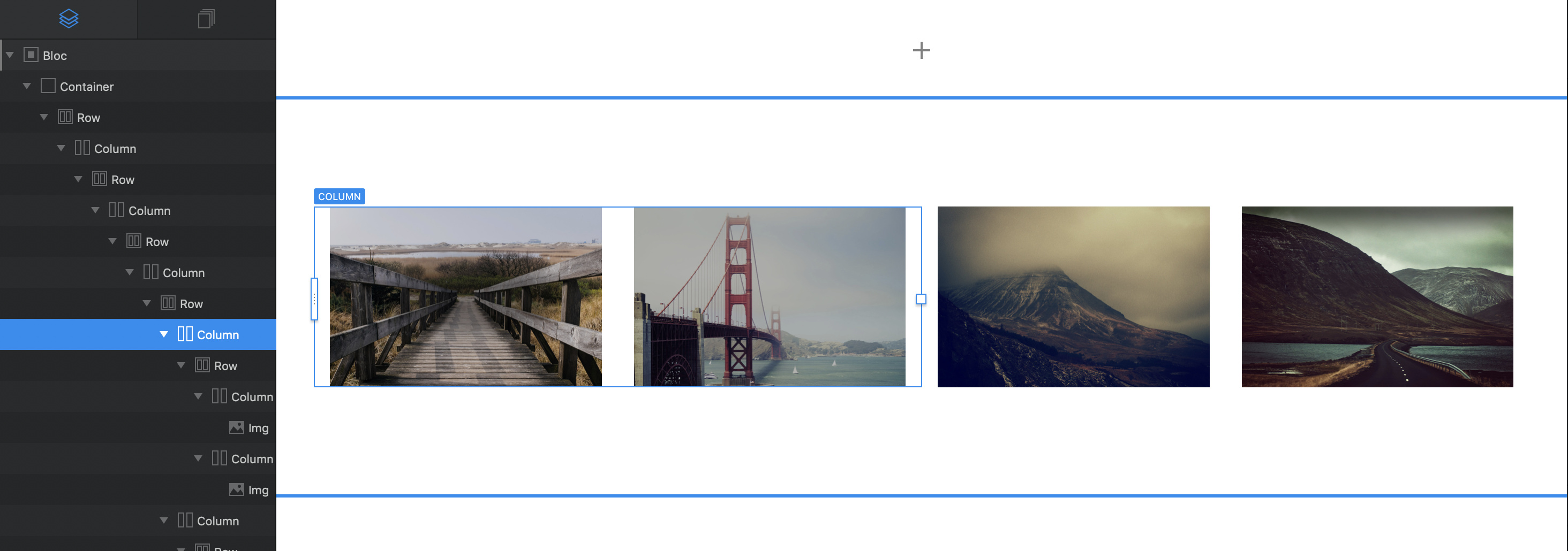
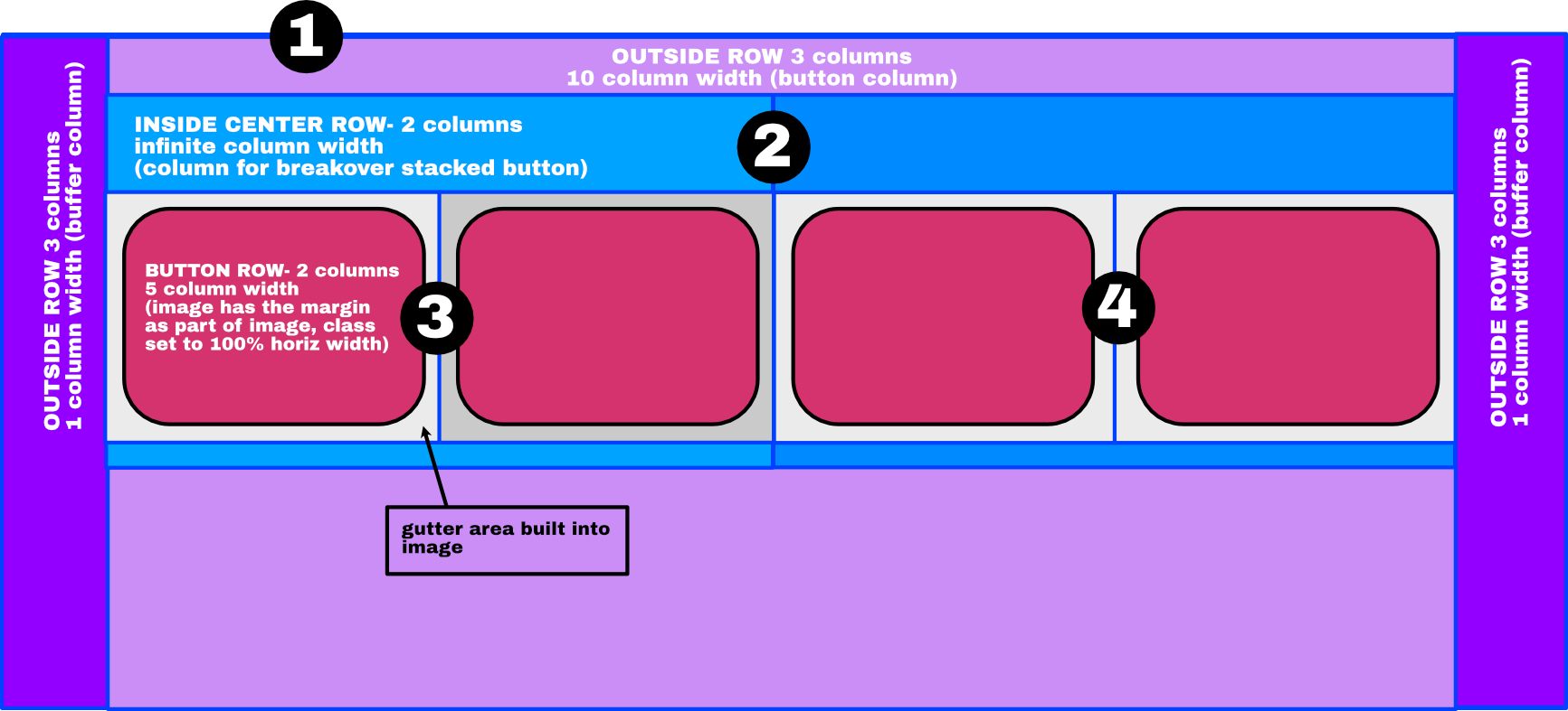
The easy way to do this is to add a standard Structure 2 Column bloc to the page - DON’T Confuse it with a Structure Group 2 Bloc. You should now have something like this:
Next, place a 2 column row BRIC into each empty column on the page to get this result:
You’ve now created a pair of nested columns. This will ensure that on narrow devices, the content will be displayed in a two column format instead of one. Basically, the outer columns will stack one above the other at the breakpoint instead of the individual content columns.
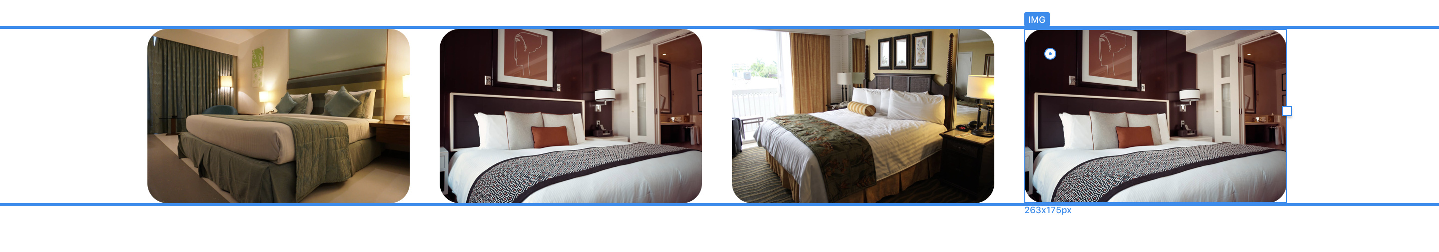
For my example, I’m going to use images, but the content could be buttons or anything else you want.
Firstly, I’ll place an image bric into each column and import an image to each. With the images placed, select the first double-column as illustrated below:
Create a custom class and apply a top margin to create the gutter you want between vertical images (usually the same as the horizontal gutters)
Apply the same custom class to the second double column.
When you view on a mobile, it should look like this:
If you want to create another block of images, remove the padding from the bloc and then duplicate the block. Replace the images in the duplicate. You should now have something like this:
Keep duplicating the bloc to add more images.
1 Like
i have to be doing something wrong… While this does make a 4 row go to a 2 row at the phone size, i still get inconsistant (or none existant) spacing between the images horizontally. I am aiming to have the same amount of space between images in every breakpoint.
I might be wrong, but it appears to me at least that class padding is pretty much ignored in the middle two breakpoints?
here also, is a slightly bigger problem. I have, in the bloc that has the grid of pictures, a centered header image and a centered paragraph with a video background… So making the bloc 2 columns causes a bit of a problem with that arrangement as well…
I’ve been following this post, and I tried hendon52’s suggestion. and I get the result he shows. So perhaps create a screen capture of all your settings in the Class Editor & Layer Tree to post and show for further guidance.
For your second issue, try using a separate bloc above the grid bloc, to place the header and video in, and for that bloc set the padding to none in the properties panel, and then make a custom class for the bloc itself, perhaps called ‘bloc padding’ and add the amount of padding you desire to create the separation between the header / video bloc and the grid bloc.
Blocs are very useful to create space where you need it, and you can gain padding control per breakpoint with a Custom Class for each bloc on the page. Keep in mind, the padding you set in the Custom Class will add to the property panel’s padding setting, which is why selecting ‘none’ in the padding setting makes sense.
Also, an important setting to use for centering elements within a bloc is to use AUTO in a Custom Class for the margin on both left & right margin controls.
Absolutely correct. You don’t have to put everything in one bloc - that’s why we have a bloc structure, so we can create different layouts for different sections of the page.
This issue is likely to be caused by your use of buttons instead of images. To create a button with an image background, you have to create a custom class to get the picture in the background and size the button to accommodate the image. This removes the responsiveness of the button, so you will have to adjust the size of the button class for each breakpoint. It may be better to use actual images and leave them as responsive. You can still add interactions to create links - you can even create a custom class to create a rollover effect. Just remember, when you adjust the size of an element manually, it’s no longer responsive, so you have to adjust breakpoint variants manually.
Well, thanks to all the good advice, I THINK i’ve got it, with an exception…
First, here is my present experiment…
http://www.sfostergraphics.com/dropbox/test/index.html
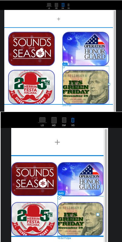
With some of the suggested row/ column “magic” (THANK YOU!) it manages to stick together as it’s supposed to, except in the smallest phone break overpaint, where no matter what I CANT get the group of buttons to center! Any suggestions as to what’s going? This is a rough approximation of how it’s put together.
The outer columns do a good job of holding the images together horizontally, but don’t seem to “scale” at the smallest breakpoint.
ever since I rewired things this way, the Vimeo movie box dimensions don’t seem to register as it exists, because that bloc seems to always cut it in half… eh, but I’m learning!
Thanks folks!
I think you may be overcomplicating matters. The general rule is to let Blocs do as much of the work for you as possible. Firstly, there is no need to create your images with borders, rounded corners or margins. Simply use a normal rectangular image with no embellishments of any sort. If you look at your current page, you will see that the images look pixelated around the border. Letting blocs add the border will remove this pixelation and make the whole thing look a lot sharper.
You will leave blocs to create the white space between the images, and you will have blocks apply the rounded corners and border. To do this, add a two column bloc to the page and remove the bloc padding - set it to none. Then place a two column bric into each of the placeholders. Next, add an image bric into each of the 4 placeholders. You will notice that each columns is separated by a gutter (I thinks it’s about 20px per gutter) this is the white space you need. Now add your rectangle images into the placeholders and set the properties as shown below.
IMPORTANT: do not resize the images - if they are of different sizes or aspect ratios, change them to be all the same size and aspect ratio in an external image editor.
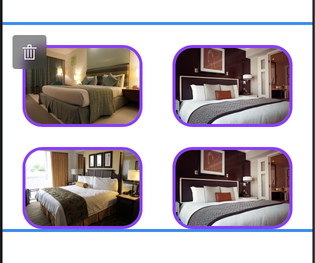
Your images should now be evenly spaced with rounded corners - like so:
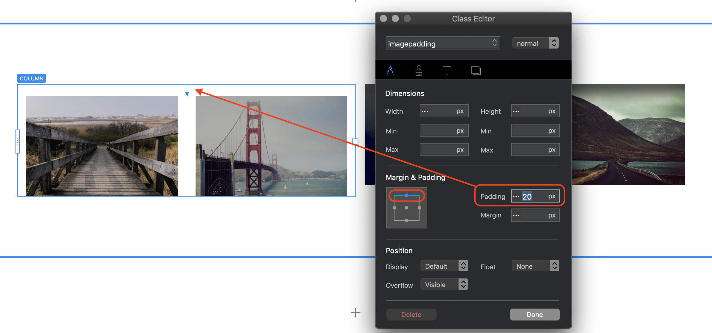
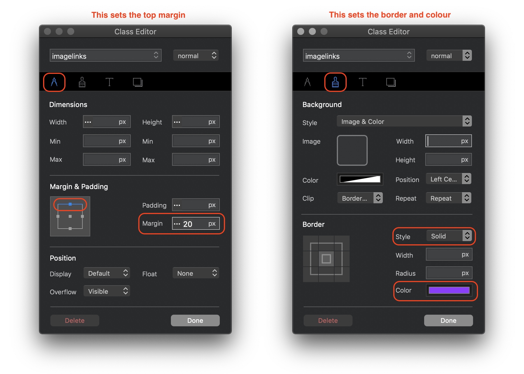
Next, you are going to create a custom class to create the coloured border and to add a top margin of 20px. In my example, I’ve created a custom class named imagelinks. The screenshots below show the setting for the class - select one of the images before creating the class.
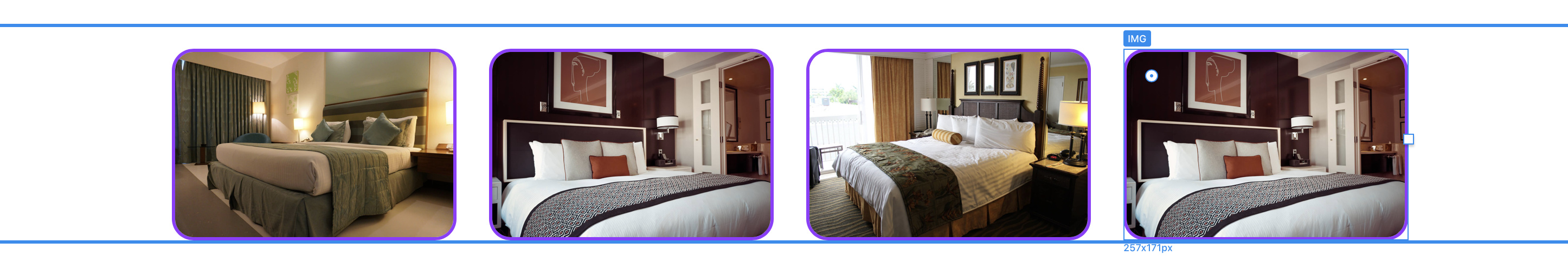
Now apply this class to all the other images. What you should see is this:
All evenly spaced with white gutters of 20px each. When you preview in the smallest breakpoint, it should look like this:
My guess is that the reason you may be getting images that run off the screen is that you may have resized them within blocs - try to avoid this at all costs. Doing so will cause all sorts of problems - leave blocs to handle the responsiveness.