Minimalist Library for Blocs 5 is Live

Hey everyone,

So, Blocs 5.1 is officially out of beta! Thanks to @Norm, @Helen, and the team for this amazing update!

I’m delighted to inform you that last week I launched the Minimalist Library 1.3!

You can read a dedicated post about the new version below.

The fastest way to create websites in Blocs
Over the past seven months, I’ve dedicated almost all my time to developing this product, which I believe will revolutionize website creation in Blocs. It has become my go-to tool for all my projects, allowing me to save a remarkable 80~90% of the time typically spent on building pages and layouts.

Monthly Updates
Moving forward, I will release a new version of the library every month. Some months will focus on bug fixes, while others will introduce a plethora of new sections. There will also be months dedicated to significant improvements, with the next update scheduled for later this month.

To get a preview of all the amazing sections included, head over to BlocsLibrary.com, the website which was also made using the Minimalist Library :grin: As for today, there are 1,070 sections (unstyled, light, and dark styles) included in the package, and many more will be added in the future!

Thank you all for your support and feedback, especially the beta testers who have been providing the feedback since the first alpha versions I released back in January.

Best regards,
Eldar

9 Likes

Hi Eldar,

Thanks for your contributions.

Can you explain how the Bootstrap Light and Dark themes are supposed to work? I assumed some connection to color swatches, where a particular bloc might reference different colors depending on the theme, but I don’t think that was the case when testing your free version.

Further, I also assumed that when using a Dark Styled Bloc from you, that when I chanced the global dark swatch (off black), then every other Dark Bloc would respect this newly changed color swatch. But instead, adding a new Dark Bloc simply added a new ‘off black’ swatch.

I’m looking to pick this up as a time saver, but just want to understand how everything works first.

1 Like

Hi @Pixla,

In this version of the library, Bootstrap Light and Dark themes are not connected to global swatches. They do not have any impact on the global swatches. However, this setting is helpful for Bootstrap elements like Dropdown menus. In the past, I faced issues where I could create a dark-themed navbar, but the dropdown menu would always show the light color. With themes, this problem has been resolved, and now it works much better.

If Blocs introduces a way to connect this setting with swatches, I will definitely incorporate this functionality into my library! :+1:t2:

I recommend avoiding any changes to the four white/black swatches. These swatches are not only used for backgrounds but also for text. If you wish to have a different shade of black, you can make slight adjustments, but it’s best to do so after adding all the sections.

Regarding the Primary and Primary Variant swatches, Blocs supports global changes to these colors. So, if you modify the color for Primary or Variant, it will be applied to all future sections you add. However, regular swatches cannot be edited in the same way (only Primary and Secondary).

For people who want more customization and flexibility, I have made the Unstyled library, which is not using the 4 black/white color swatches, giving you the full control to apply the colors as you want.

You’ve probably already seen it, but I highly recommend revisiting the demo video for more clarity:

Hope it helps!

If you will have any other questions, I am always happy to assist you directly. You can contact me here.

2 Likes

Thank you for your clear and exhaustive answer. I really appreciate that—especially that you elaborate how your template connects to Blocs and Bootstrap, which aids understanding. :+1:t2:

I’ll ask you directly via the link you provided, but one more general question I had—that might be of interest to everyone else as well—is: you say you have optimized for all breakpoints.To me, that is one of the reasons I think this would be a great time saver when building websites. But it kind of depends, I guess, on how well our opinions of “optimized for all breakpoints” align.

I was wondering if you could share a few thoughts on your process when doing this. I’ve gotten the impression that you try to keep current with web development outside of Blocs too. I’m curious about:

Are there different strategies when optimizing for mobile such as: reducing font size to prevent early shuffling/breaking of cards/columns, or is it a no-go to make fonts smaller for the narrower breakpoints? I guess one can say “it’s personal and up to the website builder”, but maybe there is a standard, or preferred way to handle this?

Do you follow any 'best practices here, or have you made judgement calls here and there? At the very least, I guess there is an over-arching strategy to make all of your Blocs coherent across the many breakpoints.

Thanks again!

Edit: I guess what I’m saying/asking is that especially for content Blocs with columns and cards, when you look at it at the large breakpoint you want to think “oh, this was optimized for large”, but then when it collapse to small you’ll go “ah, no, this was optimized for small!”.
And this is not just a question of making sure columns break in the right place and order, but you often need to have elements that only show up on large and small respectively, such as dividers and/or background colors and so on… I hope you understand what I mean.

1 Like

I’ve spent more time with your free Blocs from Minimalst and it looks good overall.

One feedback for future tweaks would probably be to give a little more structure to the xs breakpoint to not fall into this pattern:

where we lose orientation and structure as in the example to the left.

Sure, we get ‘some’ feeling for sections via Bloc padding, but I prefer a clearer design, like in the examples to the right with background colors or dividers.

1 Like

First of all, thanks for all the suggestions and feedback! Conversations like this shape future updates for my products, including this library (which I plan to update every single month)!

Regarding your questions, when I say “optimized for all breakpoints,” I mean that if a user decides to use any section as it is out of the box, all of the font sizes, padding and margins, column offset, order, and width settings, as well as other small details will be adjusted to look great. Of course, as you have mentioned, every designer will decide what exactly they want to have on mobile devices, as there are many possible ways to design certain structures. I do try to follow the best practices in web design (I spend a lot of time looking at the best-designed websites on other platforms), and I also add my input, which mainly focuses on one of my most important rules for all of my products, but especially the Minimalist Library.

This rule is 80/20, which can be applied to any aspect of our lives, but in the case of the Minimalist Library, it refers to my goal to complete at least 80% of the work for the user and leave the remaining 20% for the user to make it personal/customizable enough.

There are a few reasons for that:

  1. I don’t want all of the websites built with this Library to look the same.
  2. In theory, I can further style the sections, for example, by applying the colors to columns as shown in your example, and this will probably make the 80% something closer to 90%. It’s good for some users, but for those who do not want this particular design, it means that they will have to undo the additional 10% of changes and customizations, which wastes time. So, I try to keep the styling as minimal as possible, saving lots of time (80%), but still not making users go back and undo something they might not want to see in their designs.

The early beta testers of the Minimalist UI Kit (how I called this product at the beginning) will remember that I actually animated every single element of every single section. I spent days just fiddling with animations, and in my experience, it looked amazing. Many beta testers loved that, but some didn’t, and for these users, undoing the animations I added to every single small element took more time than it would take to add the animations from scratch (as there is no way to strip the whole section of animations in Blocs at the moment).

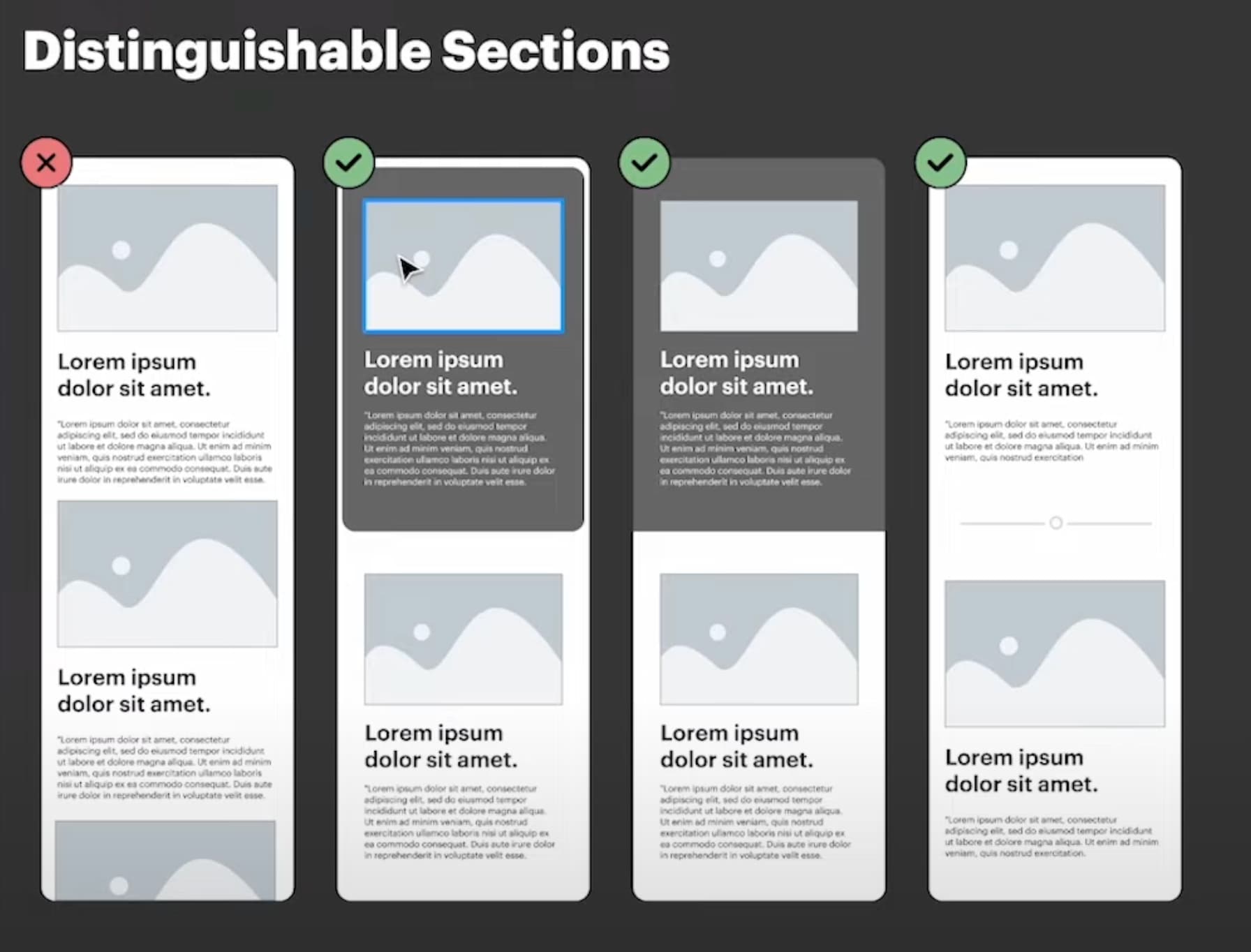
In any case, going back to mobile optimization of the sections, I tried to style as little as possible, focusing on editing the Margin and Padding to separate the sections. That being said, your suggestion is very useful, and I will think about how I can further improve my designs without adding intrusive adjustments. Perhaps adding some dividers that are only visible on mobile devices. Thanks for the suggestion! :+1:t2:

2 Likes

I understand—thanks!

I already took the plunge anyway as I figure I will save a lot of time (the only true currency) by going through your courses and base designs off a single design system (for sites that are suited for that style).
But I have to say that generally, I lean towards “content is king” and in that case, the copy itself and the actual information on the site should get the most attention and the design can take a step back (but it should look clean, professional and coherent). Your package here has convinced me and it strikes a nice balance. I can see that it’s based on the most popular “typical” ways to lay out sections (blocs) or web pages anyway. I’m looking forward to going through your videos and I’ll reach out with questions directly via Blocsmaster as I plow through them.

2 Likes

I completely agree with you!

Many beginner designers are focusing too much on small design details that literally make zero difference to the website visitors or the conversion rates (in the case of e-commerce websites).

Anyway, I’m looking forward to helping you become a Blocs Master! You know where to find me, and I am always here for you.

Best regards,
Eldar

1 Like

@Eldar Hi, are all these items self-hosted in a way that no fonts, icons etc. are loaded from external sources by default? Thank you.

1 Like

Hi @Fuellemann

Yes, Everything in inside your Blocs app.

1 Like

Thank you!

1 Like

Minimalist is looking great! 1.4 already! Question, if I purchase minimalist lifetime, will the upcoming blogging course be included or is this strictly for Blocs Master subscribers?

1 Like

Hi Mark,

Thanks! The Minimalist Library is awesome, and I use it all the time for my freelance projects.

The two upcoming blogging modules will be added as free additions to the Blocs 5 Course, and as you mentioned, will also be available for free to all existing Blocs Master members.

2 Likes