Hi,
I have two questions:
- I have designed this page but as you can see the cars listed have different names length and this misalign the accordions placed below. How can I solve this problem?
- I don’t want the accordions to collapse when opening the page, is there a way to change this behavior?
Thank you very much for your help!
Some names have a very long name and some much shorter.
C3 Aircross PureTech 110 S&S EAT6 Shine
C3 PureTech 82 S&S Feel
If you make them all the same size that fits into the largest text area the text will be very small.
I think I would make all of the product titles two lines.
You can either add a return after the one with one line (adds more space below) or you could make each one have two lines.
C3 Aircross PureTech
110 S&S EAT6 Shine
C3 PureTech
82 S&S Feel
On the accordions, when I opened the page they were all open?
Casey
Thanks for the reply and the tips!
When I open the page the “Extra equipments” accordions are open, but I don’t want them to stay close…
I’m not totally following what you’re trying to achieve. I think the page would look a lot better if all the tabs were closed when the page loads. This would show more of your choices (cars) on the screen when the user opens this page. If they want to learn more about the car they can click the tab.
If you want all the tabs to be closed when the page loads you have to delete the first tab when you place the default 3 tab bric.
Hope this helps
Casey
That’s exactly what I was trying to achieve!
Thanks Casey!
1 Like
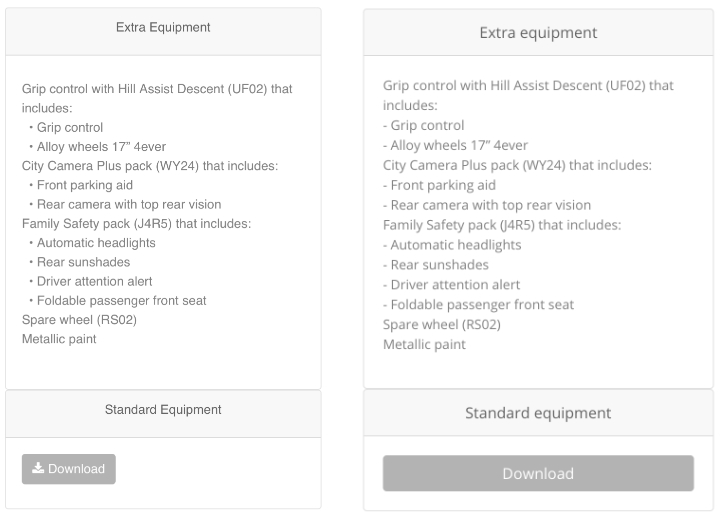
@espositodnl86 Wow, what a huge difference that made. The only thing that was hard for me was reading the specs. The text seems to all run together for me. Maybe either change to a bullet or add a couple of spaces before so that the included items stand out more. Nice job.
casey
Here’s an example. The bullets are just made with an emoji.