Hi,
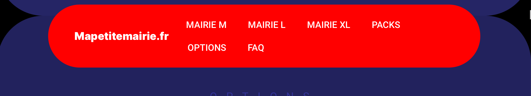
Is there a way to rise the breakpoint’s width in order the avoid two lines nav-menu as there ?
Thanks for eventual return…
Hi,
Is there a way to rise the breakpoint’s width in order the avoid two lines nav-menu as there ?
Thanks for eventual return…
In the UX/UI logic, when you have this kind of 2-line menu problem, you go straight to the Burger menu. I don’t know if you can change the breakpoint, as it’s defined for standard screens in general. And to help you think about it, do you think that changing the breakpoint would prevent 2-line display? We’re on standard screen sizes, so it’s wiser to switch to the burger menu for this breakpoint. I hope I’ve been able to help you
Hi Alpha,
Thanks for reply.
Yes it’d be great to avoid those two lines (in fact an auto-trigger would be awseom), indeed there are two lines on a gap of 2oo px width of browser.
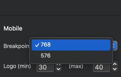
And there is only those two parameters as on image upper with Smart Nav and Esay Burger (maybe based on bootsrtap), or I may omit one way.
Btw maybe idrectly by code ? If someone has an idea I’m taker…
Although you can change Bootstrap,breakpoints there is usually no need to (it’s not advisable to mess with it, if you don’t know what you are doing), as you can use media queries in css to define your own min and max widths per selector. I often do this for menus, to stop wrapping. Eg, I will have the menu collapse at the right width for the menu.
Looks like you are using Smart Nav, in which case you need to find the CSS class that’s being used, and then add some css to override it, eg a media query,
Lots of info online for media queries in CSS.
Hi Pete,
Thank for reply. Didn’t thought about min/max width, gonna try tomorrow…
(If not it does not deserve as much time to search, I hoped a known and easy solution in fact.)
It is an easy solution.
The long bit is the learning. 
Then i’ll reduce margin between elements, thanks to Blocs no need to spend time to become code expert for this