Hello everyone, my first work with Blocs app version 4. https://milespersis-dj.de/. I hope you like it.
2 Likes
That’s a great start, well done. Just looking on my Mac just now there are two points I would change.
The first is that the body text using the Poppins font could be a little bigger and perhaps a heavier weight for easier reading.
In one part you have six columns with a background image. I find that image distracting and would remove it. Obviously just my opinion and it’s a good start.
2 Likes
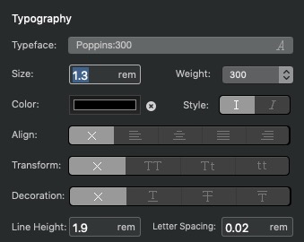
Nice job, I like using Poppins also but I find if you want to use it without making it bolder I make it a little larger with a few additions. Try this setup. It may look a little large at first but in terms of readability, I find it’s better for visitors. You are using colors that look nice but the contrast between the background color and text can make it harder to read. Another reason to make the text a little larger.
IMO the six columns would look better if each column was separate, instead of two rows of three. Some space around each column would look better.
Nice job,
Casey
1 Like
Excellent job. Not so keen on the parallax image background - I would remove it.
1 Like
Would have to agree with that…but a terrific looking site…
Rich the Weather Guy
1 Like
Thank you all for your advice, this is how we learn.