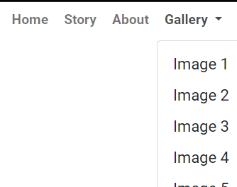
Having fun playing around with html and css making a Nav Menu with cool hover link expanding multi-color feature. It works in CodePen.
HTML
<!DOCTYPE html>
<html lang="en">


<head>
  <meta charset="UTF-8">
  <meta name="viewport" content="width=device-width, initial-scale=1.0">
  <link rel="stylesheet" href="https://cdnjs.cloudflare.com/ajax/libs/bootstrap/5.0.0/css/bootstrap.min.css">
  <style>
    /* Custom CSS for the navigation menu */
    .navbar {
      background: transparent !important;
      font-family: 'Roboto', sans-serif;
      font-weight: bold;
      font-size: 14px;
      padding: 0;
    }


    .navbar-brand {
      font-size: 14px;
    }

    .navbar-nav .nav-link {
      padding: 0.5rem 1rem;
    }

    .navbar-nav .dropdown-toggle::after {
      display: inline-block;
      margin-left: 0.255em;
      vertical-align: 0.255em;
      content: "";
      border-top: 0.3em solid;
      border-right: 0.3em solid transparent;
      border-bottom: 0;
      border-left: 0.3em solid transparent;
    }

  </style>

  <title>Nav Menu with underlin link</title>

</head>

<body>

  <nav class="navbar navbar-expand-lg navbar-light bg-light fixed-top">
    <div class="container-fluid">
      <!-- Logo with link on the left
      <a class="navbar-brand" href="">
       <img src="" alt="" width="50" height="50">
      </a>
 -->

      <!-- Menu on the right -->
      <button class="navbar-toggler" type="button" data-bs-toggle="collapse" data-bs-target="#navbarNav"
        aria-controls="navbarNav" aria-expanded="false" aria-label="Toggle navigation">
        <span class="navbar-toggler-icon"></span>
      </button>

      <div class="collapse navbar-collapse justify-content-end" id="navbarNav">
        <ul class="navbar-nav">
          <li class="nav-item">
            <a class="nav-link" href="#">Home</a>
          </li>
          <li class="nav-item">
            <a class="nav-link" href="#">Story</a>
          </li>
          <li class="nav-item">
            <a class="nav-link" href="#">About</a>
          </li>
          <li class="nav-item dropdown">
            <a class="nav-link dropdown-toggle" href="#" id="navbarDropdown" role="button" data-bs-toggle="dropdown"
              aria-expanded="false">
              Gallery
            </a>
            <ul class="dropdown-menu" aria-labelledby="navbarDropdown">
              <li><a class="dropdown-item" href="http://example.com/image1.jpg">Image 1</a></li>
              <li><a class="dropdown-item" href="http://example.com/image2.jpg">Image 2</a></li>
              <li><a class="dropdown-item" href="http://example.com/image3.jpg">Image 3</a></li>
              <li><a class="dropdown-item" href="http://example.com/image4.jpg">Image 4</a></li>
              <li><a class="dropdown-item" href="http://example.com/image5.jpg">Image 5</a></li>
            </ul>
          </li>
        </ul>
      </div>
    </div>

  </nav>

  <!-- Bootstrap 5 JS -->

  <script src="https://cdnjs.cloudflare.com/ajax/libs/bootstrap/5.0.0/js/bootstrap.bundle.min.js"></script>

</body>

</html>
CSS
.navbar-nav .dropdown-toggle::after {
  display: inline-block;
  margin-left: 0.255em;
  vertical-align: 0.255em;
  content: "";
  border-top: 0.3em solid;
  border-right: 0.3em solid transparent;
  border-bottom: 0;
  border-left: 0.3em solid transparent;
  /* Custom SVG chevron for the dropdown toggle */
}

/* Custom styles for the expanding underline effect */

.navbar-nav .nav-link {
  position: relative; /* Establishing a positioning context for the pseudo-element */
  font-weight: bold; /* Making the text bold */
  padding: 0.5rem 1rem; /* Adding padding to the navigation links */
}

.navbar-nav .nav-link::before {
  content: ""; /* Creating a pseudo-element for the underline */
  position: absolute; /* Absolutely positioning the underline */
  bottom: 0; /* Positioning the underline at the bottom of the link */
  left: 0; /* Positioning the underline starting from the left */
  width: 100%; /* Making the underline span the full width of the link */
  height: 3px; /* Setting the thickness of the underline */
  background: linear-gradient(
    to right,
    blue,
    red,
    blue
  ); /* Applying a gradient background to the underline */
  transform: scaleX(0); /* Initially hiding the underline with no width */
  transform-origin: left; /* Setting the transform origin to the left */
  transition: transform 0.3s ease; /* Adding a transition for smooth animation */
}

.navbar-nav .nav-link:hover::before {
  transform: scaleX(1); /* Expanding the underline to full width on hover */
}
 but if that’s the case you won’t be able to show