Here’s a work in progress: http://wildevoegel.fynndesign.de
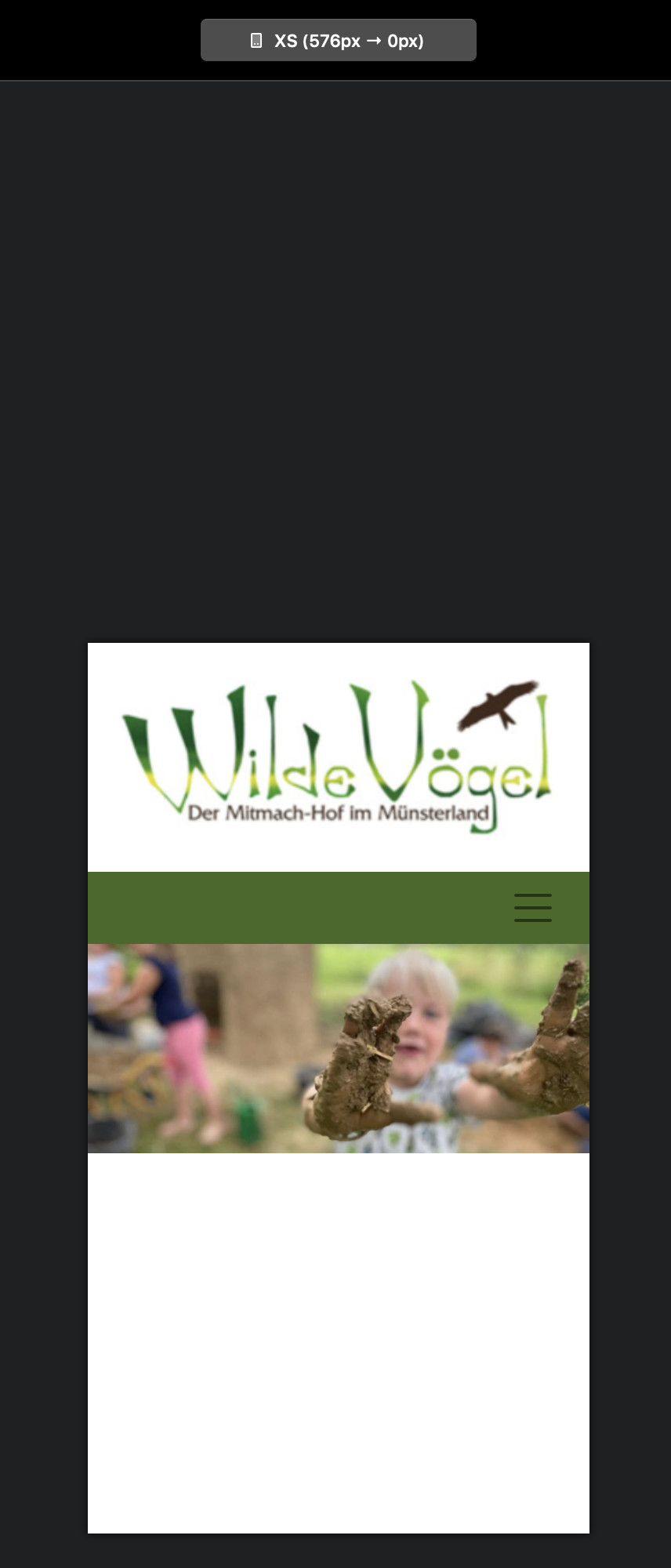
When you reduce the width of the browser window, the navigation background leaves a small white gap at both sides and I wonder if I can get rid of those, or rather color them green as well since the space is needed for the mobile menu.
Any ideas? I’d love to have both, the navigation and the image will the screen width on smaller devices. But how? It might not be needed, but I would just like to know if and how that is possible.
I’m just trying to copy the layout of an existing site, just make it responsive so the client gets an idea what responsive means at all. The original and old site can be seen here: http://wilde-voegel.de
Yeah, tried that, but that makes the nav-background wider than the image and still leaves a small gap on smaller screens.
Here’s the blocs project, should anyone find a way: webgo Webspace-Admin
Maybe I am thinking too complicated once more 
No, I want it like on the original page: navigation background and image at the same width, but responsive, so that it fills the whole width on mobile devices, with no space left or right). The way it is now, it does not work. Tried this with RW8 and Foundry, wich uses Bootstrap 4 too. Done in 1 Minute. Why is that not doable in Blocs right away? I don’t want to use RW 
btw, I have not added assets to the blocs project. Corrected that now. It’s only the homepage (Startseite) so far.
The easiest way to deal with this is to duplicate your navigation bloc. Set one to full width and the other to page width. Use the visibility options to set which one displays on what device. Effectively, the full width navigation will be visible on mobile devices (no white space on either side) whilst the page width version will be visible only on desktop and laptop.
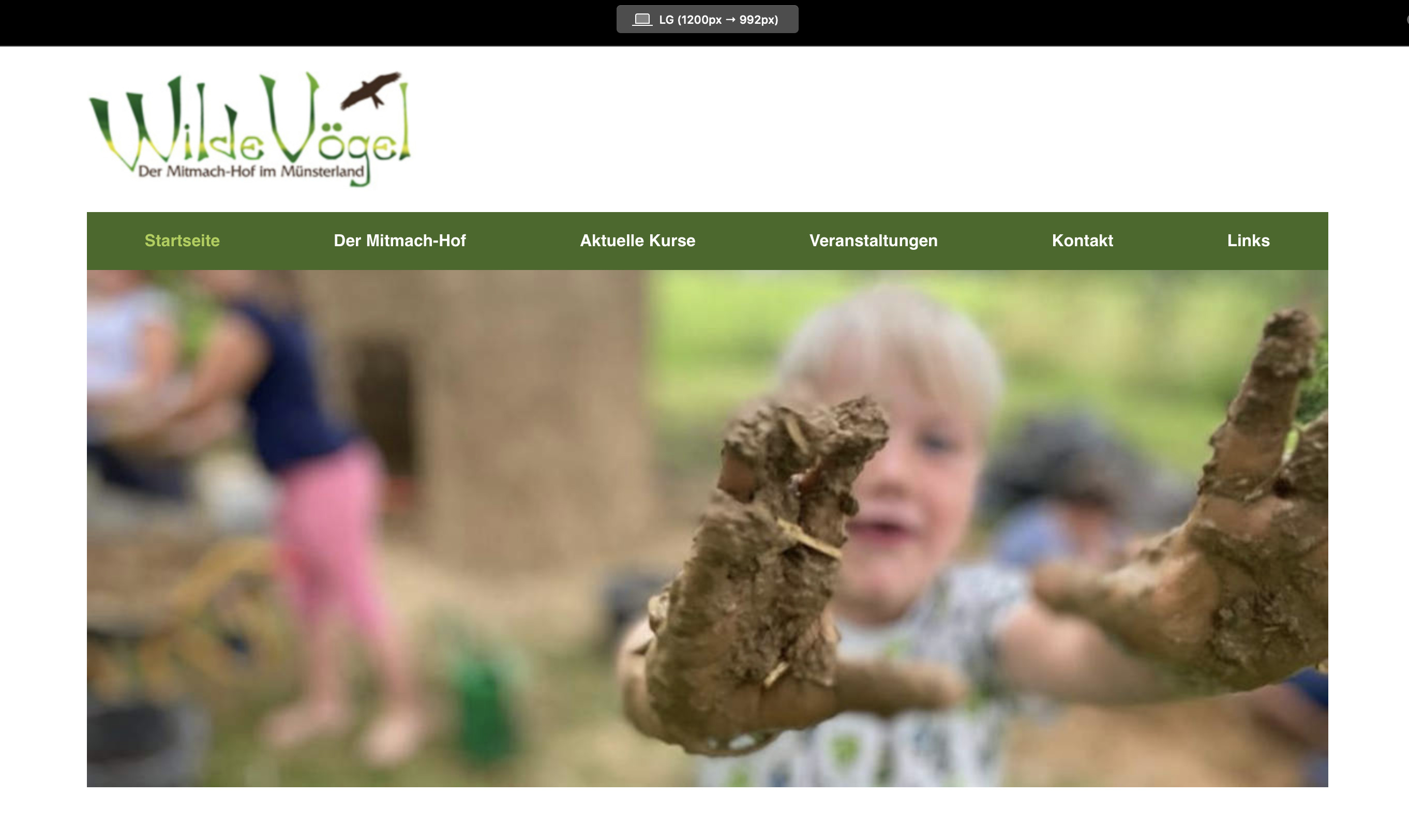
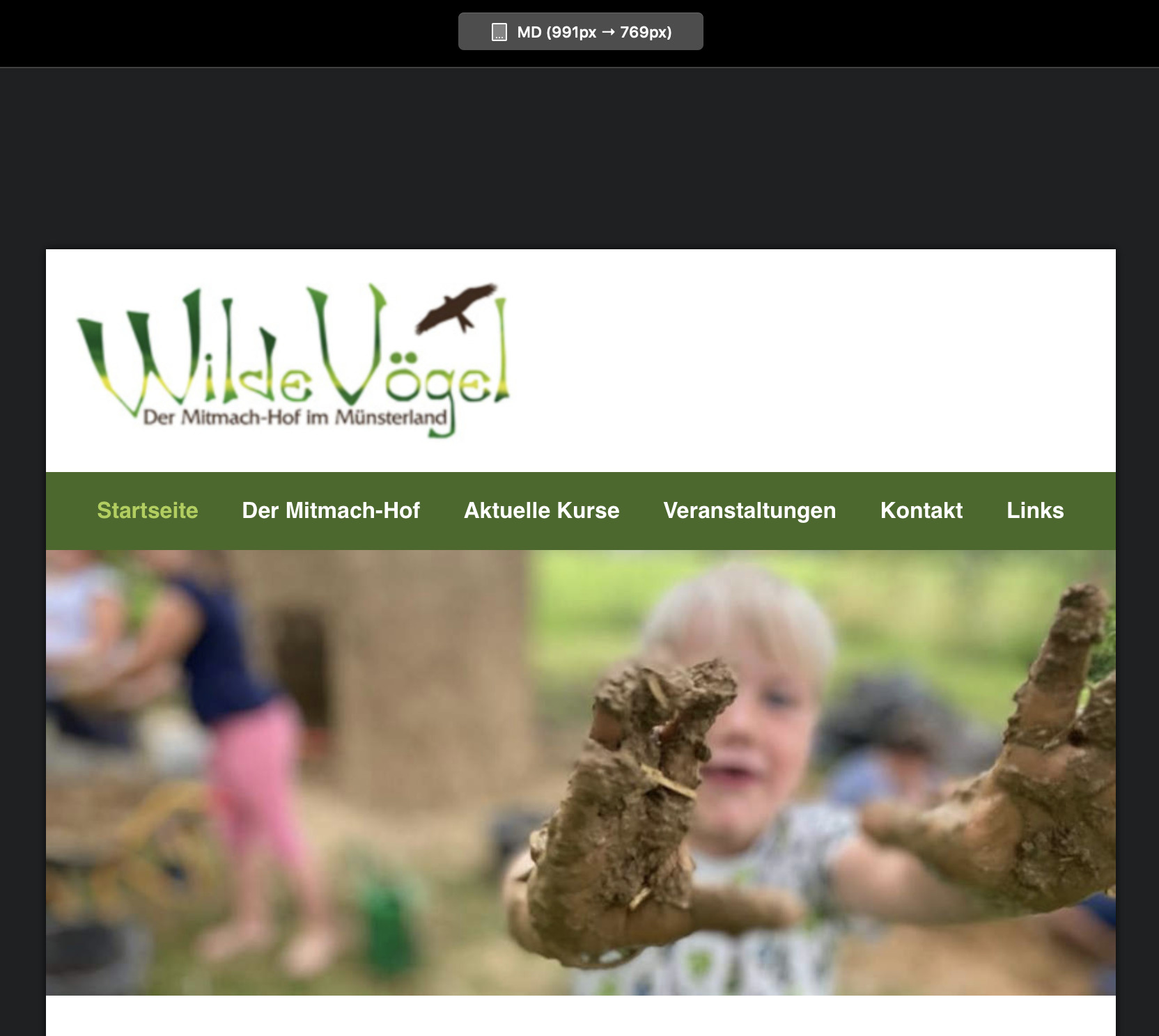
Getting there, but try that on the homepage (Startseite) and you’ll see the issue. Added the assets to the blocs file, so you can actually see what I mean.
If you mean like the images below, just use the solution I suggested in my last post. Duplicate the nav bloc and use visibility to show how you want it. All I did for the smaller breakpoints was add a background colour to the navigation block that displays on these breakpoints, whilst leaving the nav bloc for the largest breakpoint to no background colour. I think it does what you are trying to achieve.
1 Like
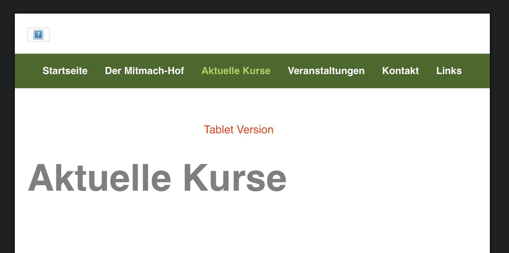
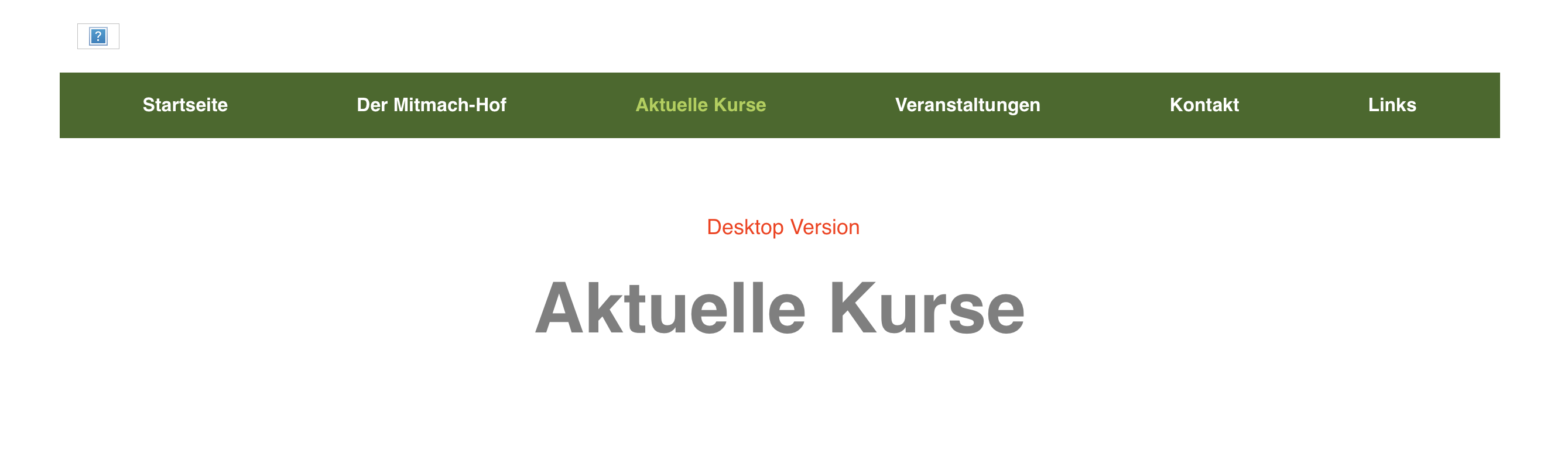
Thank you. While the works when I simply select the breakpoints, reducing the size by hand shows a white are around the navbar, when the image is already at full width, shortly after the other navbar shows and it looks ok again. I don’t want that to happen and I wonder how I can do that. In RW with Foundry, easy as pie, but I prefer to use blocs.
Not sure I understand. You don’t have to resize anything. Just duplicate the nav bar and on the duplicate add a background colour to the duplicate bloc ( the same green as your nav bar background). Have that bloc display on all the mobile breakpoints and make it invisible on the widest breakpoint. Likewise, with the original nav bar, have that display on the widest breakpoint and make it invisible on the other breakpoints.
If I’ve misunderstood something, can you tell me which of the sample images I posted is wrong - I may then be able to get a better idea of the problem.
There’s nothing wrong with your sample images. I made a screen recording to show what I mean: webgo Webspace-Admin
Call me nit-picking, but I don’t want that to happen. And I think that should be doable.
Found a solution. Using a class for the navigation bloc, set the max-width to 1200px and margin-left/right to auto. The bloc below got an image bric with the image (which is 1200px wide), set the blocs-width to full width and unchecked “include gutters” from the row. This way the image scales nicely.
http://wildevoegel.fynndesign.de
1 Like