On the brick store I see you have issued version 1.4.9, but on Gumroad I only find 1.4.7
I used 1.4.7 in a design in December 2020, but now after upgrading Blocs to 4.2.2 (Bootstrap 4) the button and card is not clickable anymore. It is supposed to toggle a modal. In addition there is a small button below the image used as well.
Any info on this?
I purchased the Black Friday bundle last year and can’t see it in my Gumroad library.
How I would make sure to catch the latest versions of those products?
I need to talk about an issues that I may have brought up in the past. Card Designer is a really great tool and i love using it. There is just one thing that I’m struggling with.
I would like to see a feature which allows me to set text sizes at the different breakpoints. The way the card design is set up now, you set one Titel Text size, and then check the responsive box and let CD do the rest. This doesn’t seem to work too well for me.
First of all the difference in the text sizes across breakpoints is too much for my taste. For example, if I set a title height to 40, check responsive, and look at the text size at the smallest breakpoint, the title size is on 1em, which is too small for a H2 title at the smallest breakpoint
Also another issue I have with responsive setting in CD is that the setting is also based on column width, regardless of breakpoint. So if I make a gallery with 1 column width of 8, and the other column width of 4, when i view this at the largest breakpoint, the title text sizes are different for the 8 column as compared to the 4 column width.
Another thing I tried using is setting the “Text Size Level” setting for Medium and Small Breakpoints. Here I notice that changing small setting doesn’t have any affect on the title size at the breakpoint small. But if I change the Text Level Size for medium, it changes the text size at the small breakpoint. ??
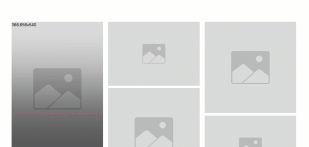
Here is a screenshot illustrating what I mean. Take a look at the differences in title size. This happens because of the difference in column widths. What am i doing wrong?
Have a great Christmas! Say hi to the Windy City for me
First of all the difference in the text sizes across breakpoints is too much for my taste. For example, if I set a title height to 40, check responsive, and look at the text size at the smallest breakpoint, the title size is on 1em, which is too small for a H2 title at the smallest breakpoint.
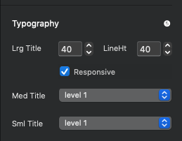
Change the value for the smallest (Sml Title) size to your liking.
There are 3 sizes (above). As a column changes width, your card will fall into one of these buckets.
Lrg Title
Med Title
Sml Title
You are correct that the values are all take from the card size, not the breakpoint. The thing is, you have to make you columns. behave the way you want them to, not the card. For instance (by default) the smallest breakpoint IS actually a larger column than you get in a 3-4 column layout. A common trick is to adjust padding at that breakpoint, then the card will follow suite!
It’s actually a tough concept to grab for some seasoned developers. There’s no wonder why Card Designers is unique to web design tools!
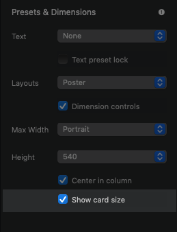
Show Card Size
I don’t talk about this unique feature enough. It’s super useful to really understand what the columns are doing at each breakpoint.
If you ever want to see what’s happening to Bootstrap columns as the page is resized turn on the feature “Show card size”. Don’t forget to turn it off in production
Preview the page and take a look at the actual column size in Bootstrap. Resize the page and the value will update.
There are 3 sizes (above). As a column changes width, your card will fall into one of these buckets.
Lrg Title
Med Title
Sml Title
You are correct that the values are all take from the card size, not the breakpoint. The thing is, you have to make you columns. behave the way you want them to, not the card. For instance (by default) the smallest breakpoint IS actually a larger column than you get in a 3-4 column layout. A common trick is to adjust padding at that breakpoint, then the card will follow suite!
So if I understand correctly, I should basically ignore columns, and try to size things based on the “Show card size” value? Also it would be very helpful to understand exactly how the “small medium large title” and the settings “Level 1-12” all come into play with regard to the Bootstrap breakpoints.
I still haven’t figured out how this works, As I wrote, I tried using the “Text Size Level” setting for Medium and Small Breakpoints. Here I notice that changing small setting doesn’t have any affect on the title size at the breakpoint small. But if I change the Text Level Size for medium, it changes the text size at the small breakpoint.
So now I have to assume that your setting for “Sml Title” has nothing to do with the Bootstrap breakpoint “Sml” – is that correct? If that’s the case, how do I know what “text level” setting should fire at which bootstrap breakpoint? “Med Title” for Bootstrap breakpoint “Med”, or Bootstrap breakpoint “Sml”, or ???
As a column changes width, your card will fall into one of these buckets.
OK, then how can I find out which “column width change” corresponds to “Sml Med Lrg Title” ?
Any idea how you change the heading of the text, I have a card designer near the footer, which uses the H2 tag, how do I change it to label or paragraph?


