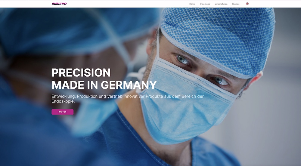
Hey guys, I’m working on a new website for an endoscopy company. It is still under development. There isn’t much text So it’s a bit difficult to fill the pages.
It’s a great start! I like the design lines on the left of the divs. The text size is perfect and it reads well. The contrast between colors and text helps. Maybe try adding a little animation to the images that overlap the columns on each side, fade or slide?
This is another example of a clean layout where less is actually more.
Hey Casey, thank you. Unfortunately the customer don’t like animations on his page. I thought the same like you I had to remove it. But thanks for this good idea.
Yes I had this happen to the website on my mobile too.
I do believe this is associated to the bug on mobile that I’ve had all year.
@Norm I filed a report a while back & was told there is a menu update coming, do you know when this is coming as getting desperate for the mobile menu issue to go and it’s seen here too.
I see @RME has removed the X (close) to eliminate the problem of the menu not closing but from the video above - other problems creep in.
Thanks Norm do hope this fix is coming soon !!! - pleassssseeee!!!
 I had to remove it. But thanks for this good idea.