New user, 2 questions: menu position & hero page on mobile

Hi everyone,

I’m a brand new user of Blocs and this is my first post, so thanks for letting me join this community and special thanks to Norm for this fantastic app!

I’m a professional writer and journalist from Berlin, I have some experience with DTP (mainly inDesign, Photoshop, QuarkXpress from way back), I have zero knowledge with html or anything else related to website building. The last websites I’ve put together wer iWeb-Sites from around 10 years ago.

Finally, I have the time to update those dated homepages. I like the look & feel of Blocs, it’s the first »modern« website editor I’ve tried and so far I like it so much that I’ve not even tried the competition.

I built the first rough sketch for my wife’s homepage:

Putting together the page, I ran into two problems I couldn’t solve with the help of support documents or forum search:

Problem No. 1:

I use the »mountain hero« as a basis for my hero page. I use no global header, menu and company are in the top dynamic bloc. I use the hamburger with sidebar menu on all three settings, even desktop. Everything’s fine, except that on my wife’s computer the hamburger and company sit really far up when she summons the site. So far, indeed, that the first three menu items are not visible and there’s no way to scroll upwards. Here’s a screenshot:

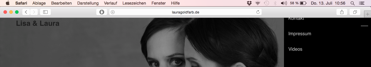
My wife has a Macbook Pro 13" from 2010, Safari is Build 8.08.

I tried to move the menu down on the page by assigning a class and playing with the padding, but I could only move it up, not down.

Problem No. 2:

Mobile view is fine for all elements except the hero bloc. Again using mountain hero as a basis, the image and font do not scale down in mobile view. I found a work around by creating a seperate hero bloc for the mobile view that’s not visible in desktop / tablet mode, but I’m sure there’s a more elegant way.

And (not a problem, but just something I need to understand) again in the mountain hero I’ve changed the font size of the header mountain-hero-sub using the Type Settings in the sidebar menu. But I can also change the font size with the class editor. Which one should I use? Which overrides which in which circumstances?

There’s some more stuff I need to wrap my head around, but I’ll keep looking in this helpful and friendly forum before asking more silly questions.

Thanks for your help!

@SimpleText Hello and welcome to the community :slight_smile:

Your site looks great!

(1) I can’t replicate that issue.
Could it be that the browser is zoomed in or that the system is set to show bigger text?

(2) You can change the class of something at the three views.
So if you want the text to be smaller on tablet and mobile, go to those views and edit the class.

Here’s an example:
http://take.ms/afDju

Hi Jakerlund,

thanks so much for you help!

  1. Settings on the computer itself and Safari seem normal. Browser is not zoomed in. I’ll try to find some other pages that look funny.

  2. The video really helps with the adjustiment of font sizes. Still, I don’t understand why the hero image doesn’t adapt in mobile view like it does in your video.

Also, I ran across »wrap in span« and I have no idea what that means …

I’ll keep trying things, I’ll probably update the site a couple of times today.

1 Like

@SimpleText Best way to find errors is to start a new clean project with just that one element you have an issue with and see if it behaves as expected.
A large site with all classes can mess things up unintentionally.
It’s usually some class added that you forgot was there :fearful:

Hi Jakerlund,

thanks again! I’ve replaced the homepage with the pure and unaltered »mountain« template / style bloc and uploaded it to the domain. The problem persists with that particular computer, but only in Safari, not in other browsers. A Macbook Air running Mavericks I was able to check had no problems. I reset Safari, returned everything to default, but it’s still the same mess.

But having seen your brilliant video you just posted regarding drop down menu, I will swap the sidebar menu for a dropdown menu and change the appearance. I’ll keep you posted on the results!

Regarding the names of classes - how do I know, which name I should give a class that turns, for instance, the background of the dropdown menu to black?

Thanks again!

1 Like

Thanks for your kind words :innocent:

The name of the classes for the drop down menu has to be exactly right or nothing will work.
Just follow that tutorial and you’ll be fine :sunglasses:

Hi Jakerlund,

your method works indeed. But as soon as I deviate a bit from your plan, I’m lost. What I want to do is a bit different: Regualr (non hovering) drop down menu as my main menu, change the background colour to black, lessen the space between the menu entries, change the width (all in desktop view). I managed to change the width of the white drop down box with a class I called (guessed) dropdown-menu. Nothing else changed, though.

For now I give up and use a global nav bar like everybody else. As it’s my wife’s and her twin sister’s page, it should at least work on her computer. But I’m starting to get interested by the nitty gritty stuff. Sleepless nights ahead, I guess …

1 Like

@SimpleText You mean something like this?

  • Drop down on click only
  • Tighter menu

Hi Jakerlund,

yes exactly – the only difference being that I’m not using a sub menu from the nav bar, but the main menu from the »hamburger« on a hero page.

How do you do these little animated screenshots? They’re really cool.

Thanks again!

1 Like

@SimpleText So basically a hamburger menu for desktop, tablet and mobile?
And as a sidebar menu but with the menu items tighter together?

Fot that gif I used the free GIF Brewery 3

Cheers

Hi Jakerlund,

the hamburger für all three device types – but with a (black and tighter) drop down (not side bar) menu.

But it’s just cosmetics - the site works fine now with a coloured nav bar in the hero page, I put it on:

lisalaura.de

I’ll give the Brewery a spin!

Cheers, ST

Have you got over your magnification problem yet? Open Safari and try Cmd-0 (zero). I’ve had this issue before and this solved it.

(Similar background to you, BTW - journalism, DPS Pagespeed, Quark, InDesign and Eidos Methode.)

Hi Chiefsub68,

thanks a lot! I’ll give it a try as soon as I can – Laptop is on the road right now. Yes, things were easy in print publishing, when a page had the same dimensions no matter who was reading it where and how. As time goes by …

Cheers,

ST