I am about to finish the following site, I would like to know your comments.
Greetings to all.
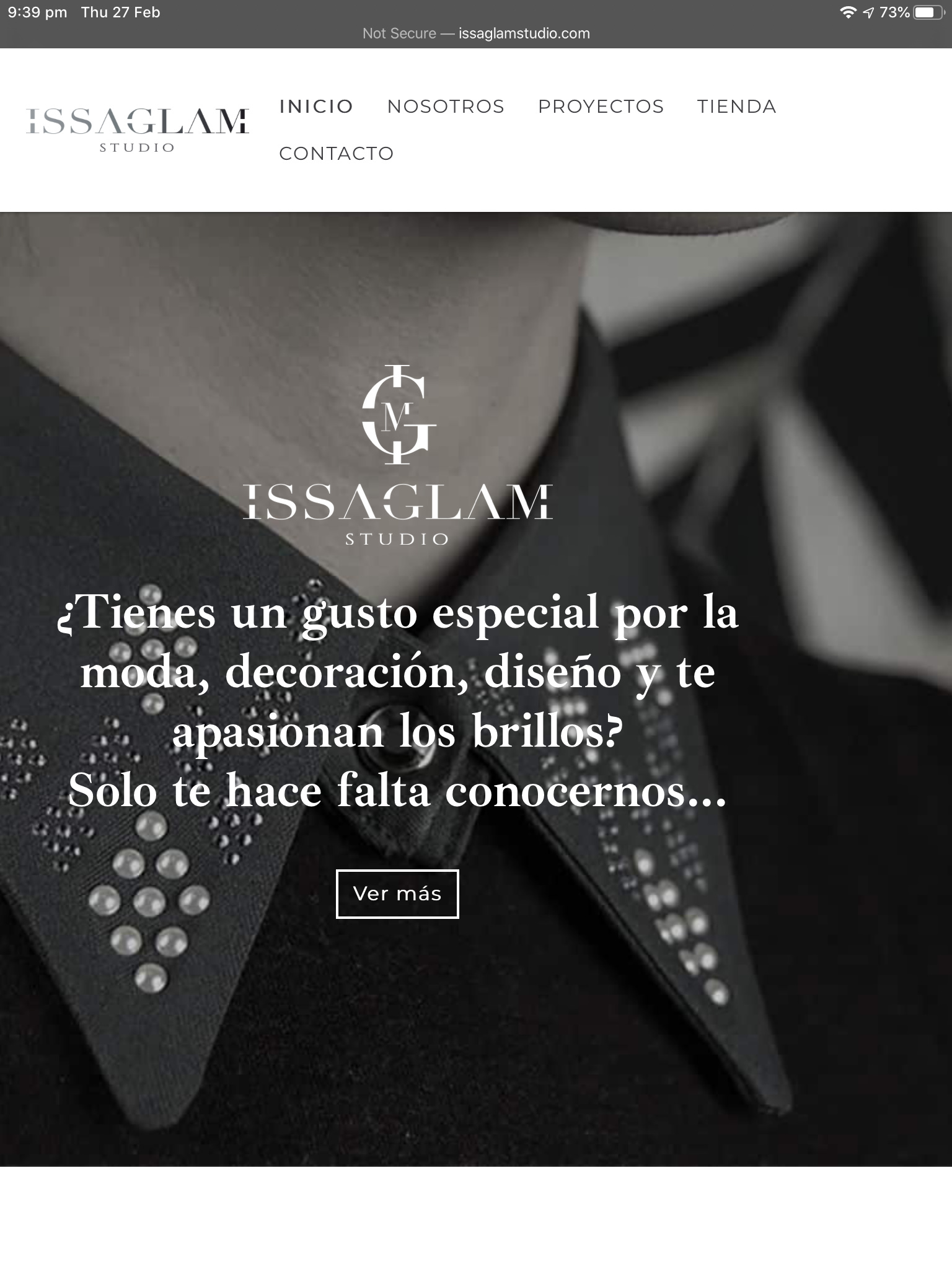
I like the use of Ibarra Nova Real in the headers. It has a nice Spanish feel. I haven’t checked it on mobile but the rest looks good on desktop with a clean, stylish appearance.
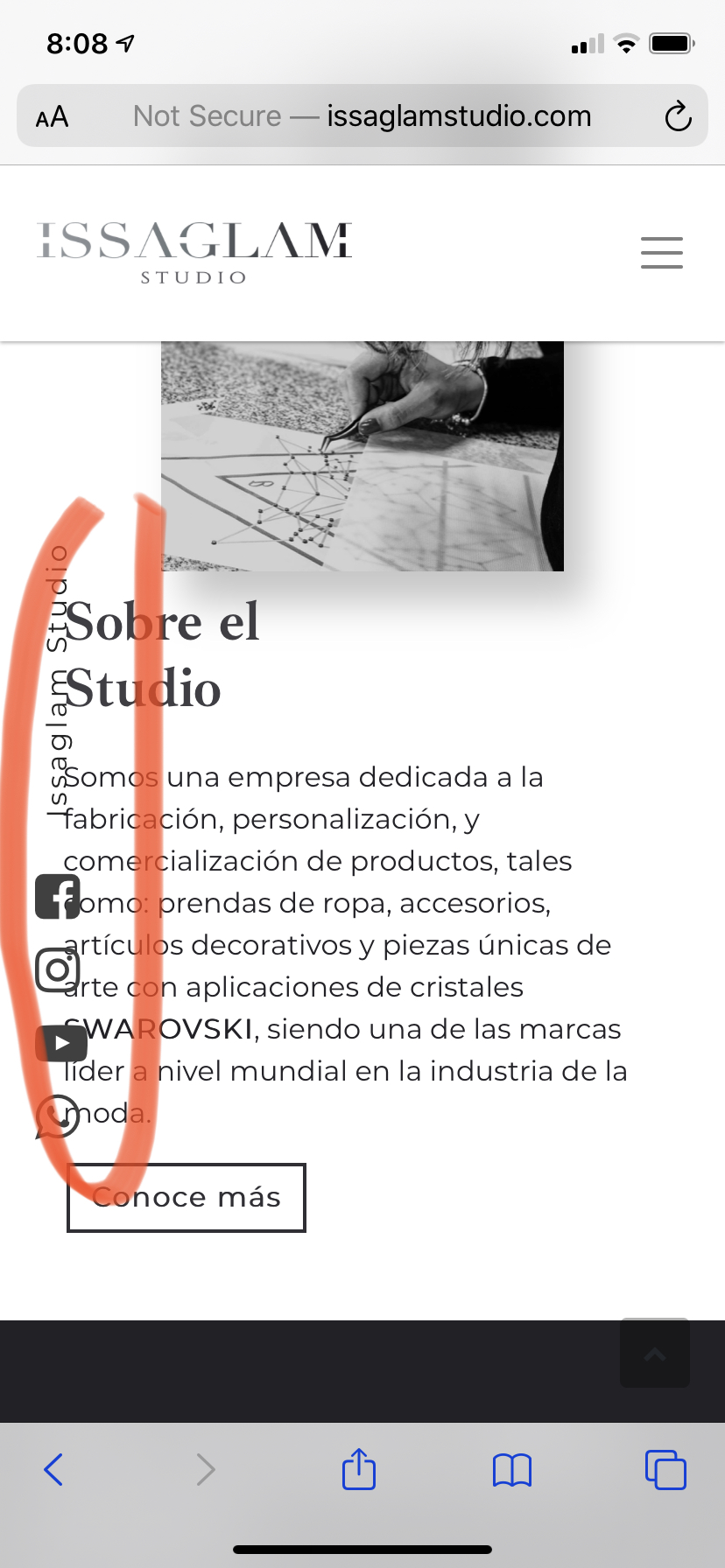
I was curious too about mobile regarding the vertical social icons. This is on an iPhone 11. I don’t know If you want to disable that for small breakpoints?
I too discovered the body text overlapping to the left the fixed vertical social text on the iPhone 6s.
Nice website, indeed! 
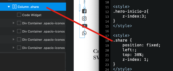
It would be interesting to know how you did the static left social text.
Looks good. What did you use for the Instagram links? Lightwidget? The page opening is a nice effect.
The head navigation menu slips onto 2 lines on an iPad though.
How strange, I have the notion that I had hidden it for mobile, but good observation! thanks
It is not so complicated, it is just to place it normal one under the other and add a class that I share here:
yes, Lightwidget!!! I’ll fix it, if it shouldn’t be applied that way!
Thanks for the feedback
Hello, what a great looking site. Congratulations!
Quick question: How are you achieving the cool “page opening” animation in Blocs?
Thanks for sharing your work.