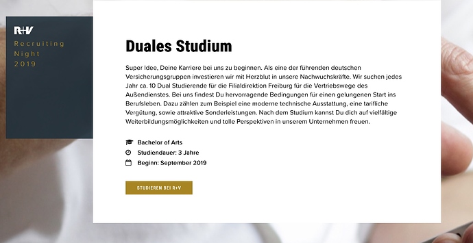
Hey guys, I did change the design of this page a little bit. What do you think? Your comments are welcome.
This looks very nice. The only slight problem I noticed was that the animated transitions seemed a little rough and jittery, both on mobile and desktop.
I saw this recently on a site of my own where I applied this to an entire column and it seemed to improve when applied to the separate items inside the column instead. Is there another way of doing this that achieves the same result in a smoother way?
Do you have lazyload enabled? I believe that makes animations less fluid. Applying the animations into smaller areas may help though if you haven’t tried already.
No lazy load is off. I did change the animation to fade in now.
Your original idea had more impact, but this is definitely smoother.
Yes I like the website. Very effective und toll gemacht. 
Totally minor, because it’s just a matter of my own taste is, that I find the white separator lines between each message statement are to thick. I personally would prefer a less imposing, more unobtrusive separation (thin line, and maybe not full page width and maybe in the corporate colour of the R+V Versicherung).
What to me personally, again only my perception, is really a little bit annoying, because distracting, is this hysterical hopping (nervöses Gehüpfe) of the little centred arrow to indicate to scroll down (as if nobody would not know that anyway). At least if clicked, it moves the page downwards (unlike, and I assume it’s an overseen flaw, on your own site where nothing happens).
Everything in life is only matter of taste. However, the site is well done.
Ganz toll, auch die Übersetzung ins mobile Geschehen ist wirklich gelungen.
Schöne Hintergrundbilder und draufgelegter, schlicht weißer Text (Header in angenehm zu lesendem weiss).
Wirklich schön.
Mein einziger Wermutstropfen ist das Kontaktformular mit der Frage, ob denn die Spielerei beim Hovern gutes tut…
Mir persönlich springt das aus dem Rahmen zum Rest der Seite, zumal die Hintergrundfarbe der Felder auch anders ist als bei den anderen Buttons (hier täte ich Linie halten / warmes Braun-Orange).
Der blaue Rand ist wie immer nervig, ich glaube, ich hab im Forum mal was gelesen wie der zu vermeiden ist, wahrscheinlich bei Eladar  ).
).
Danke für Deine tollen Seiten!
Immer schön anzusehen und eine echte Inspiration 
Hey @pixelwork Vielen Dank für den Hinweis. Das soll so nicht sein. Es ist noch von der vorigen Version. Ich werde das ändern. ![]()
@StFoldex thank you for your opinion. The task was to make the site different than the corporate side. That’s why I chose different colors.
On a page with a fullscreen image, so many visitors do not know that the page has more content. I tracked it with hotjar. that’s the reason for the “jumping arrow”. I ll change it to a “blinking arrow” or do you have an other idea? 
Cool, die Seite ist wohl die beste, die ich je hier gesehen habe.
Hier ist das Video von Eldar:
So ab Minute 8:40 sieht man da die Klasse mit der der blaue Rand nach Walhalla geschickt wird ![]()
perfect. now it should be better 
Yepp!
Bravo, was für ne tolle Seite 

Hi @RME,
yes, if you need the arrows as you said, this with the blinking arrow is by far better. Less skittish distracting but recognisable. 


Maybe to put the blinking (down) arrow on the same/similar grey round background as the (up) arrow for moving back to the top of the page would have been my personal choice and my suggestion.
 R+V should use your website as a recruiting test. When the young potential recruit wouldn’t know to scroll down, she/he fails to be hired.
I realised something on your form. When I type something into the fields and move my mouse cursor around and hover over a field where already text is filled in, the text disappears as long as the cursor is over the field it. I discovered it, because I was thinking, that the counter for persons up and down adjustment arrows doesn’t work as I could not see the resulting number in the input field when clicking on it.
Like I said before — impressive website. 
You can always check the code on the website to see how it was made 
From a design background, not a coder so anything code related is a learning curve. 
me neither, learned here like you asking around 

