Hi,
I have a link with the target_blank. And I want to open the page not on a new tab, but inside my webpage in a modal ? Like an iFrame …
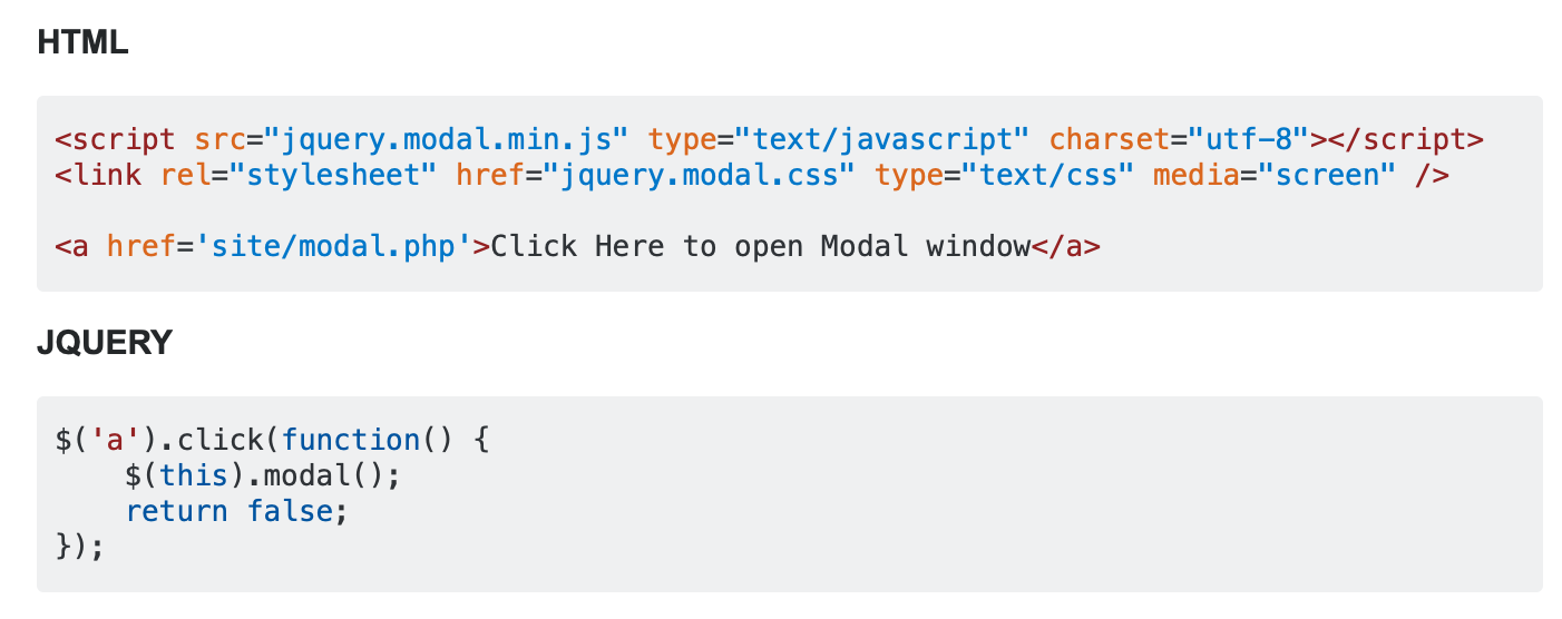
Did anyone do this before ? A solution for this ? I found this but don’t get it to work.
I also want to use a button created inside blocs app.
Hi @PeteSharp
thanks … it doesn’t work. When set a DIV and give it a class embed-responsive blocs app create a video div … When I add a class embed-responsive-item I dont get a video div … But also not working …
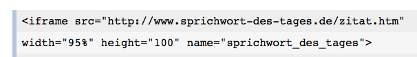
But when I insert in a html bric the complete code ( from the link ) it works on Desktop. On mobile the iframe is small and you can scroll inside the iframe. Not perfect …but okay. Do you think this is also a correct way ?
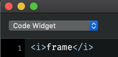
Something wired goes also on. When I create a div and want to set a class I only can type in two letters. I my case “em” then blocs crashed …
And when I want to type inside the code bric the iframe tag I get this:
Is this normal ?
UPDATE:
Think this is the solution for me. Just use an Html brick and set the css width and height, also no border and the scrolling attribute ( I think only in Html ? ) So in the height I leave a little bit space on the desktop view, and mobile the scrolling attribute helps …
Sorry for the delay, I had to go out… try adding this CSS to the Div wrapping the iFrame with the Bootstrap responsive classes.
<style>
.iframe-fix {
  overflow: hidden;
  padding-top: 56.25%;  // As I understand it, this needs to be a ratio depending on the content. So for 16:9 this is supposed to work well?
  position: relative;
}
.iframe-fix iframe {
   border: 0;
   height: 100%;
   left: 0;
   position: absolute;
   top: 0;
   width: 100%;
}
</style>